With iPhone 6S, Apple introduced a new type of touch gesture: the 3D Touch. Unlike the other gestures, which usually are detected by taking into account the amount of time the finger is on the screen and the trajectory of that finger, the 3D Touch takes into account the amount of force being deployed. (The name “3D” is probably an analogy with pressing “deep” into the screen as opposed to just touching the surface, though the user is actually still pressing down on a rigid unmoving piece of glass. Thus, the press is not literally three-dimensional.)
Apple Watch users may be familiar with 3D Touch’s predecessor: the Force Touch. Unlike Force Touch, which is associated with the entire screen, 3D Touch is connected with a particular UI element. In other words, on the watch it doesn’t matter where you press: if you press with the right amount of force anywhere on the screen you will get the Force Touch menu for that screen (if such a menu exists). On the phone, you will get different results depending on where you press. Thus, the phone operation is similar to right-clicking the mouse in Windows (which gives you a context-sensitive result), whereas the watch operation is similar to pressing the Windows key on a PC keyboard (which produces the same menu no matter where your mouse is pointing).


3D Touch can produce two kinds of views: a quick-actions view, like in the example above or in the Maps example below, or a peek-and-pop mode, in which users see a preview of an item such as an email message or a link on a website.

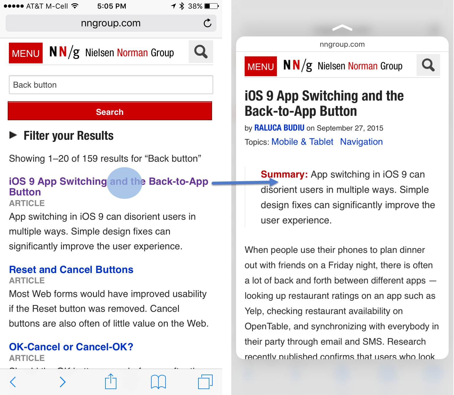
We often question overloaded commands: the idea of having the same operation produce two different results, depending on the context. However, in this case, the two different outcomes of 3D Touch are unlikely to cause usability problems. For most users, there’s not much difference between the two outcomes: both simply show more details related to the target they’ve pressed. Interaction designers will appreciate the difference between the two view options, but users don’t really need to know or care about this distinction. (As long as pressing the same UI element doesn’t produce different views depending on some hidden mode or state that users would usually not remember. That would be confusing.)
However, as discussed further below, one confusing aspect of having two different outcomes for 3D Touch is that the interaction with each of these views is quite different.
The Appeal of Gestures on a Small Screen
Gestures have always fascinated small-touchscreen designers, for good reason: they represent a unique opportunity of loading more functionality into an app, without taking up any visible real estate. They are an elegant solution to the tension between content and chrome that makes designing for mobile devices such a challenge.
However, here we are, 8 years since touchphones became mainstream, and gestures are still far from being widely used by apps. Yes, certain generic-command gestures such as the horizontal swipe have become more standard, yet most of the gestures available on either iOS or Android are still only modestly used in apps. And for good reason.
First and foremost, gestures have no natural signifiers: most of the time, people have no idea what gestures they are supposed to use with an interface. Designers have to work hard to create signifiers for the gestures that they employ. Second, gestures are not easily memorable. Especially when there are many gestures to be learned, people often get confused and forget which gesture they are supposed to use for which action. And last but not least, gestures can sometimes be hard to produce reliably. This last difficulty is especially a problem when two very similar gestures (such as flick and swipe, or swipe and long swipe) are assigned to two different actions, and is one of the main issues with the 3D Touch, as we discuss below.
Long Press vs 3D Touch
In theory, the difference between long press and 3D Touch is quite clear: the first requires the finger to touch the screen for a longer period of time, while the second requires the finger to press harder. Moreover, the 3D Touch has haptic feedback: when the user uses the correct gesture, the phone vibrates shortly in recognition. In practice, however, it’s quite hard to distinguish between the two gestures and to perform each reliably. Even after using my new iPhone for a month, half the time my 3D Touch gestures end up being interpreted as long presses.
There are a few consequences of this similarity:
- Whenever the long press is available, the action triggered by it is inadvertently taken instead of that corresponding to the 3D Touch. For instance, on the homescreen, instead of getting the quick actions associated with the Messages app, I may find myself in the homescreen-edit mode and accidentally delete apps.

- Users are unsure if the gesture was performed correctly. 3D Touch provides feedback only if the gesture has been associated with that design element that you’re pressing. If you happen to try 3D Touch in an app that does not use the gesture, you won’t get any feedback, and thus you won’t know if you didn’t actually perform the gesture correctly or if, in fact, the interface does not support 3D Touch. (Or, if the phone is slow for some reason, which is one of the ways in which engineering flaws degrade the user experience.) You may try again repeatedly, hoping that the app will respond, or you may give up.
If most apps will not in fact support 3D Touch, the lack of consistent results may make users rely less and less on the gesture. This is what happened with the Menu and Search physical buttons on the initial Android phones: because apps used them inconsistently, users ended up ignoring them most of the time. Google’s official Nexus phones no longer have these physical buttons, and although Samsung phones still carry the physical Menu button, most Android apps do not use that button for essential functionality (and justly so).
The Mechanics of 3D Touch: Maintaining Screen Contact
One of the uses of 3D Touch is the so-called peek and pop, that enables users to take a preview a content element such as an email in their inbox or a link on a website. For instance, when users perform a 3D Touch on an email message they will see a lightbox with the beginning of the message. To keep the preview visible, users must continue touching the screen, although this contact is just a regular touch — it does not need the same amount of force as when the peek was initiated. Should they lift the finger from the screen, the lightbox will disappear. Should they slide the finger up or laterally, more actions will become available. Should they do another 3D Touch in the preview mode, the message will pop up full screen.
Maintaining continuous contact with the screen during the peek is problematic for three reasons:
- The finger blocks the content. The point of the preview is to actually see the content, yet, because the finger must stay on the screen, it blocks a good part of what’s actually displayed.

- Maintaining the touch on the screen is somewhat strenuous. If you add to that the fact that users are supposed to do other gestures (such as slide the finger horizontally or vertically, or even press harder) to further act upon the item, while still sustaining contact with the screen, you can see how it’s easy to make an error and accidentally dismiss the item while trying to perform one of these actions.
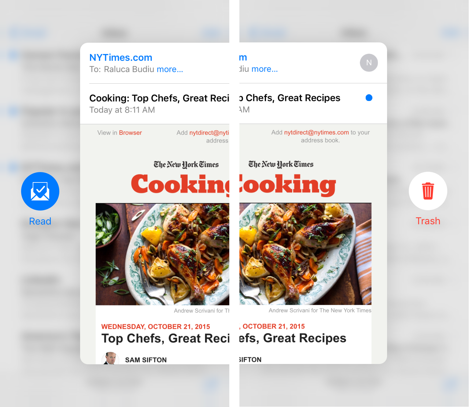
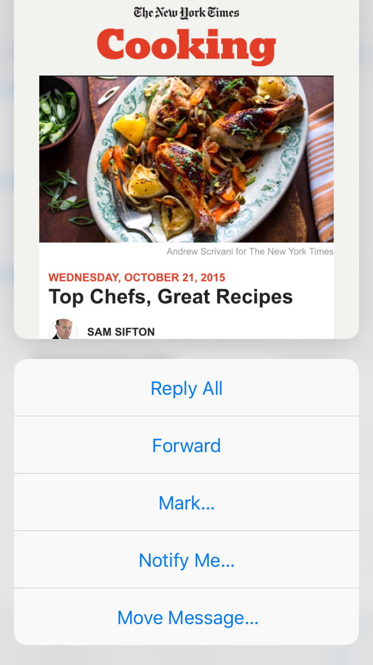
If users do slide up the peek, they can finally lift their finger and read the list of actions available for that item.
- Last but not least, having to maintain screen contact in peek mode is inconsistent with how 3D Touch is implemented for quick actions. In quick-actions mode, users can lift the finger off the screen without losing the menu generated by the 3D Touch. However, in peek and pop, the contact must be sustained to avoid dismissing the preview.
While these two different types of behavior may seem logical if you know of the two different modes available with 3D Touch (quick actions and peek and pop), for users this distinction is not evident, because both are generated by the same gesture, even though they look different. There is no reason for one to require a different interaction than the other.
Enhancement, Not Requirement
Although the actual implementation of the 3D Touch is somewhat problematic, the approach taken to the functionality assigned to this feature is the correct one: 3D Touch should be an enhancement to the user experience, not a requirement to achieving a user task. Indeed, so far, all the functionality provided by 3D Touch, whether in quick actions or peek-and-pop mode, is redundant: users who don’t have the latest iPhone or have trouble with the 3D Touch can still do their tasks without using it and achieve the same kinds of actions, albeit in a more roundabout way. This redundancy is the right solution to the problems that gestures pose: lack of affordance and memorability, as well as difficulty in performing them.
Is 3D Touch Worth the Effort?
Is 3D Touch here to stay or is it just Apple’s marketing gimmick to encourage users to upgrade to a new phone? It’s too early to have an answer to that. First, with a little over a month since the iPhone 6S came out, we don’t still understand very well how fast people will adapt to its idiosyncrasies. Will its perceived benefits be worth the hassle of not getting it right? Second, in further iOS updates, Apple may easily improve one of the problems with 3D Touch — namely, maintaining screen contact in peek-and-pop view. Third, and very important, part of the answer lies in how the app designers are going to respond to it: are they going to enthusiastically adopt it or ignore it?
Is this a feature worth having? Yes, as an enhancement. There is a lot of potential for improving the user experience and supporting behaviors that mobile and desktop users are engaging in already. Two of them come to mind: microsessions and avoiding pogo sticking.
Microsessions are phone sessions that are 15 seconds or shorter. Recent research by Denzil Ferreira and colleagues shows that 40% of app launches are microsessions, namely short interactions in which users are able to quickly satisfy their goals. A common microsession activity is checking for updates in an app (such as Email or Facebook); the quick actions offer an opportunity for rapid access to such frequent tasks or content. Peek-and-pop views should also make many microsessions more efficient for users.
Pogo sticking refers to alternating between inspecting a collection of items (such as a list of products) and looking at each item individually (a product in the list). It is usually an inefficient behavior because it makes users jump back and forth between pages, losing not only time for loading the page but also the time needed for recovering context. Our recent research with Millennials shows that pogo sticking is so annoying that, on desktop, users have developed a special behavior called page parking to avoid it. On mobile phones, page parking is a lot more difficult. But the peek-and-pop view can actually prevent pogo sticking: it can helps users quickly inspect items that have the potential of being interesting, without navigating all the way to those items and thus without the need to issue an explicit Back command. Wisely selected actions in the peek-and-pop view may actually allow users to collect items of interest for further inspection.
What Should Designers Do?
App designers: Embrace the force!
The silly Star Wars word play notwithstanding, the only chance that we have to actually make 3D Touch a success is to embrace it in apps and make it available for users. If people try the gesture and get rewarded with a result most of the time, chances are that it will be eventually learned in spite of lacking signifiers and the difficulties associated with the mechanics. But if only the occasional app takes advantage of the 3D Touch, it may have the same fate as the physical Menu and Search buttons on Android: too many disappointments, and people will give up trying. Luckily, we’re still at the beginning: the vast majority of iPhone users do not own a 3D Touch device yet. But hurry up, so that, when they do, people will be able to learn to use the gesture easily.
Web designers: Is your page previewable?
Think of the preview as a speed date: you have a few seconds to make a good impression under conditions that may not be optimal. Make sure that your users are compelled by what they see in the peek and pop and ready to go on to the full-page view.
- The preview mode (as well as iOS 9’s split view and slide-over view for the iPad) means that you cannot guarantee how users are going to see your site: some may see it full screen and may be able to easily scroll down, while others may look at the front page only in a section of the screen. So, whatever you put at the top of the page should be compelling enough to pass the preview test and make users click over. That’s another reason why the page fold matters (if you weren’t already convinced).
- Previewed pages are squeezed into the smaller preview window, so as a result, the text will appear about 7% smaller than in a full-size window, plus users won’t be able to zoom in to increase the font size. Tiny fonts will get tinier, and the previewed page may become illegible, so start with a font that’s big enough to stand a decrease without impacting legibility.
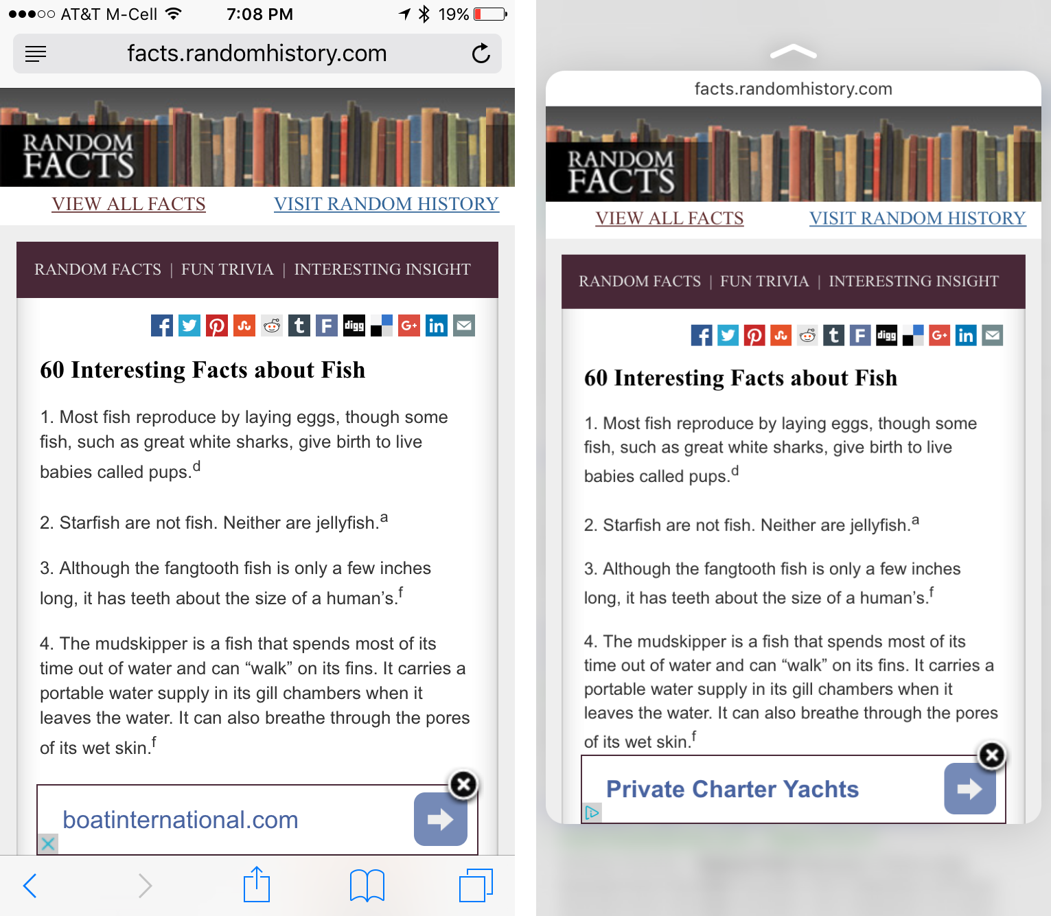
- Stay away from Interstitials: They prevent users from seeing a preview of the actual content. There are many reasons for not using interstitials that ask users to choose whether they want to see the app or the webpage, but previews are another one: if people see irrelevant info as the preview, they’ll assume that your site is irrelevant.

- Don’t ask for permissions before loading the page. If the site requires permission to use current location before loading the page, you’re in trouble: users in peek-and-pop mode cannot give you permission without leaving the preview mode, nor can they see what your site has in store for them. They may simply not bother and skip your site in favor of a different one.

Conclusion
The 3D Touch is a new gesture that presents some challenges for users due to its similarity to the long press. Designers should use this gesture as an opportunity to enhance the user experience of power users, by providing quick access to frequently accessed pages and to by making their pages previewable.
Reference
D. Ferreira, J. Goncalves, V. Kostakos, L. Barkhuus, A. K. Dey. 2014. Contextual experience sampling of mobile application micro-usage. In MobileHCI '14. http://doi.acm.org/10.1145/2628363.2628367