Sites with large inventories or complex products often provide category pages as well as product-listing pages. Category pages act like homepages for a particular product category. They don’t provide a complete list of products but may showcase a few products and provide links to product subcategories. They are, essentially, an intermediary step that users pass through on their way to a product-listing page.

Category pages often provide some combination of:
- A description or explanation of the category and what it contains
- A menu of subcategories, with descriptions or representative images
- Promotions of sales or featured products within that category
Dedicated category pages are not necessary for all products. Sometimes they can actively annoy customers because they require an extra step to see product options.
Many sites omit category pages entirely and instead direct users straight to a product-listing page where they can filter and browse products immediately.

While this article focuses on category pages in ecommerce, these pages are also used in other types of sites, particularly news and education. These recommendations may apply to those situations as well, but consider testing your designs in case your users’ needs differ from those of online shoppers.
When to Use Category Pages
Category pages are a good idea if your ecommerce site sells products so complex that many of your customers need to be educated before they can be successful at filtering and comparing products. Additionally, sites with large categories and many subcategories of products will sometimes provide some type of category page to help browsers find a meaningful starting point.
However, you may decide that category pages are only necessary for some of your products and not others. For example, Lululemon sells both fitness clothing items (which mostly do not require category pages) and an expensive home-gym product called MIRROR, which requires more detailed explanation and, as a result, has its own category page.

Explaining Complex Products
Category pages can play an educational role for complex products like electronics. Users may not be ready to click on an individual product if they don’t yet understand the product options. A category page provides a path for them to learn about various potentially relevant product features more efficiently than randomly clicking different products.
For example, there are many types of smartwatches with different capabilities and price ranges. Fossil’s website provides a category page listing different types of smartwatches, with options to either Shop Now, Learn More, or Compare.

Direction to Subcategories
Shoppers may not need to be educated about familiar commodities like clothing or food. However, a site with a vast inventory organized into many subcategories may still benefit from category pages — especially if the subcategories can be clearly represented by distinctive images. Images can be scanned more quickly than a long list of (sometimes obscure) labels. They can also be helpful for international shoppers.
REI sells many products for all kinds of outdoor activities, from kayaking to mountain climbing. If the site’s Camp & Hike link in its global navigation took shoppers to a listing page with all of REI’s camping products, that would probably be overwhelming and not very interesting. Instead, REI offered a traditional category page at that link. The page included:
- Subcategories (Tents, Sleeping bags, Hiking)
- Most popular brands in the category (Osprey, YETI)
- Seasonal information related to the category (Shop cold weather hiking)
- Advice (How to Choose Sleeping Pads, Food Storage and Handling for Campers)

Don’t Force Customers to Go Through Category Pages
If your site does provide traditional category pages, make sure you give shoppers easy ways to avoid those pages and go directly to product-listing pages if they want to. It’s a good idea for your site’s global navigation to provide links to subcategory product-listing pages (for example, in a megamenu) as well as links to the traditional category pages.
It may also be necessary to ensure that search results always yield product options instead of taking shoppers to a category page. In our study, Zappos forwarded certain searches to brand-focused category pages instead of linking to products from that brand.
One participant was annoyed that a search for her favorite brand, Sam Edelman, took her to a promotional-feeling traditional category page for the brand rather than showing her products. To her, it felt like an unnecessary extra step.
“When I put in Sam Edelman, I want to see results. I don’t want it to be the page for the brand.”
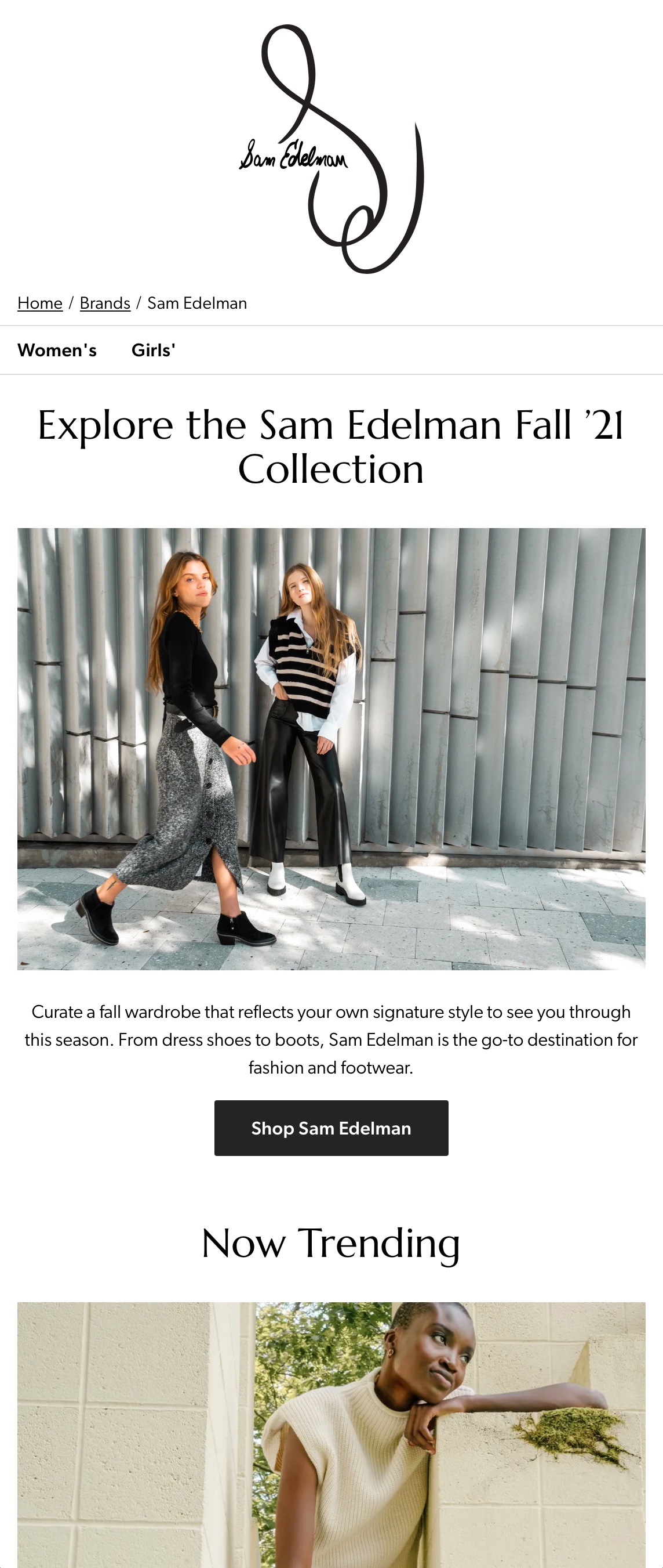
When users search, they expect to see results immediately. This participant already wanted Sam Edelman shoes — she didn’t need to see a category page to be convinced.
A Hybrid Approach: Providing Category Information on Product-Listing Pages
To avoid traditional category pages and provide fast access to product listings, many ecommerce websites now combine a small amount of category information — such as brief descriptive explanations or a short subcategory menu — within the main product-listing page.

This hybrid approach works well because users who are interested in the description or subcategory menu can pause and read it, while uninterested users can simply skip past to quickly access the actual the product listings.
Explanatory Content
Some ecommerce sites include important product or marketing details within or alongside the products on routing pages. These elements convey useful information without slowing users down, like traditional category pages can.
A fine-jewelry retailer, VRAI, used a hybrid approach by including category-page style elements within some of its product-listing pages. One of its product-listing pages, Round engagement rings, included a list of products with prices, as well as explanatory content. The text at the top described general features of this type of product. A side panel gave additional details about characteristics shared by all products in this category.

Subnavigation
Instead of using a category page, some retailers provide navigation links to sibling categories or to subcategories on product-listing pages. These links (which are one of the reasons category pages were originally invented) allow shoppers to easily explore the site’s product inventory.
For example, Ann Taylor’s Pants listing page displayed a category of the different styles of pants with links to that subcategory. This content appeared directly above product listings, helping users understand available options and navigate to them.

Conclusion
Although category pages can provide helpful context, they also create an extra step for users, who must navigate through them before they can see actual products. When the content on category pages is not helpful or relevant, users can react negatively to them.
As a result, it’s important to use traditional category pages only when they are truly necessary — typically for complex products or sites with many subcategories — and allow users to skip them by linking to product subcategories within the global navigation. Consider whether a hybrid approach could deliver necessary product or marketing information directly on the product-listing page.
For more advice on how to design ecommerce user experiences, explore our Ecommerce User Experience report series.