This article is the second in a three-part series.
- The first article defines the 3 Cs and explains how to provide context for quantitative visualizations.
- This article discusses the importance of removing clutter from charts.
- The third article explores ways to add contrast to your chart designs.
Edward Tufte, the Data-Ink Ratio, and Chartjunk
Edward Tufte is a visualization pioneer who advocates for a minimalist-design aesthetic when it comes to presenting quantitative data.
“Data graphics should draw the viewer’s attention to the sense and substance of the data, not to something else. […]
Occasionally artfulness of design makes a graphic worthy of the Museum of Modern Art, but essentially statistical graphics are instruments to help people reason about quantitative information.” – Edward Tufte
Tufte famously analyzed data visualizations using his data-ink ratio. (He advanced this theory back in the days when charts were designed to be printed, not shown on digital screens — thus the use of the word “ink” to mean anything that appears in a visualization.) He defined data ink as the core meaning of the visualization — the elements that convey information and cannot be removed without changing the visualization’s message.
The data-ink ratio for a graphic refers to the ratio between data ink and the overall ink of the graphic; in other words, the proportion of the ink in the graphic that conveys key information. A chart with a high data-ink ratio has few or no redundant or decorative elements — Tufte’s ideal is a visualization that communicates the data in the most efficient way possible.
Tufte refers to any unnecessary elements as chartjunk — a perfect name for them. Chartjunk is the opposite of data ink: any visual element that isn’t really necessary and in fact distracts from the chart’s meaning.
This theory is a variation of the signal–to–noise ratio, a human-computer interaction concept. The signal (in this case, data ink) is relevant information, while noise (chartjunk) is irrelevant information.
Clear Out the Chartjunk
To help your viewers understand your data, ensure that your visualization doesn’t contain visual information that distracts from the chart’s point.
All too often, I see teams rely on the charts that Excel produces by default. Please don’t make this mistake. Those auto charts will be generic and not tailored to your goal in presenting the data. (That isn’t Microsoft’s fault — the app doesn’t know what point you’re trying to make with your chart!)
Even worse, Excel provides a bevy of chart style options — almost all of which are detrimental to clarity. Sometimes, people tell me they picked those styles to make the chart look “interesting.” Your point is interesting enough on its own! You don’t need gaudy stripes or 3D effects to dress it up. Using those will only obscure your chart’s meaning.

Sometimes these styles can even create an optical illusion, distorting users’ perceptions of the data values.
While nobody should ever use 3D designs in their data visualizations, other design elements can be informational or distracting depending on the context.
It can be tricky to determine which elements are truly necessary for your chart. For example, tick marks might be completely necessary for one chart and totally unnecessary for another. Let’s look at two common chart elements, axes and legends, to see when they might count as chartjunk.
Axes
By default, Excel produces bar charts that have labeled axes with grid lines. Depending on the situation, you might be able to remove those visual elements and simply use data labels.
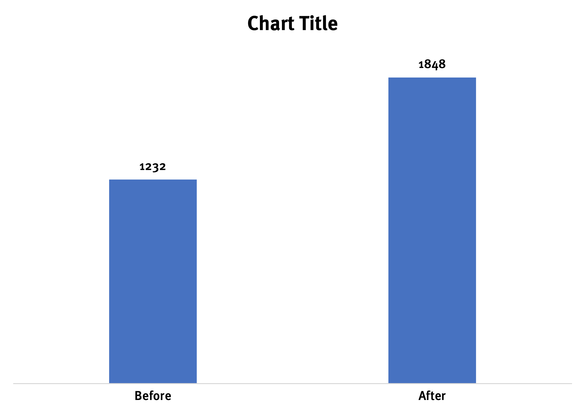
For example, let’s imagine we redesigned an enterprise product website. We increased average monthly lead form submissions from 1232 to 1848. By default, Excel gives us a chart with grid lines, a y-axis, and grid line labels from 0 to 2000.

Using the axis and grid lines alone, it’s a bit tricky to determine exact values. Looking at that default chart, is the Before value 1210? 1215? 1250? We can add data labels to end of each bar to help people see the precise value more easily.
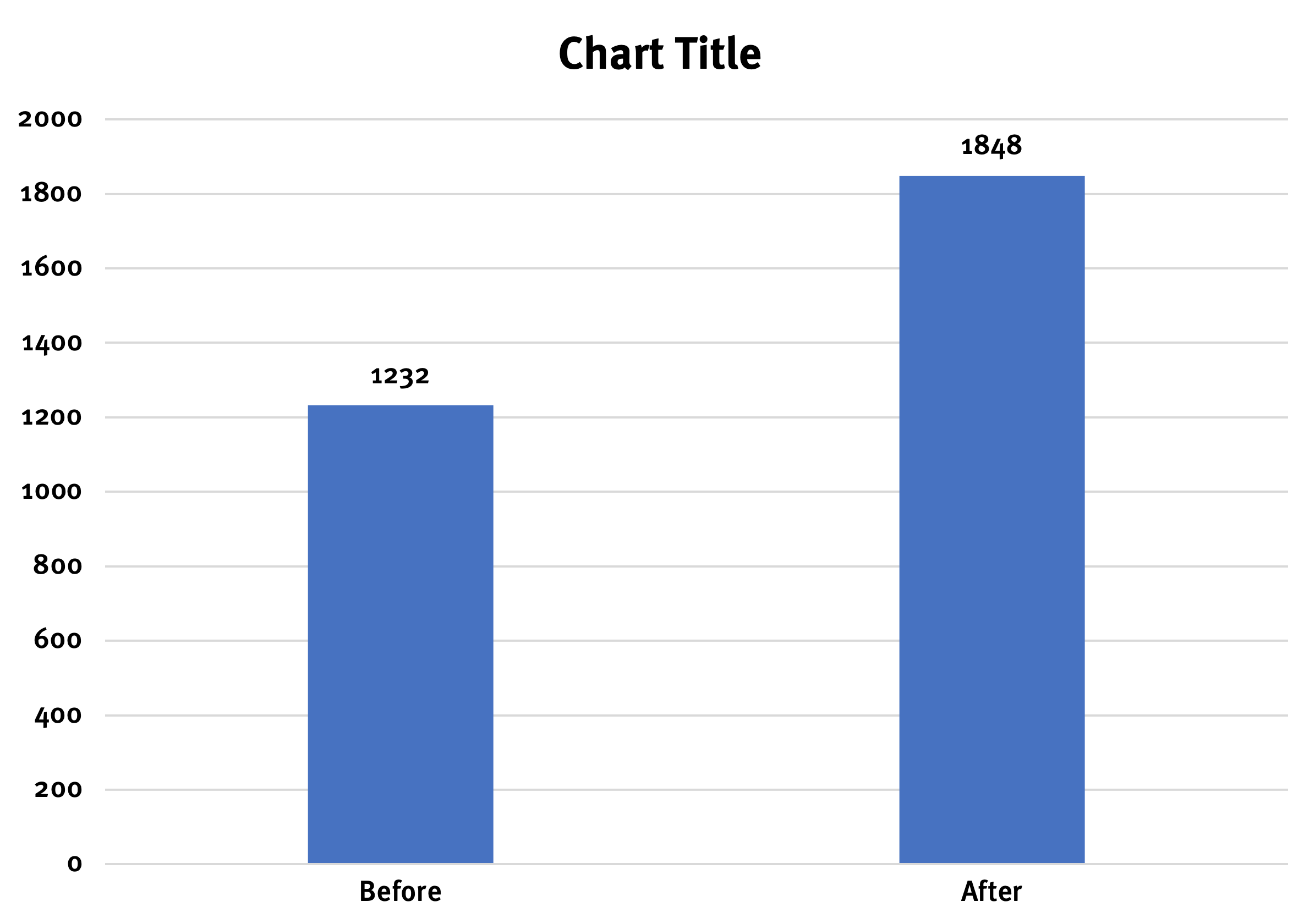
However, with the addition of the data labels, the grid lines and y-axis are rendered unnecessary — they are no longer needed to determine the values. In this case, they’re now chartjunk and can be removed.
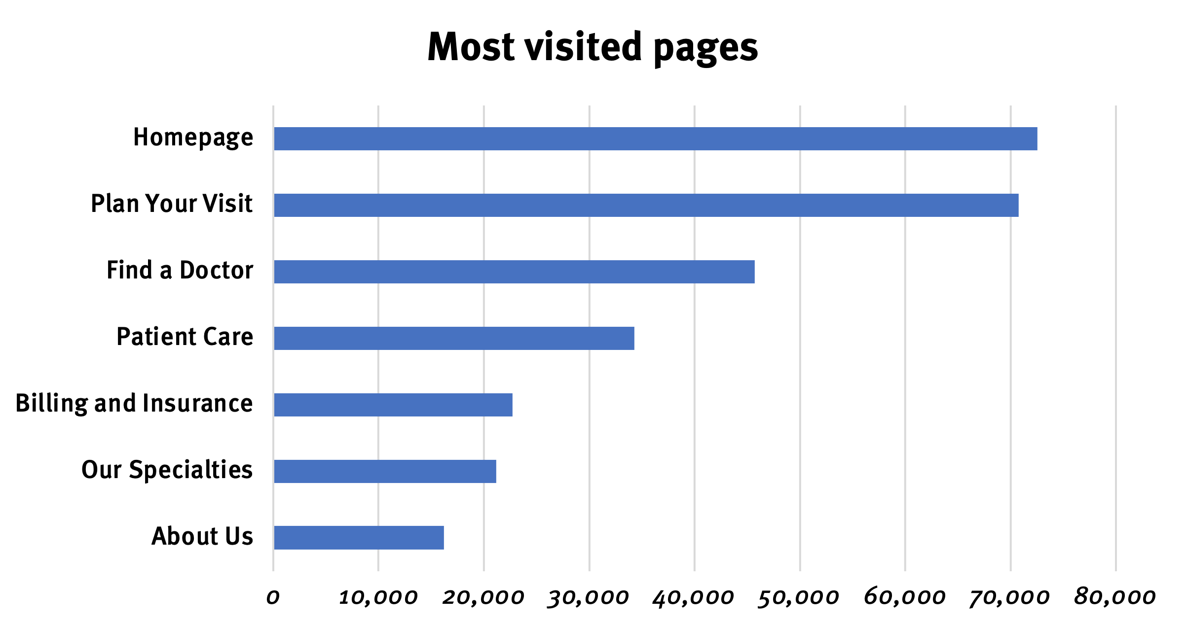
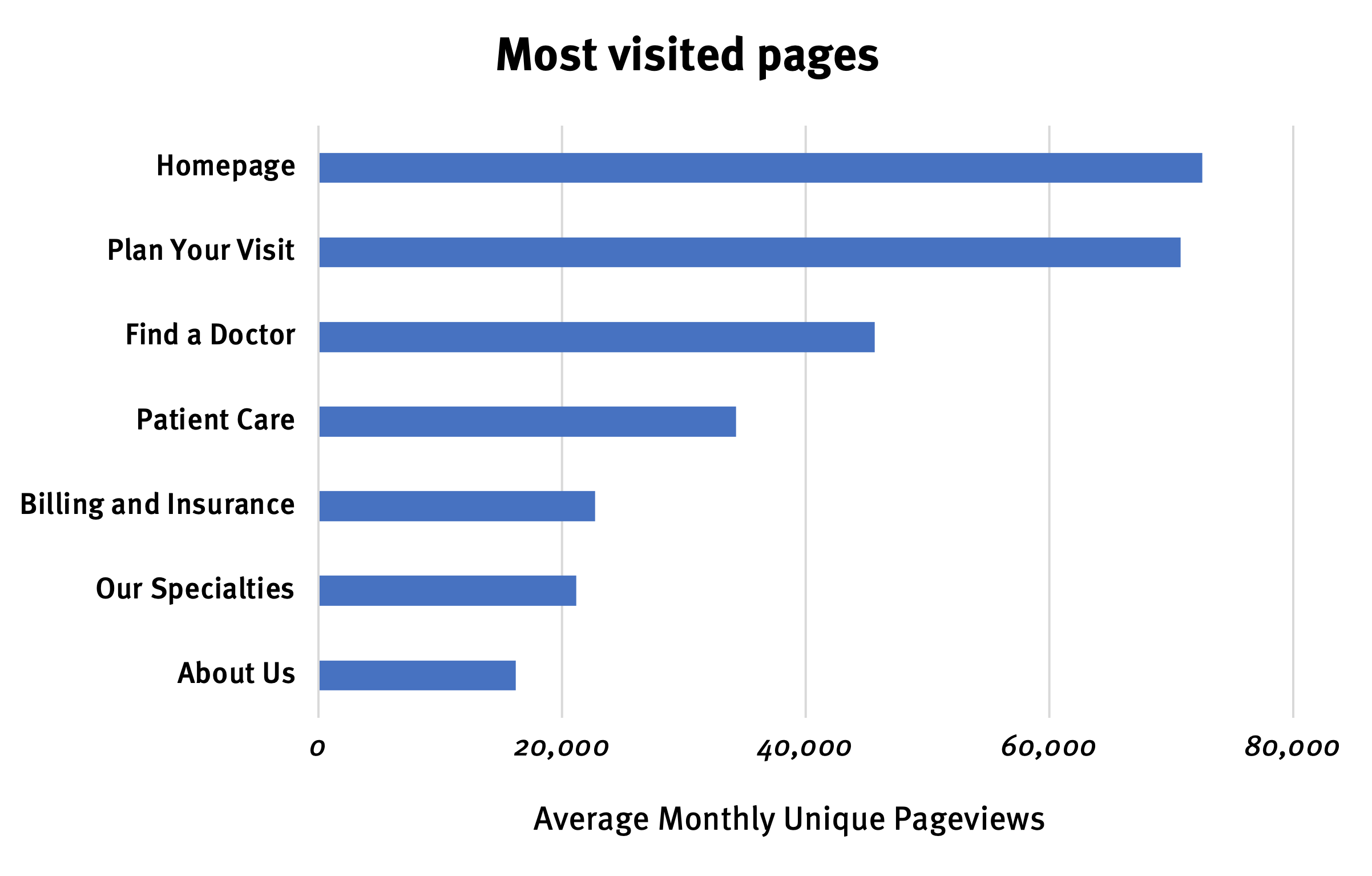
Axes aren’t always chartjunk. Let’s consider another example and imagine we’re working on a hospital website. We want a chart want to show the seven most visited pages (with the highest number of average monthly unique pageviews).
We might decide to keep the axis and grid lines in place if we simply want to give our viewer a sense of the scale of the differences between these pages. With grid lines and no data labels, viewers can still see that the homepage and Plan Your Visit pages are much more heavily visited than the others. Viewers won’t know the exact numbers (~73,000 instead of 72,563), but that wasn’t our goal in this case anyway.
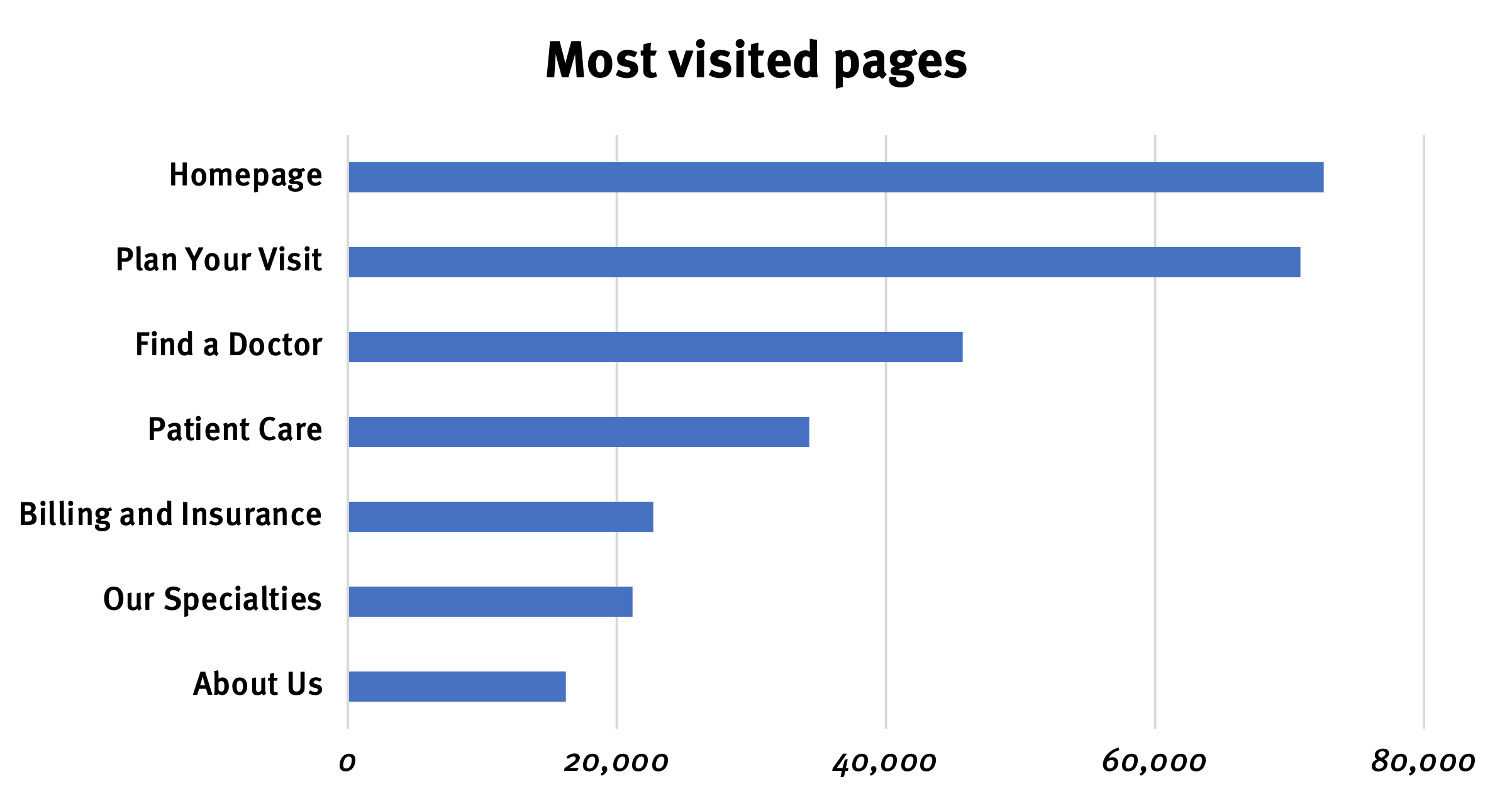
Don’t forget that Excel gives control over how each axis is presented. We can modify these settings to produce a more minimalist chart without losing information. For example, we might change the axis unit from 10,000 to 20,000, to reduce the number of grid lines and labels.
When you include an axis in your chart, you don’t always have to include an axis label. When the chart’s title clearly indicates the metric (and unit) displayed, axis labels may be unnecessary. In this case, the chart’s title Most visited pages is ambiguous — some people may correctly infer that the x-axis represents the number of pageviews but others may think of a metric such as time per page and be confused. It’s worth adding an axis label to this chart to be clear.
Legends
Legends are intended to help people distinguish between different series of data shown in a chart. For example, let’s imagine we’ve been conducting quantitative usability testing on a financial-planner app over the years. We want to show how much the success rates for our top three features have improved over the years.
By default, Excel gives us three different colors — one for each data series. It also gives us a legend, which explains that Retirement calculator is shown in blue, Budgeting tool is shown in orange, and so on.
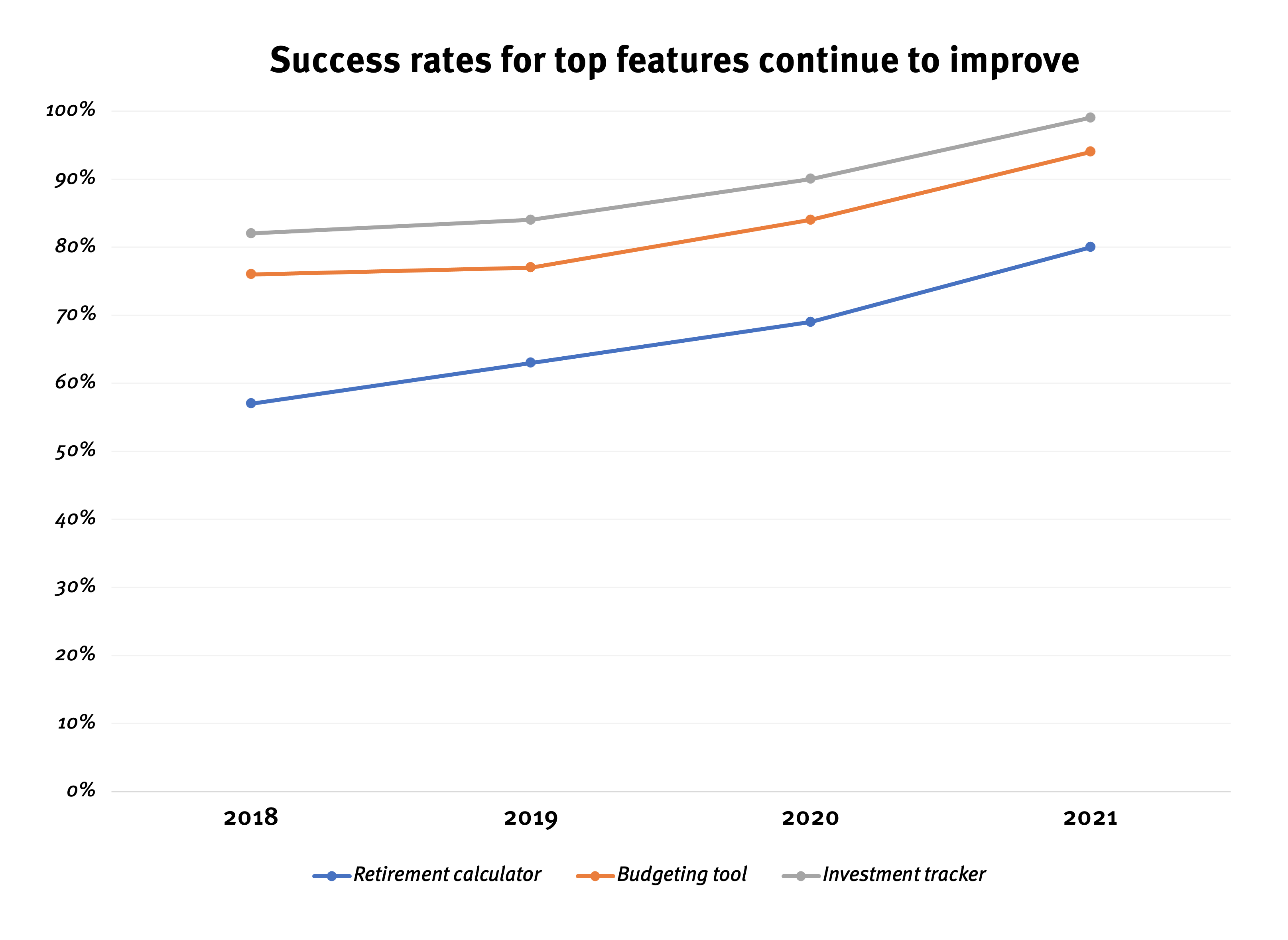
The problem with legends is that they require people to quickly look back and forth between the data visualization and the legend. It’s easier for people to process these series if we place the meaningful labels directly on each line.
In addition to being easier to process, this approach is also more accessible. It’s difficult for people with certain visual impairments — particularly people who are colorblind — to rely on color alone to differentiate between data series. Placing the labels directly above each line eliminates that problem.
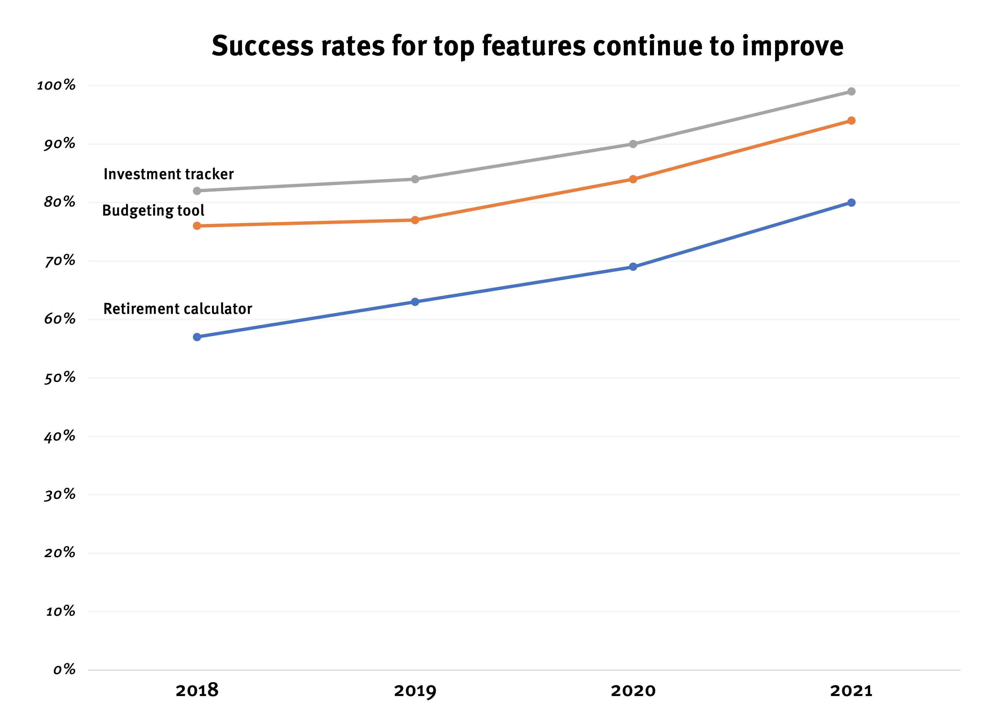
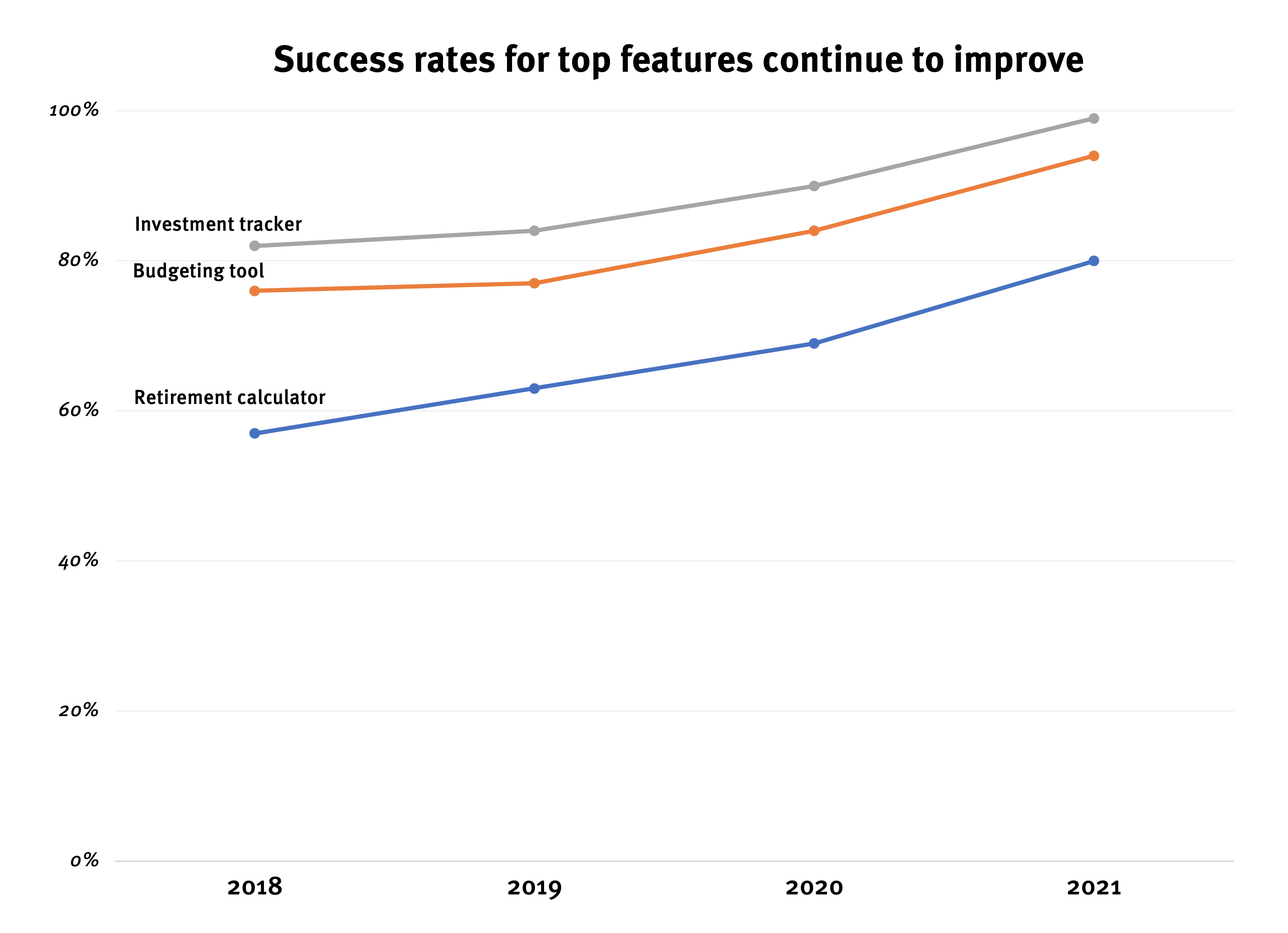
To make these direct labels even easier to read, we could reduce the number of grid lines.
Conclusion: Less is More
Remember that data visualizations often contain a lot of information, which your viewers will try to process and sense of. Remove any unnecessary visual elements that distract from your meaning.
The next (and last) article in this series explores ways to add contrast to your charts.
Resources
Edward Tufte. 1983. The Visual Display of Quantitative Information. Graphics Press.
Jonathan Schwabish. 2021. Better Data Visualizations: A Guide for Scholars, Researchers, and Wonks. Columbia University Press.