- Let Users Know About Savings
- 1. List Discounted Items Under Sales and in Appropriate Categories
- 2. Communicate Site-Wide Promotions on Every Page
- 3. Help Users Reach Minimum Spend
- 4. Be Upfront About Restrictions on Promotions
- 5. Remind Users of Multi-Item Discounts
- 6. Include Available Offers on the Shopping-Cart Page
- 7. Display (and Apply) Discounts for Qualifying Purchases
Let Users Know About Savings
Many ecommerce websites offer a variety of sales, coupons, or discounts to their customers. Incorporating the many possible promotion types (ranging from sitewide coupon codes to multi-item savings) in the online shopping experience can be a difficult design challenge. Designers should evaluate the types of promotions that may be offered and design effective approaches to communicate these offerings.
In our research for the latest edition of the Ecommerce User Experience report series, we evaluated users’ experience with promotions and discounts across a variety of websites, and we’ve identified a set of guidelines to help designers address the presentation of discount-related content on ecommerce sites and applications.
1. List Discounted Items Under Sales and in Appropriate Categories
Do not limit the display of sale items to a dedicated Sales section of the site. It is best to list discounted items on the appropriate category page as well as the Sales section.
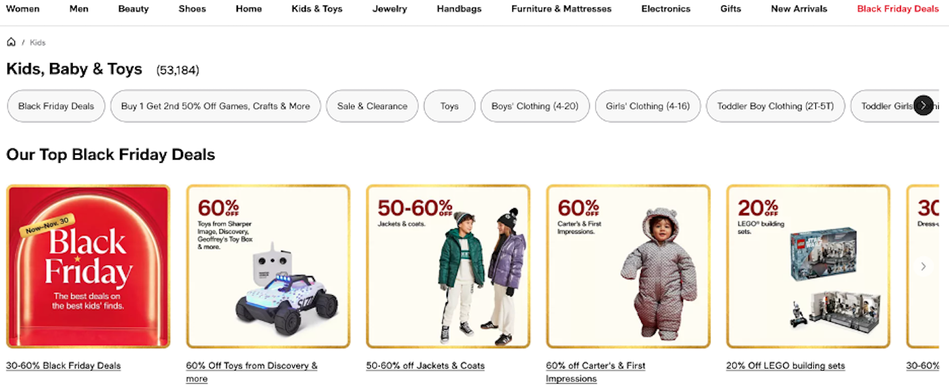
Some users navigate directly to Sales sections when motivated to find a bargain, but others do not specifically seek out Sales sections. (Previous research established that there are several different types of ecommerce shoppers with different behavior patterns.)
Users looking for a particular item generally browse based on category. Sites that display sale items together with full-price items help users discover discounts within their area of interest. Our research participants often gravitated toward discounted items shown alongside full-price merchandise, and mixing sale-priced products with regular-priced items helped them understand that there were sale items on the site.
On Macys.com, a user went directly to a designer’s page, hoping that it would include sale items from that designer.
“If I go to a designer I like, I wonder if the things by that designer that are on sale will be there?” When she got to the page, she was pleased to see sale items listed. She said, “Yes, they are [listed]. Now, knowing that, if I came back to the site, I would just go to the designers I like.”
It is still appropriate to have a Sale section for those motivated by cost savings, but cornering these savings into a single page means many users will never see them. Discounts should be advertised to everyone — not just those seeking out sale items. They could positively influence users’ perception of the company, giving them another reason to check back in the future.
2. Communicate Site-Wide Promotions on Every Page
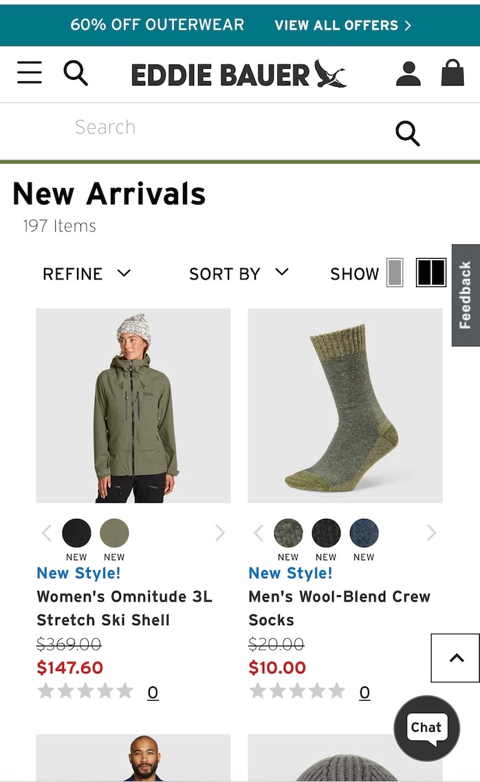
If the site offers free shipping or other site-wide discounts, show these offers on each page of the site. Consistent reminders of discounts can help users find items in their budget and encourage them to buy. Again, they portray your brand as one that provides perks to buyers. By showing site-wide promotions only in select areas, you risk that not all users will discover them. In addition, if coupons are not advertised on all pages, people may assume that they were intentionally hidden to prevent use — which doesn’t reflect well on the brand.
Techniques for achieving good communication of promotions include:
- Promotional announcements in the hero space on the homepage
- Banners at the top of every page with the discount details or coupon code — including on the shopping-cart page or the checkout page where the deal should be entered
- Promotional callouts within the product-listing page or in the right rail
- Banners at the bottom of the page, in or near the footer (Though this space may appear throughout the site, users don’t expect to find deals there, so they may not discover them. For this reason, the bottom of the page should be used only for secondary, redundant promotional messaging.)
Whichever technique you use, don’t make the content look too much like an advertisement in order to avoid banner blindness.
3. Help Users Reach Minimum Spend
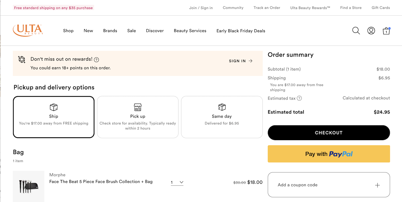
Some sites offered promotions like free shipping for purchases above a certain dollar amount. These deals were enticing to users, and many were willing to spend extra time and money to qualify for them.
For minimum-spend promotions, sites should tell users exactly how much more they need to spend to qualify for the offer. ULTA Beauty correctly alerted users that they could receive Free standard shipping on any $35 purchase. However, it would have been preferable to indicate on the shopping-cart page how much more the user needed to spend..
Users often wanted to spend just enough to qualify, and searching for items that would put them just over the necessary purchase amount is a time-consuming activity. People typically didn’t mind doing it, but product recommendations that satisfy this constraint can expedite this process.
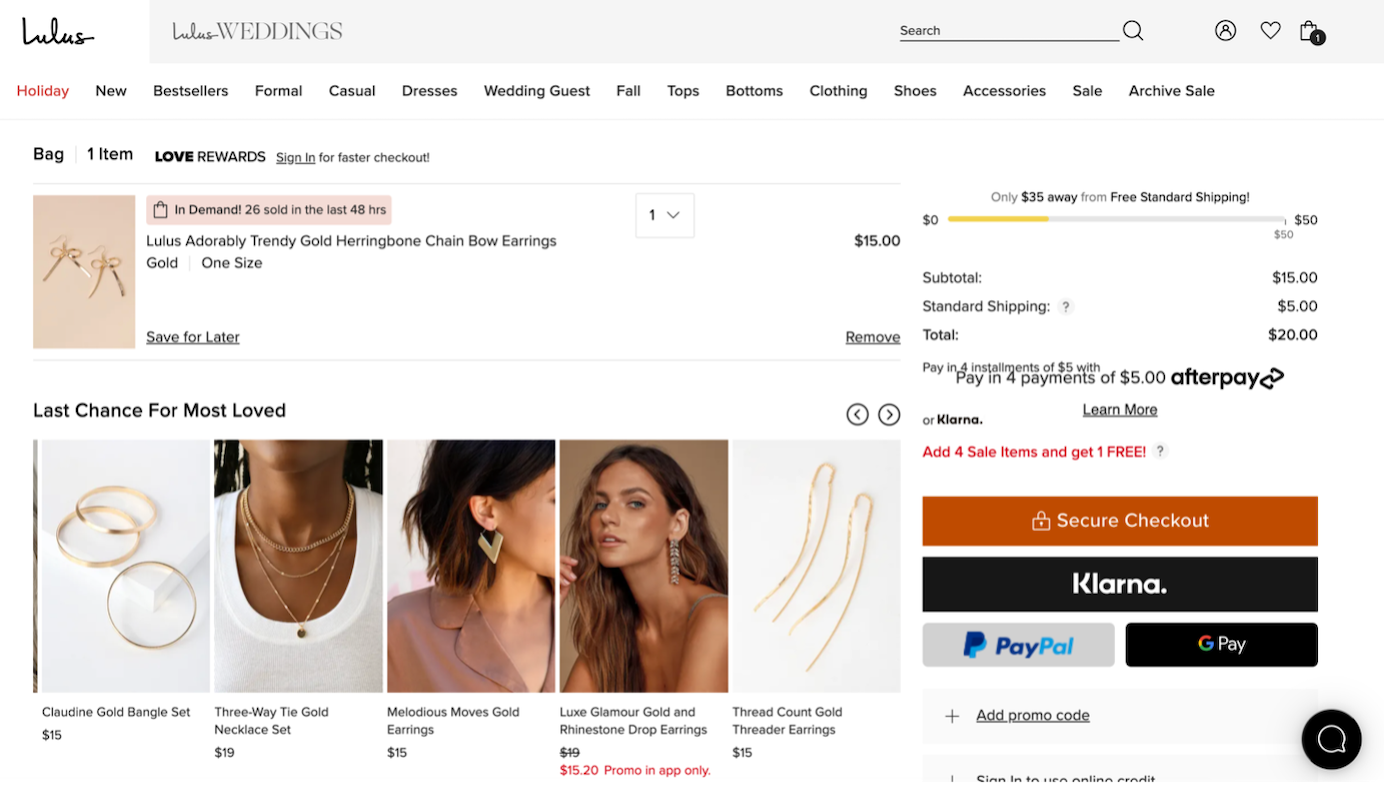
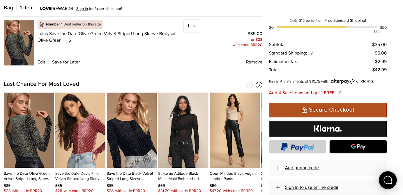
Lulus.com displayed a message to users in the shopping cart, letting them know how much more they needed to add to qualify for free shipping. It also provided product recommendations to help them reach the minimum spend. One user remarked,
“It's nice that it tells you that you’re close to free shipping … So, I might go back now that I see I'm close. I wonder how much shipping is.”
Not only is this a strategic way to upsell more items, but it demonstrates that the site wants to help customers save money and positively impacts users’ trust in the company. However, Lulus could have improved this design by suggesting items at various price points to reach the minimum spend. Instead, all the suggested items were similar in price and did not allow users to reach the minimum — unless they purchased several of them and spent much more than the minimum. Thus, users may perceive such suggestions as a deceptive pattern, forcing them to pay more than the amount needed for the discount.
4. Be Upfront About Restrictions on Promotions
Sometimes, promotional offers might be subject to qualifiers or restrictions. If that is the case, ensure that the offer clearly indicates what restrictions apply. Link to detailed information about these conditions if necessary, but do not require users to dig through the fine print to understand the basic restrictions. Nothing is more frustrating than expecting to receive a deal only to find out at checkout that you do not qualify. (Loss aversion makes it extra painful when customers think they have something that’s then taken away from them.)
One study participant was shopping for a pair of shoes at DSW.com and the site advertised free shipping in a banner at the top of the page. Free shipping was also shown as the default shipping option when an item was added to the bag.

The black banner at the top of the page also advertised a coupon code for $10 off using the code “MYSPRING” in the checkout process, but when the user entered this coupon code in the cart, the free-shipping promotion was removed. The user was confused by what had happened. She said,
“Wait, what happened to my free shipping? I think it removed it when I put in that coupon code.”
After removing the coupon code, free shipping was again applied, and she said,
“Yes, it did! It says free shipping all over this site. Nowhere does it say you can only get it if you don’t use this coupon code they’re also advertising. DSW is using some sneaky tactics.”

DSW did not set accurate expectations. Omitting important information about restrictions on the offers caused frustration and broke the participant’s trust in the brand. Instead, the offers should have read Free Shipping; No other offers can be applied or Get $10 off with code MYSPRING. Free shipping does not apply with the use of this offer. Even better, omit the free-shipping deal during the MYSPRING-promotion period since the $10 discount will always be better than the $7.95 savings on shipping.
5. Remind Users of Multi-Item Discounts
If the site offers a discount for purchasing multiple items of the same product, users should be able to easily discover the offer and meet the minimum requirement.
Victoria’s Secret’s site followed this recommendation. For instance, a 5-for-$28.50 promotion was signaled in three ways:
- The promotion was listed next to the price: $10.50 or 5/$28.50
- A reminder appeared after users added an item to their bag. On the desktop, the message was displayed within a banner below the price. On mobile, the text Add 4 more and save appeared within the added to bag-confirmation overlay.
- A reminder also appeared in the shopping cart if the requirements were not met.

Additional qualifying items were listed lower on the page. In a You’ll Also Love section below the main product area, the site listed several products eligible for the promotion and thus gave users the option to order more within the same page.

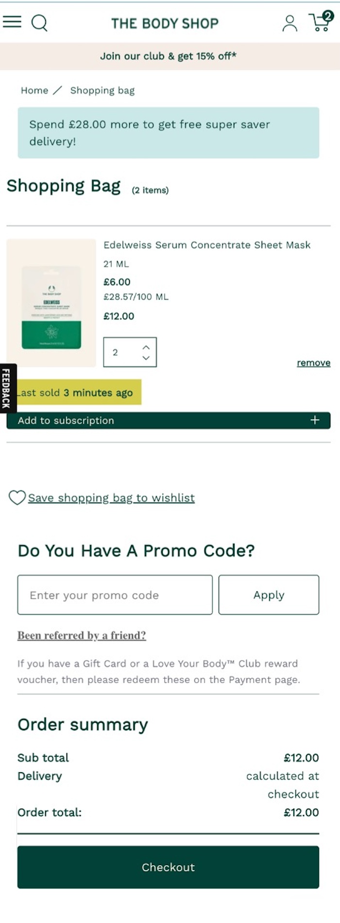
In contrast, on THEBODYSHOP.com, a 3-for-$5 deal was hard to notice on the product page and became obvious only when users reached the shopping-cart page. On the product page, a banner for the promotion did appear below the product description, but was placed so far from the price and quantity selectors that most study participants ignored it.
Those who did notice the banner and clicked on it were taken to the homepage rather than to information about how to qualify for the promotion. Also, adding only one item to the cart did not generate a reminder about the 3-for-$5 promotion on the product page. Only on the shopping-cart page were users informed they could add more to qualify.

6. Include Available Offers on the Shopping-Cart Page
The last chance to catch users’ attention and help them discover available promotions is on the shopping-cart page. There, they can still easily make changes to the order, so be sure to include any special offers users can qualify for, such as free shipping or discounts. The promise of free shipping frequently made shoppers add more items to their carts.
It is not enough to show the offer in a consistent place on every page. Users may miss it or forget about it by the time they check out. On sites where potential savings were highlighted in the cart, users considered buying more products to qualify for offers.
On the UK version of THEBODYSHOP.com, the multi-item deal was promoted on the product page. This design made it much more noticeable, as the red tag element had high contrast with the rest of the page and was placed close to the price and quantity selector. However, at checkout, users were not reminded of this promotion.
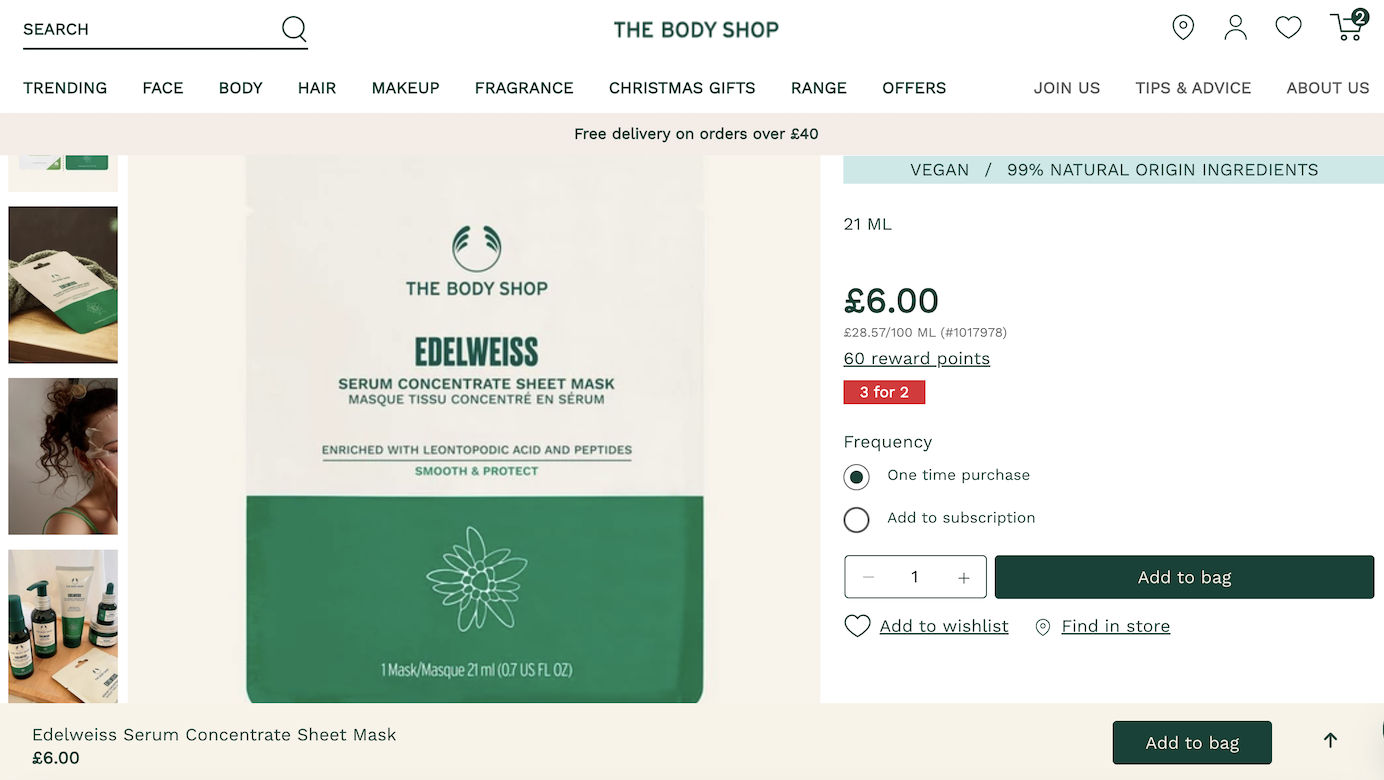
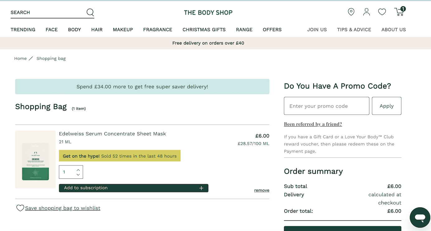
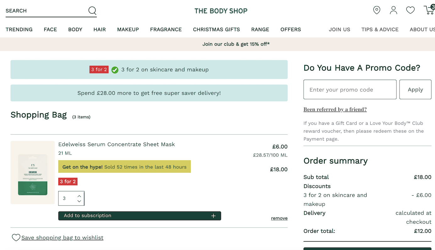
Displaying a promotion on the shopping-cart page is not enough though — offers must also be clearly noticeable on that page in order to attract users’ attention.
To draw the user’s eye, use appropriate placement and visual weight.
- For product-level offers, present messaging near the product itself.
- For site-wide offers, present the offer in a priority space directly above the option to proceed to checkout.
- If the discount applies to shipping, placement with site-wide discounts or next to the order total may be appropriate.
7. Display (and Apply) Discounts for Qualifying Purchases
Macys.com’s shopping-cart page reminded people of coupon codes that they qualified for. The codes were placed near the subtotal, making them easy to discover, and the single-click Apply button made them easy to take advantage of.

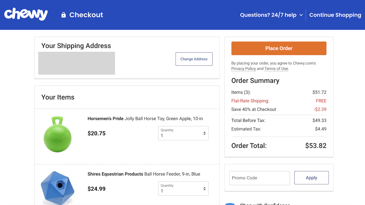
In contrast, Chewy.com made it more difficult to take advantage of offers. Its sitewide banner promoted $20 off your $49+ with code GIFT20OFF.
However, the banner disappeared on the checkout page where the coupon was supposed to be input.

In contrast, Lulus.com nicely reminded users of the discount code for which their purchase qualified. It was easy to see it in red text next to the product total.
Conclusion
Communicating a promotion through a single banner on the homepage is often not enough. Popular promotions are not always straightforward, requiring minimum spend or multiple items purchased. Your job is to help visitors understand your offers and qualify for them. This goal may require a multipronged strategy: Not only must the message be delivered in the right way, but additional steps should be taken to remind users and help them qualify at the time of checkout.
However, communicating the details of a promotion is just the first step. Sites must also ensure these promotions are easy to apply, and savings should be immediately visible. In a different article we discuss additional guidelines for effectively designing discount functionality in the ecommerce checkout experience.