
This article presents the methodology we used to study the effects of content dispersion on desktop-website usability.
Content-Dispersed Layouts
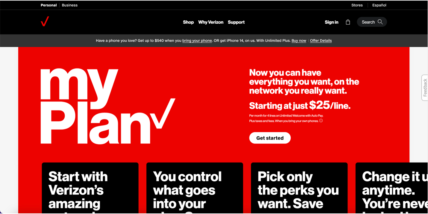
Many modern websites are designed with a mobile-first approach, in conjunction with other design styles, such as minimalism and image-focused design. When such pages render on desktop devices, the content often becomes stretched out, with large images, large text, and excessive negative space occupying most of the viewport. We call this phenomenon content dispersion.
Analysis
We started by analyzing an array of example websites (see Figma file) from across many domains that exhibited content dispersion as described above. We compared these examples to pages with typical content density. This analysis gave us a better understanding of what content dispersion looked like and what attributes these pages had in common.
To understand and define content dispersion, we looked at:
- The number of unique content elements on a web page and the average number of content elements per viewport on a long scrolling page
- The percentage of the page that was not being utilized
Common Attributes of Content Dispersion
Based on our analysis, we identified common attributes of content dispersion
- Long pages
- Large, stretched-out images and text
- Instances where related content is fragmented in multiple screenfuls
- Limited content shown within one viewport. Our dispersed page examples typically had fewer than 7 unique content elements per screenful, whereas condensed pages had a higher content density —around 8–14 unique content elements per screenful.
- Excessive negative space. Our dispersed page examples had a higher average (30%) of unused space, compared to 17% for condensed pages.
There are usually several reasons behind content dispersion:
- Responsive rendering on desktop. Some web pages may have only a few sections that exhibit content dispersion, while other sections maintain a condensed content density. In these cases, it appeared that the responsive rendering on desktop was the only culprit leading to dispersion in these sections.
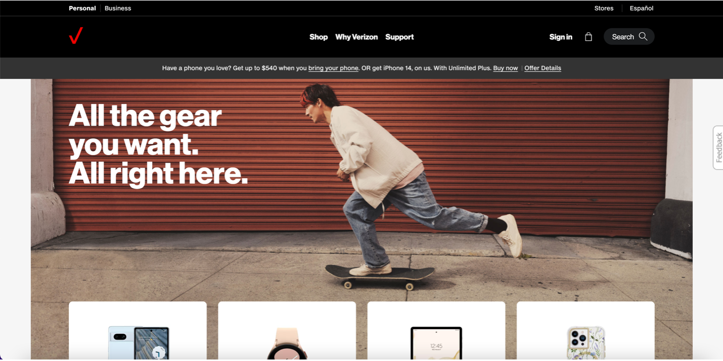
- Aesthetic choices about the website design. Large, bold text, and big, high-quality images can be excessively stretched out when rendered on desktop (like in Verizon’s case above).
- Minimalist designs with lots of negative space also dilute content and lead to dispersion.
The Prototypes
We looked at two types of layouts (condensed and dispersed) on two different types of web pages (homepage and product page), for a total of four different prototypes corresponding to all combinations of these variables:
- Dispersed homepage
- Condensed homepage
- Dispersed product page
- Condensed product page
Based on our analysis, we selected two real web pages that exhibited content dispersion throughout most of the page. We recreated these exact web pages as prototypes and also produced condensed versions of both pages using primarily the same content from the original pages.
Challenges and Caveats
Our goal was to isolate the dispersion variable, making it the only difference between each prototype. However, that was not entirely possible, resulting in a few instances where the prototypes differed in small ways.
We planned to have a within-subjects study design in which participants view and complete a task with all four prototypes, and then compare them. For this study design to work, we needed:
- To allow participants to complete the same task on different layouts without setting expectations from one layout to the next.
- To have minimum content and style (e.g., color) differences across layouts so that these do not muddle participants’ judgements.
These challenges required a few iterations of the prototypes with pilot participants, to finetune them for the actual study.
Homepage Prototype
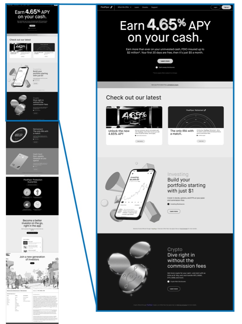
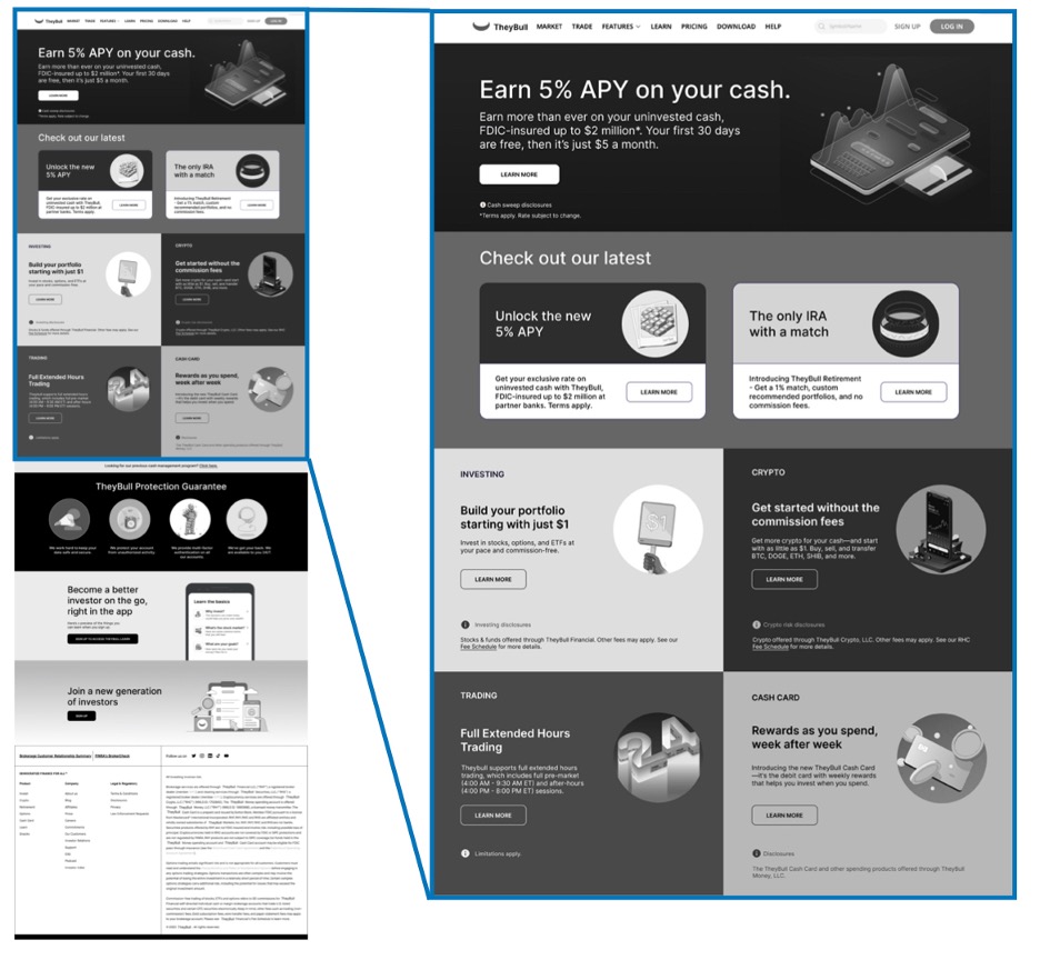
The dispersed homepage prototype was based on Robinhood.com, a financial website. The condensed prototype used elements from a competitor site, Webull.com
We made a few strategic decisions about assembling these prototypes to address the challenges discussed above. Aside from the obvious layout, we ended up with the following differences between the dispersed and the condensed prototypes:
- Different company names. Our dispersed prototype replaced all instances of Robinhood with a fictitious company, PiedPiper, to prevent users from recognizing the brand and basing their judgments on it. We branded the condensed prototype with the name TheyBull, a play on the name of WeBull.
- Different imagery. To make the page appear unique, we replaced all the images from the original pages with different, but visually similar images. Because the images were decorative rather than informational, we assumed that this change would not affect the usability of the designs.
- Mostly the same text with one exception. The text needed to remain the same, to prevent it from becoming a confound and making one page more usable than the other. However, because we were interested in evaluating findability and comprehension, we did have to vary one piece of information across the two prototypes to avoid learning effects.
Additionally, to prevent introducing additional confounds, both the dispersed and condensed prototypes were shown in Grayscale. Our early iterations of these prototypes utilized the same color choices as their inspiration sites (Robinhood and, respectively WeBull). However, pilot testing revealed that users focused their feedback less on the differences in layout and more on their visual preferences.
Product-Page Prototype
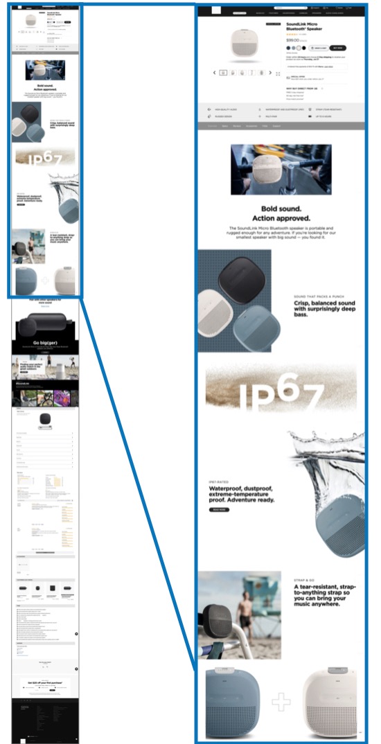
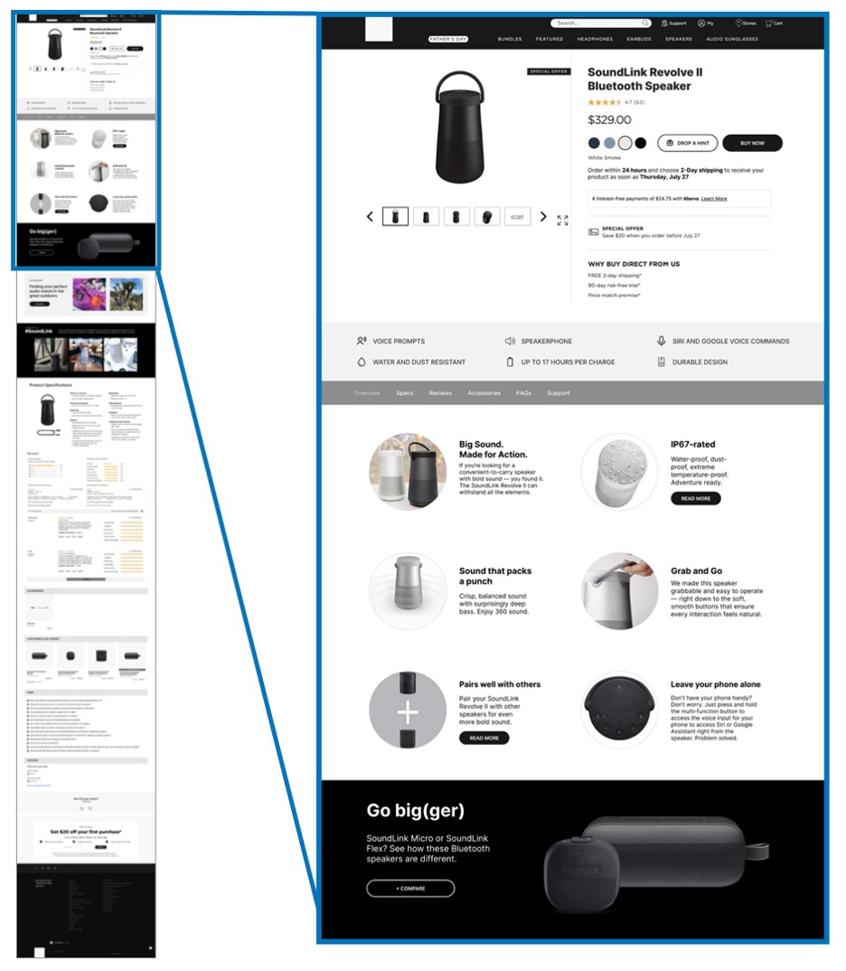
The product-page prototypes were based on product pages from Bose.com, an electronics company producing products such as portable speakers. For these prototypes, we selected two Bluetooth speaker product pages that displayed similar features and content. The dispersed prototype replicated the original product page for one of the speakers. The alternate prototype resembled another product page and displayed the content in a condensed layout.
We made a few strategic decisions about assembling these prototypes to address the challenges discussed above:
- No branding. Even though both prototype versions resembled Bose Bluetooth speakers, we removed any branding to avoid it influencing our participants.
- Different speakers from the same brand. By using speakers from the same brand, we intended to minimize confounding variables, as the style of the prototypes would be as similar as possible. However, to enable us to test two prototypes, we had to introduce some differences. Thus, we decided to present two different speakers in the condensed and dispersed prototypes. We were able to keep the same sections of content and much of product information consistent between both prototypes, as many elements were relevant to both products. That being said, some content elements had to change. We swapped out the product imagery but adjusted prices and product specifications to make the product pages appear different. Doing this helped us isolate the layout variable as much as possible.
- High fidelity. In contrast to the homepage prototypes, we decided to present the product-page prototypes in high fidelity. Because both prototypes featured products from the same site Bose.com, it was understandable that they would look visually similar, which enabled us to use high-fidelity prototypes that resembled the original product page more closely. The pages appeared to be two different product pages from the same site, that happened to employ different layouts.
- No accordions for product specifications in the condensed version. The original Bose.com product page presented product specifications in accordions. That element, however, contributes to content dispersion. Therefore, to allow for a realistic comparison between the two layouts, we did not use accordions to present product specifications for the condensed prototype version.
Study Methodology
Our study involved qualitative usability testing, followed by semi-structured interviews. We recruited a diverse set of 13 study participants: 5 were included in our pilot tests, and the remaining 8 were exposed to our final versions of the prototypes, which were updated based on the feedback from the pilot sessions. The recruitment criteria for participants included:
- Demographics (21–65, mixed gender, race, locale, income)
- Medium-to-high financial savviness (necessary because the homepage prototypes included details about personal investing)
- Laptop screen sizes (13”–16”)
Each participant was exposed to four prototypes: two homepages (one dispersed and one condensed layout) and two product pages (one dispersed and one condensed layout). For each prototype, participants:
- Performed some realistic, open-ended activities.
- Responded to a questionnaire that prompted them to rate the usability of the prototypes, the ease of comprehension, and the ease of consuming information.
- Participated in a semi-structured interview that used the filled-in questionnaire as a starting point.
The order in which participants were exposed to the prototypes was randomized to minimize bias.
Conclusion
We encountered some challenges in conducting this study. One challenge was to arrive at a clear understanding of what defines a dispersed layout. Overcoming it involved analyzing existing desktop designs. Another challenge was to create prototypes that were similar in content, visual style, and language so that participants could focus their observations on the layout differences. Choosing sites with a subject matter that would resonate with users was also a challenge: We had to ensure that users would be interested in the content and find the experience relatable to their real-life browsing behaviors. The pilot tests helped us finetune the prototypes.
Overall, the prototypes helped us gather insightful behavior and comments from our test participants.