This article is the third in a three-part series.
- The first article defines the 3 Cs (context, clutter, contrast) and explains how to provide context for quantitative visualizations.
- The second article discusses the importance of removing clutter from charts.
- This article explores ways to add contrast to your chart designs.
Don’t just throw your UX data into a chart and share it with stakeholders, hoping they’ll see the point you’re trying to make. Amanda Cox, data editor at the New York Times, once said:
“The annotation layer is the most important thing we do […] Having someone tell you, ‘This is what you should pay attention to,’ is a very useful and helpful idea. Tell me what I should look at. […] Otherwise, you put too much of the burden on someone and say, ‘You go figure it out.’ […] We don’t want to make scavenger hunts.”
– Amanda Cox, data editor at the New York Times
Use highlighting, annotations, and contrast to draw your viewers’ attention to your finding. They will help viewers understand the chart more quickly and avoid misinterpretation.
Elements that Provide Contrast
Pay attention to how you use these three important aspects of your chart design to help viewers understand your point:
- Color
- Titles
- Callouts
Color
Color is a powerful tool for directing attention to the data series or values that are most important for the takeaway you’re trying to convey. Show those key series or values in a brighter, bolder color than the others.
Economist Jonathan Schwabish offers a great tip in his excellent book Better Data Visualizations: “Start with gray.” By that, Schwabish means that you should initially make all the elements in your chart in grayscale. Then, strategically add color to highlight the values or series that are most important to your chart’s intended point.
For example, let’s look at a bar chart showing the success rates for four tasks tested in a quantitative usability test. We’ll follow Schwabish’s advice and start with gray.
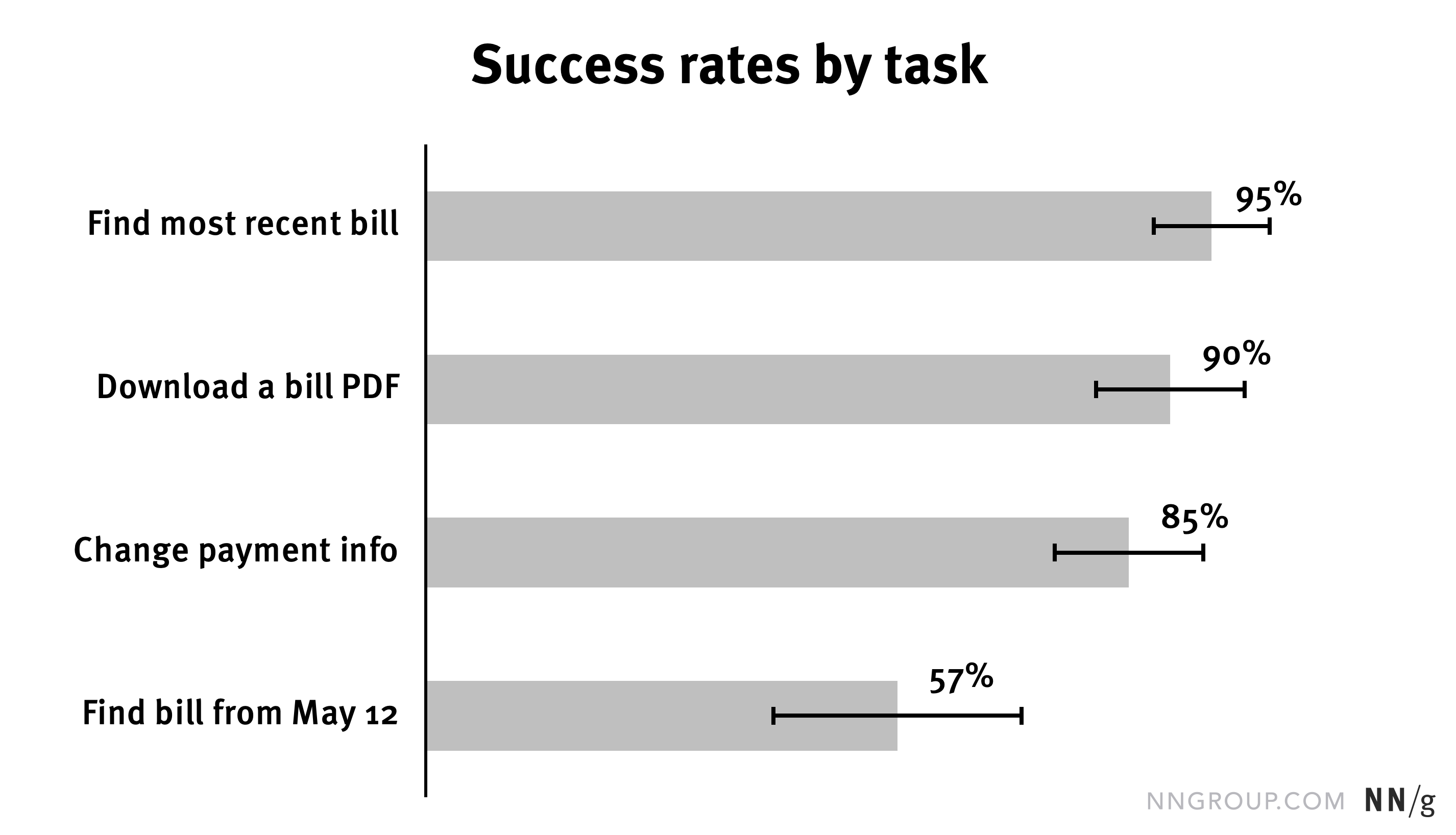
When all the bars in a chart are the same color (in this case, gray), nothing really stands out. Let’s imagine that our goal is to draw attention to the fact that the last task, summarized as Find bill from May 12, is the one that participants struggled with the most. We want to use this chart to argue that we need to conduct qualitative research to understand how to improve that aspect of the design.
If we leave all the bars the same color, people might notice that on their own. But if we want to be sure that our viewers pay attention to that last bar, we can make that bar look different from the rest.
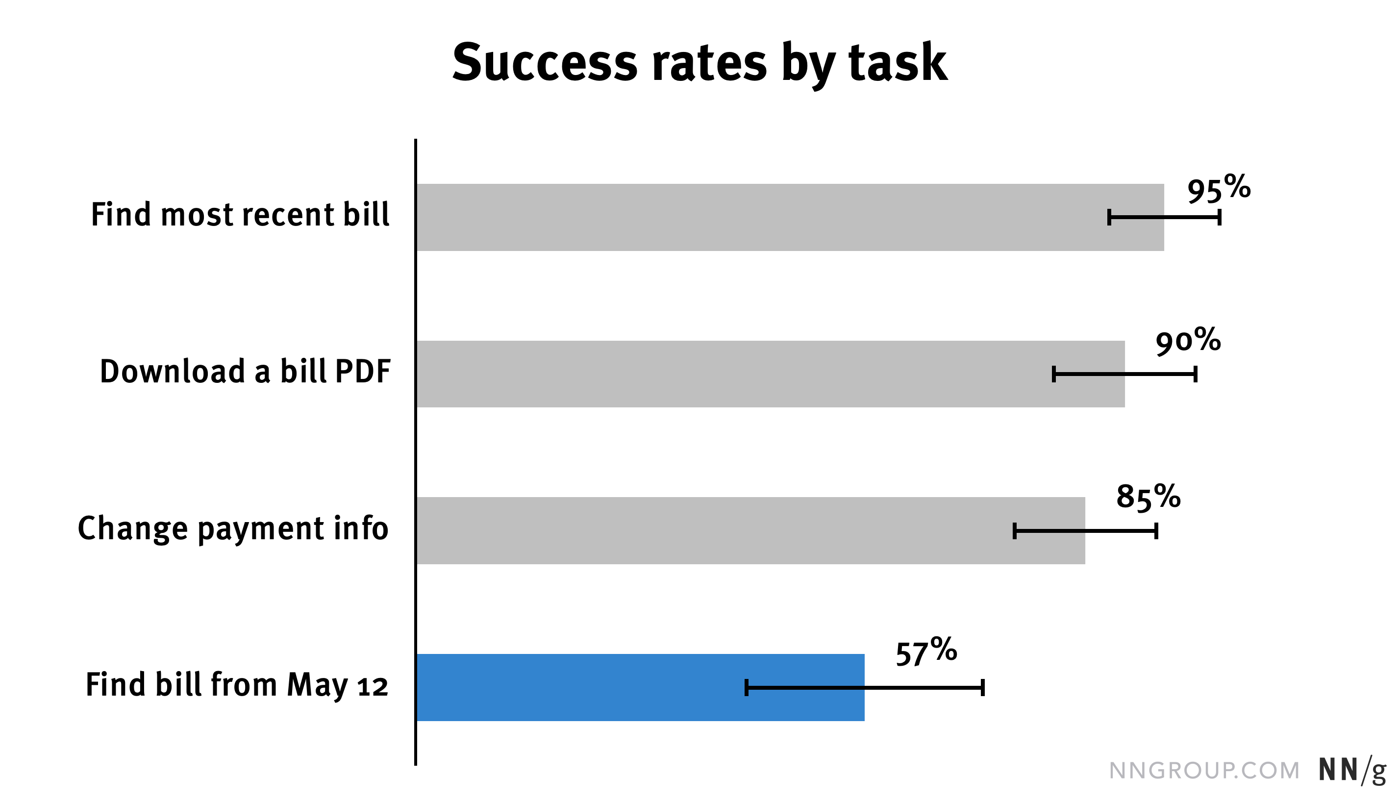
When selecting your colors, don’t forget about accessibility. Avoid solid colors of similar brightness — these will be hard to differentiate for colorblind users. Using different levels of darkness as well as various hues will be more helpful.
Be cautious when using red and green. In many cultures, these colors have inherent meaning (red = “bad” or “stop”, green = “good” or “go”). When preparing charts to be shared within your company or a client’s, consider using colors from the company’s brand style guide.
Titles
Use a meaningful title that tells the audience the finding or takeaway. By far, an informative title is the easiest big-impact change that you can make in your chart. You don’t even have to be an Excel wiz to make this improvement.
Titles should not merely describe the data shown — they should describe its implication. Don’t force viewers to search for the takeaway; Draw the conclusion for your audience. In his book, Schwabish calls these kinds of titles “active titles.”
Let’s look at some passive titles and consider how they could be rewritten.
|
Passive Title |
Active Title |
|
Login rates before and after redesign |
Login rates improved by 29% after redesign |
|
Success rates for top features |
Success rates for top features show strong increases over the past 5 years |
|
Average difficulty rating by task |
Change a hotel reservation was the most difficult task |
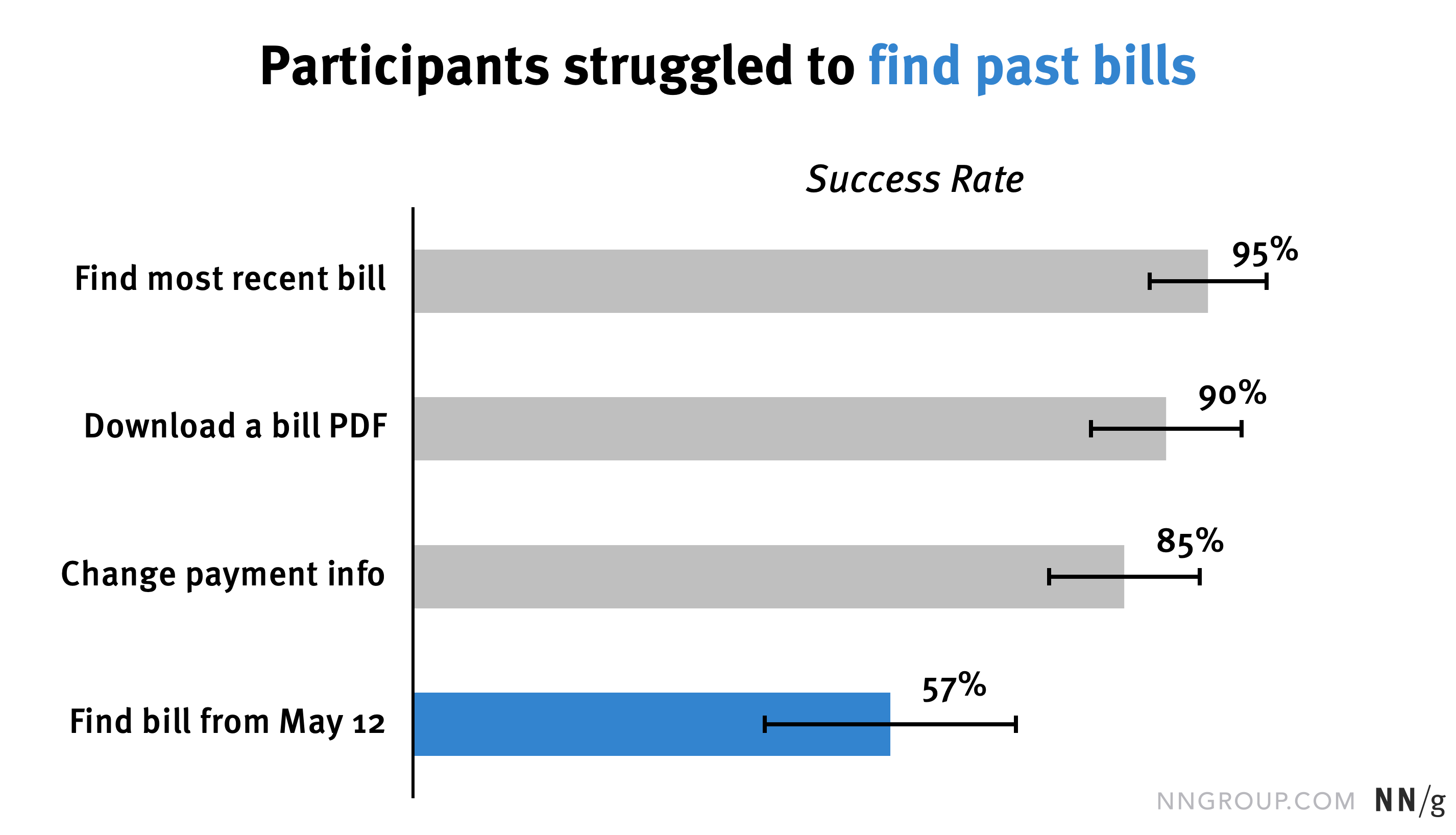
In our earlier example, we used a bland, passive title: Success rates by task. If our goal is to show that one of the tasks had much lower success rates than the others, we simply have to state that in the title: Participants struggled to find past bills.
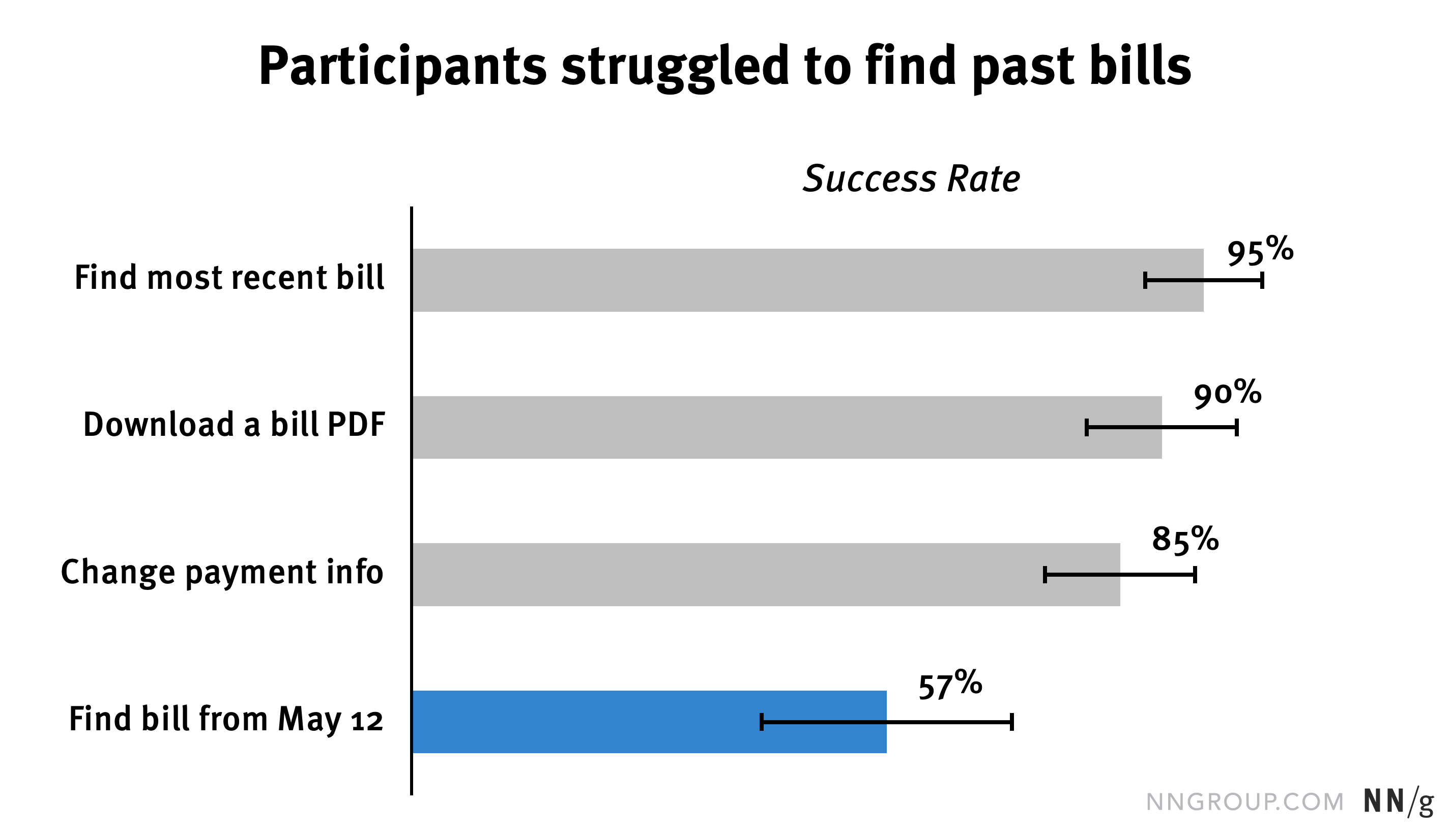
We can make this title even stronger by using a heavier font weight on key phrases. Additionally, we can connect the title to the data value of interest by using the same color in both.
Callouts
This last element is optional. Callouts are annotations that add additional information to your chart. These might look like text or tooltips.
For example, let’s imagine we want to show that the average satisfaction rating increased after a redesign. The increase was from 3.5 to 4.1, which is a 17% improvement over the baseline rating. If we want to make sure our viewers know that percent increase, there’s nothing wrong with simply putting that number in the title.

While there’s nothing wrong with placing the percent change in the title, we do have another option: adding that text into the chart.

Callouts can be particularly helpful when showing time-based data in a line chart. In these situations, we might want to add a callout to help people see where important events (redesigns, sales, or external events) impacted the metrics.
Let’s imagine we’re working on an ecommerce site that sells children’s clothing, toys, and supplies. We have physical stores in addition to our ecommerce site, and we’ve been tracking average order value (AOV) over the past years. AOV increased slightly after a redesign in December 2019, but spiked substantially when the 2020 pandemic caused booming ecommerce demand.
If we present this chart in a stakeholder meeting, we could show a line chart and verbally point out the causes of the two spikes.
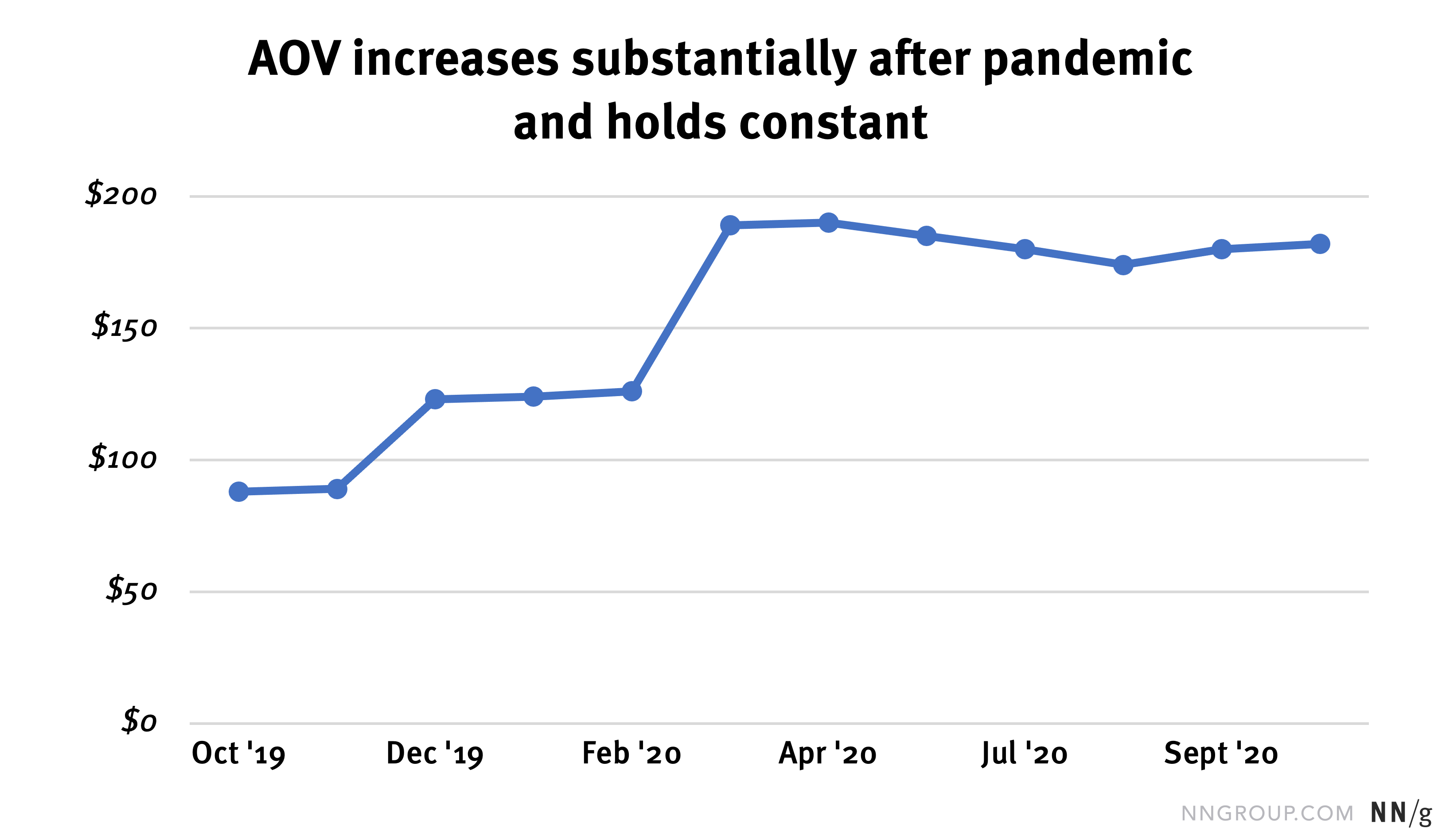
However, that approach may not be ideal. First, it slightly adds to our audience’s cognitive load, because audience members will have to store this information in their short-term memories. Second, if our stakeholders want to review this information later or share the chart with others, that context will be lost.
We can avoid those issues by simply adding callouts next to those important time periods.

Avoid Bias and Manipulation
Designing a chart to emphasize a finding is not the same as manipulating a chart to make it misleading. Don’t abuse these techniques to trick your audience. Don’t try to obscure findings that contradict your expectations or do not serve your political goals in the organization.
It’s always best to be honest and upfront about your data. If there’s a data point or finding that doesn’t conform with your expectations, don’t ignore it. Transparency is always the best policy when it comes to reporting research.
Conclusion: Test Your Charts
The easiest way to know if people will understand your charts is to test them, just like you would with any other design. Show a member of your intended audience (team member or stakeholder) your data visualization and ask them to summarize their interpretation.
If the chart is unclear, return to the 3Cs and consider what changes might be needed: more context and contrast, or less clutter?
References
Schwabish, J., 2021. Better Data Visualizations: A Guide for Scholars, Researchers, and Wonks, Columbia University Press.
Cox, A., 2011. Shaping Data for News, presentation at the 2011 Eyeo Festival. https://vimeo.com/29391942