

In the article Error-Message Guidelines we described 12 guidelines for creating user-friendly error messages. However, guidelines are broad and it can be challenging to apply them objectively. We’ve created an error-message scoring rubric to make these guidelines actionable and informative and help you prioritize UX debt or align stakeholders toward necessary UX improvements.
Error-Message Scoring Rubric
As attendees of our Design Tradeoffs & UX Decision Making course know, evaluating too many factors simultaneously negatively impacts decision-making and ultimately leads to worse decisions. Using a rubric can reduce this problem by asking evaluators to make individual assessments based on common standards. Reviewing the criteria may also provide you with inspiration on how to improve your error messages.
Our error-message scoring rubric is a tool to help you analyze and improve your error messages. The rubric lists 12 error-message guidelines and provides detailed guidance on when to assign a particular score.
The rubric contains 3 dimensions:
- Visibility
- Communication
- Efficiency
Each of these dimensions is further detailed by 4 guidelines that are specific to it. Your error message will be scored for compliance with each guideline. The scoring range contains 4 options: Excellent (4 points), Good (3), Fair (2), and Poor (1).
Once you get a score for each guideline, the scores are added and averaged. Thus, the final score for your error message will be a number between 1 and 4, corresponding to the following letter-grade ranges:
- A (4.0 to 3.3): This error message is a top-tier user experience. Congratulate yourself and your team! The organization clearly understands the business value of helping users recover from errors quickly and continue their workflow.
- B (3.2 to 2.5): There’s room for improvement; at least one guideline area is lagging and should be investigated for enhancements.
- C (2.4 to 1.6): You may not be prioritizing users’ needs enough. Low-efficiency scores are likely the culprit in many cases since the efficiency dimension requires more implementation effort to score higher than the other categories.
- D (1.5 or less): Your message has several significant deficiencies. If multiple error messages score this low, there is a systemic problem with how the organization designs, writes, and implements error messages. The organization should implement error-message changes soon before more users quit using the system due to its disregard for their time and patience.
Below are the rubric’s Excellent criteria for each guideline; dropping some of the criteria downgrades the score. (See our article on Error-Message Guidelines for a detailed discussion of each guideline.)
Visibility Guidelines
- Display the message close to the error’s source. The error should be displayed next to the associated interface element(s). No further user interaction should be needed to view the message. If the error message is in a modal dialog, the presentation should be unobstructed and within the page needing attention.
- Use noticeable, redundant, and accessible indicators. At least 3 error indicators (such as supplemental labels, iconography, borders, or shading) should be used to signal the issue. These indicators must be reserved exclusively for errors and warnings. All error indicators must be WCAG- AA or -AAA compliant to make them accessible for as many users as possible. Nonessential animations (animations that, if removed, would not change the information or functionality of the content) should be used; their duration should be 100–500 milliseconds.
- Design errors based on their impact. Modal dialogs (which have high interaction cost) should be reserved for presenting consequential, actionable decisions to users. Other types of interface components, such as banners, toast notifications, popovers, or labels, should be used to communicate passive warnings or less severe errors to reduce interaction costs. Warnings should not look like errors and should not use conventional error-message styling.
- Avoid prematurely displaying errors. The error message should be displayed after the user has intentionally provided some input to the system. In cases where the input is likely error-prone and/or uncommonly encountered by the user, the error message should be displayed in real-time and provide guidance for the user.
Communication Guidelines
- Use human-readable language. The error message text should be written at a 7–8th-grade reading level (Flesch-Kincaid formula) or lower. Error codes, if present, should be visually minimized or shown upon user request. The text should be free of technical implementation jargon but may use audience-specific jargon that users would likely understand.
- Concisely and precisely describe the issue. The message should balance conciseness and the details of what happened in user-relatable terms; it should also frontload important content to aid scanning by users. The error message should be free of spelling or grammar mistakes and should clearly communicate the problem in terms that users can understand.
- Offer constructive advice. The error message should describe a solution that is sufficient for the user to fix the problem. The solution should require low interaction cost.
- Use a positive tone and don’t blame the user. The tone of the error message should be positive, and the phrasing should unambiguously place accountability for the error on the system, not on the user. Humor should be avoided.
Efficiency Guidelines
- Safeguard against likely mistakes. The system, in combination with the error message, should guide the user to avoid discrepancies between user goals, product goals, and user input. Additionally, the workflow where the error occurs should be tested regularly with users.
- Preserve user input. The user’s original input (even if incorrect) should be automatically preserved and referenced within the error message to contextualize it.
- Reduce error-correction effort. Offer an actionable fix with a high probability of resolving the error. Users should be able to fix the error or dismiss the warning with minimal interaction cost.
- Educate on how the system works. At least one help resource contextual to the error should be offered, so users can get more information or assistance. The resource should provide immediate assistance with low interaction costs for the user.
How to Use the Rubric
Download the Microsoft Excel spreadsheet at the top of this article. For an individual error message or a set of error messages found within a workflow or product, observe how the error message(s) presents, review the rubric’s criteria, and then assign a score from 1–4 for each guideline. The spreadsheet will automatically calculate the overall average and give the letter grade.
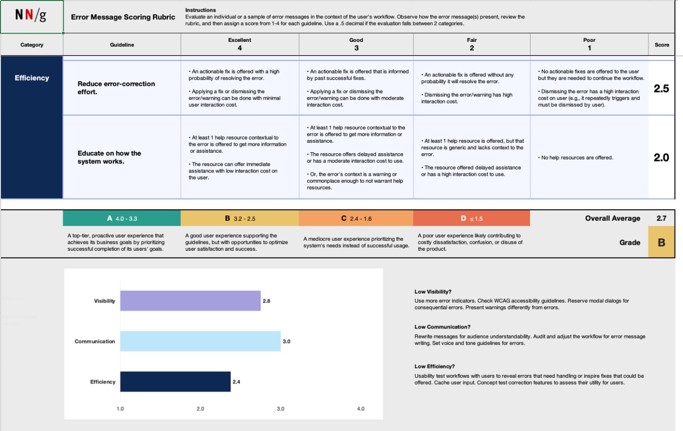
Here are a few additional tips when using the rubric:
- Your score can include a .5 decimal if you believe the error message falls between 2 categories.
- If multiple team members are conducting the analysis:
- Review the rubric together before starting and clarify any questions or confusion. Make minor adjustments to the specific criteria as needed but ensure that all team members understand and agree upon all criteria before starting.
- Have each team member perform their evaluation privately to reduce groupthink and bias. Average all overall scores together to determine the final grade.
- The bar chart indicates the error message’s average score for each dimension. Use it to identify the message’s strengths and weaknesses quickly.
Below are 3 examples where two evaluators leveraged the rubric to assess several error messages. Evaluators independently reviewed the error messages and then averaged their scores.
Low-Scoring Example: Craigslist
Situation: Users can change the email address for their account, but they must enter it twice. This error triggers if the email addresses do not match.
Average Score: 2.08 (low score)
Points earned by guideline:
|
VISIBILITY |
EXPLANATION |
SCORE |
| 1. Display the message close to the error’s source. |
The error message is displayed on the same page but is not adjacent to the field that requires attention. |
2 |
| 2. Use noticeable, redundant, and accessible indicators. |
The error message is WCAG-AAA compliant, but it lacks clear error indicators, such as iconography, borders, or shading. Additionally, the bold red text for the error message is also used for a warning. |
1.5 |
| 3. Design errors based on their impact. |
The message is clearly shown as an error and as a barrier to moving forward. |
3 |
| 4. Avoid prematurely displaying errors. |
The error message triggers after clicking the Submit button. |
4 |
|
COMMUNICATION |
EXPLANATION |
SCORE |
| 5. Use human-readable language. |
The error text is written at a 6th-grade reading level and contains no jargon. |
4 |
| 6. Concisely & precisely describe the issue. |
The error message does not describe the issue (that the email addresses mismatched) but instead is terse. |
1 |
| 7. Offer constructive advice. |
The error message doesn’t offer any solutions or guidance for resolving the problem. |
1 |
| 8. Use a positive tone & don’t blame the user. |
The error message places accountability on the user and has a negative tone. |
2 |
|
EFFICIENCY |
EXPLANATION |
SCORE |
| 9. Safeguard against likely mistakes |
The system sends confirmation emails to both email addresses that were entered, even though they were not matching. This increases the likelihood of potential mistakes. |
2 |
| 10. Preserve user input. |
The entered input is discarded and needs to be re-entered. |
1 |
| 11. Reduce error-correction effort. |
The user must fully start over the process of changing their email. This increases the effort required from the user to solve the problem. |
1 |
| 12. Concisely educate on how the system works. |
The interface provides some instructional copy and one help resource by linking the help desk forum. However, using the help desk forum introduces high interaction costs for the user to solve the problem. |
2.5 |
|
Craigslist – Average Score |
2.08 |
Overall assessment: The message scores decently on visibility due to the conventional red, bold error-message styling. It also correctly displays after the user clicks the Submit New Email Address button. But the experience scores lower in communication and efficiency. The error message’s phrasing is terse and subtly faults the user for entering mismatched email addresses. The text inputs are cleared when the error triggers, thus making error correction harder.
Potential improvements:
- Remove the red error formatting from the If you no longer have access… warning to make actual errors more visible.
- Add error formatting to the affected text inputs, such as shading, borders, or icons.
- Place the error message closer to the fields themselves.
- Remove the you phrasing from the error message and offer more advice. For example, The email addresses entered do not match or The second email-address field is empty.
- Alternatively, removing this confirmation-email field and its error message may be a better approach. Users will likely copy/paste into the confirmation text input to reduce interaction costs. So, this confirmation-email field is probably adding little additional error prevention.
Medium-Scoring Example: Google Flights
Situation: This error message appears when no flights match the user’s search request.
Average Score: 3.17 (medium score)
Points earned by guideline:
|
VISIBILITY |
EXPLANATION |
SCORE |
| 1. Display the message close to the error’s source. |
The error message appears on the same page but not adjacent to the fields that need attention. |
2 |
| 2. Use noticeable, redundant, and accessible indicators. |
The error message uses text but does not highlight the dates or the destination field. |
2 |
| 3. Design errors based on their impact. |
The error hinders users from successfully finding a flight but is styled in a subtle way that may be overlooked. |
2 |
| 4. Avoid prematurely displaying errors. |
The error message triggers after clicking the Search button. |
4 |
|
COMMUNICATION |
EXPLANATION |
SCORE |
| 5. Use human-readable language. |
The error text is written at a 4th-grade reading level and contains no technical jargon. |
4 |
| 6. Concisely & precisely describe the issue. |
The error message has no spelling or grammar mistakes but is very generic in describing the issue. |
3 |
| 7. Offer constructive advice. |
The error message offers two options to address the situation within the UI. Both options have comparably low interaction costs. |
4 |
| 8. Use a positive tone & don’t blame the user. |
The system takes accountability, and the error message conveys a positive tone. |
4 |
|
EFFICIENCY |
EXPLANATION |
SCORE |
| 9. Safeguard against likely mistakes |
The system does not allow the user to book flights that depart before the previous flight arrives, and thus prevents the user from making a mistake with their booking. Instead, it offers solutions for the previous and the following day. |
4 |
| 10. Preserve user input. |
The original input is preserved and editable. |
4 |
| 11. Reduce error-correction effort. |
The user can easily update the search with the suggested revised search criteria by clicking a button. |
4 |
| 12. Concisely educate on how the system works. |
The system does not provide any information about why there are no flights. The page offers a help link but is far from the error. |
1 |
|
|
Google Flights – Average Score |
3.17 |
Overall assessment: This error message performs well in communication. It also scores high in efficiency, retaining the user’s original input and providing easy-to-accept suggestions for alternate dates. Visibility is where this error message loses the most points. The black and grey text blends in with the other interface elements, making the error message hard to recognize.
Potential improvements:
- Use conventional error-message styling to clearly warn users that their original search did not return flights. This styling could be applied to the message in the center of the page or to the text-input fields.
- Replace generic terminology (e.g., options and results) with the more contextual term flights.
High-Scoring Example: J.Crew
Situation: This warning appears when users change their delivery method from Ship To Home to Pick Up In Store during checkout. Users must choose one of the two delivery options for all items in their cart.
Average Score: 3.67 (high score)
Points earned by guideline:
|
VISIBILITY |
EXPLANATION |
SCORE |
| 1. Display the message close to the error’s source. |
The warning is shown adjacent to the source of the issue, which is the Shipping Option button. |
4 |
| 2. Use noticeable, redundant, and accessible indicators. |
The message uses large, bold text and a saturated fill to indicate the warning. It is also WCAG AAA compliant. |
3 |
| 3. Design errors based on their impact. |
The warning is visually different from an error message. |
4 |
| 4. Avoid prematurely displaying errors. |
The warning is shown only after the user decides to change the shipping method. |
4 |
|
COMMUNICATION |
EXPLANATION |
SCORE |
| 5. Use human-readable language. |
The error text is written at a 5th-grade reading level and contains no technical jargon. |
4 |
| 6. Concisely & precisely describe the issue. |
The situation is clearly described in a short sentence and uses wording consistent with the UI (i.e., bag, item). However, there is a spelling error (Item instead of Items) that might confuse users. |
2 |
| 7. Offer constructive advice. |
Since this is a passive warning, no constructive advice is required to solve the issue. |
3 |
| 8. Use a positive tone & don’t blame the user. |
The tone is positive and does not blame the user. |
4 |
|
EFFICIENCY |
EXPLANATION |
SCORE |
| 9. Safeguard against likely mistakes |
The system effectively informs the user that the shipping method for all items has changed. |
4 |
| 10. Preserve user input. |
All items are preserved if the user switches back to the previous shipping option. |
4 |
| 11. Reduce error-correction effort. |
The warning does not require the user to interact with it or to take any additional action. It can just be consumed and disregarded if it is irrelevant to the user. |
4 |
| 12. Concisely educate on how the system works. |
The warning is sufficient for the user to understand that they can only choose one shipping method for all items in their cart. |
4 |
|
J.Crew – Average Score |
3.67 |
Overall assessment: This message is a warning — it does not block the user's workflow but may contain important information to reduce user confusion or misunderstandings (in this case, about how J.Crew ships products). It is clearly styled as a warning rather than an error by avoiding the color red, yet it is still prominent enough to catch visual attention.
Although a strong performer overall in each guideline dimension, this message contains a surprising issue — a typo in the phrase All item in your bag.
Potential improvements:
- Fix the grammar mistake in All item. This warning message is trying to communicate that changing the shipping methods affects all items in the shopping cart. The missing plural undermines its intent.
Conclusion
For those determined UX professionals working in low UX-maturity environments, identifying UX problems can be hazardous work — they may raise the ire of their colleagues or be accused of basing their analysis on personal opinion. While usability testing is the best remedy for such criticism, there are other tactics to leverage. Use this error-message scoring rubric (or similar standards) to demonstrate a systematic and consistent rationale for your analysis. Take inspiration from the error-message guidelines when reporting error-message UX problems: make your analysis highly visible, communicate it constructively, and show how enhancements can improve user and business efficiency.