

In a previous article, we reported a quantitative study that showed that hiding navigation makes it less likely to be used and degrades the user experience on a variety of metrics both on mobile and desktop. We attributed this effect to several factors:
- Navigation options hidden under a menu have decreased discoverability and findability.
- The interaction cost to access these navigation options increases, since users must take extra steps to expose them before reading or selecting them
- Clicking on the navigation icon takes longer and is more error-prone, because these navigation-menu icons are often small and close to other clickable items.
However, not all sites in our original study were equally impacted by the hidden navigation. In this article we discuss the site-design differences that affected desktop navigation usage. (See our companion article for an analysis of navigation on mobile sites.)
About the Study: Sites Tested
NN/g partnered with international remote-usability-testing firm, WhatUsersDo, to test 3 different types of navigation: hidden, visible, and a combination of hidden and visible navigation. As described in the study methodology, 179 users participated in our study; they completed tasks on 6 different websites, on desktops and smartphones:
- 7digital (music, e-commerce)
- BBC (news)
- Bloomberg Business (business news)
- Business Insider UK (business news)
- Supermarket HQ (e-commerce)
- Slate (news)
We collected 5 metrics:
- Navigation use: whether participants used the navigation links at all
- Time to navigation: the time from the beginning of the task until the first use of the navigation in that task
- Task difficulty: participants’ assessment of task difficulty
- Content discoverability: whether participants were able to discover the content on the site
- Task time: the time it took people to complete the tasks
The first 2 metrics are related to navigation usage, while the last three refer to the quality of the user experience. Since this article focuses on what makes navigation discoverable and findable, we refer mostly to the first 2 metrics. (Our other article discusses all hidden navigation study metrics in detail.)
On Desktop, Salience Impacts Navigation Use
The chart below shows desktop navigation usage on each of the 6 sites:
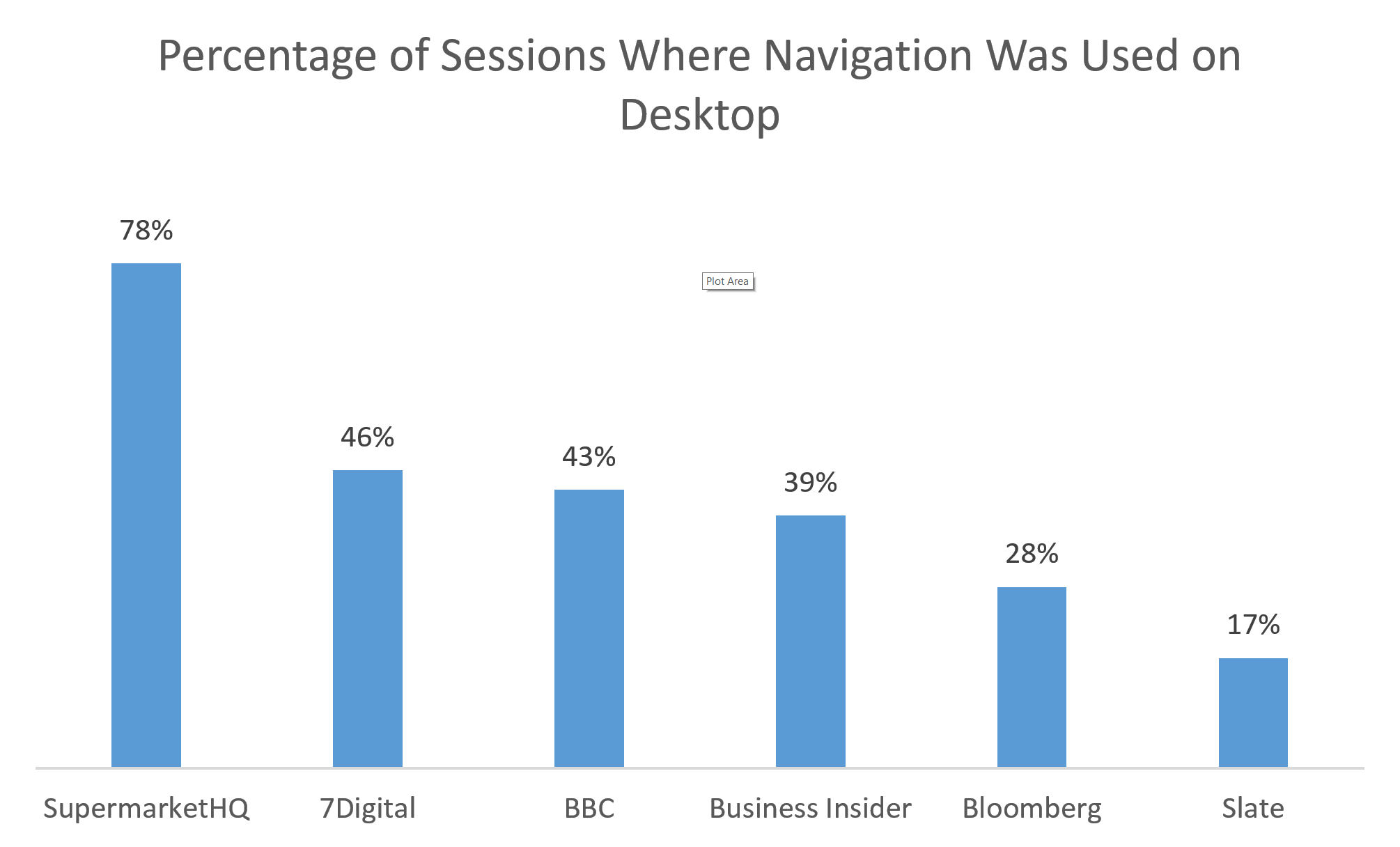
As you can see, whereas the navigation usage was fairly similar for 7Digital, BBC, and Business Insider UK (the differences between these sites were not statistically significant), we did find that the other sites were different from this average group: navigation was used least on Slate and Bloomberg and most on Supermarket HQ. (The differences between these sites and the others were statistically significant, except for that between Bloomberg and Business Insider, which did not reach statistical significance.)
Let’s take a look at the navigation on each of these sites to better understand what was going on.
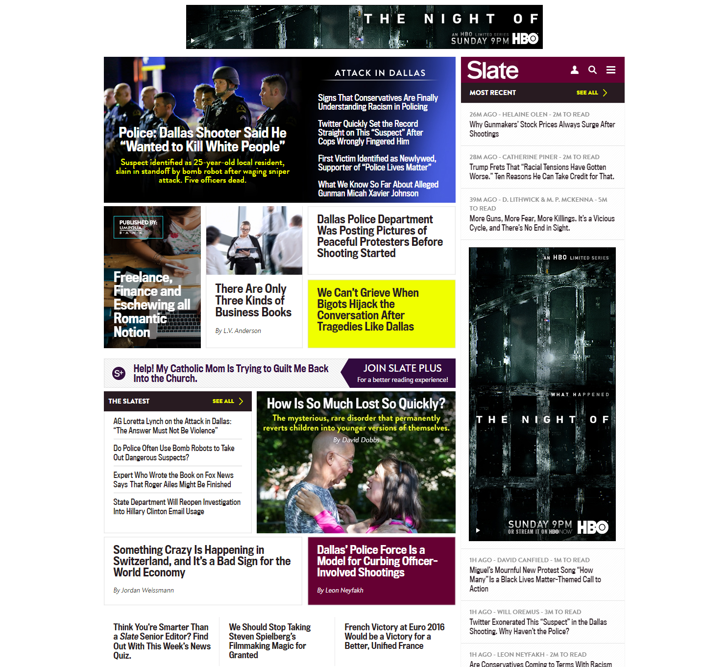
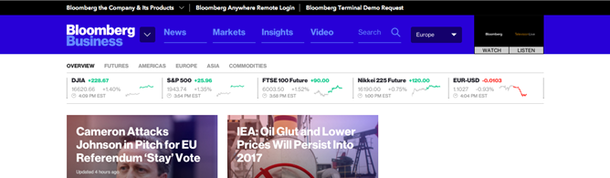
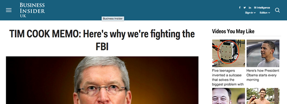
The lowest performers hid at least some of the navigation under a menu: on Slate, it was completely hidden under a hamburger menu, whereas Bloomberg did have some visible navigation, albeit shown in low-contract colors that probably reduced legibility and visual salience.
Not only did Slate place the global navigation under a menu, but it also positioned this menu in the top right corner. Only 17% of people used it, as opposed to the 42% total average of desktop navigation used. And, it took an average of 33 seconds to find, compared to the desktop average of 25 seconds. Ironically, of all the sites in our study, users probably needed the menu most on this site. The mixed typefaces and crowded text made scanning the pages difficult. After some scrolling and reading, one user cursed then called the homepage “a real cluster”. Another user, who had also been scrolling and reading said, “I can’t find an article about the arts… Really weird typefaces. Slightly confusing and different all over.” After more scrolling she basically gave up on the task and said, “I can’t find an article on the arts. I am really not liking this. There is just too much. I don’t know where to start.” If the menu had been very simple and visible, this person probably would have used it.
There were several potential explanations for the poor navigation usage on this site:
- The nonstandard position for desktop navigation (top right corner) was unexpected and nonconventional on the desktop.
- The navigation was placed at the top of a right rail. Traditionally, the right rail houses items such as related links or ads; people have learned to ignore this design element, especially if it resembles an ad (we’ve all heard of banner blindness).
- The maroon color was also employed as background for two other stories and thus it misled people into assuming that the Slate banner that housed the navigation menu was in fact such a story, too. As a result, people did not direct attention to it.
- The global-navigation menu was grouped with the utility-navigation items. The first item people see in a set of grouped items can make them assume that all of the rest of the items are similar. Users who first noticed the person icon on the right may have assumed that the icons in this area were all related to logging in and may have stopped inspecting the area carefully.
The bottom line: the global-navigation menu on the Slate homepage had a tiny footprint, low visual salience, and poor page placement. So people rarely used it.
The fact that Bloomberg performed so poorly (28% navigation usage vs. 42% overall navigation usage on the desktop) is more surprising: after all, Bloomberg did have a combination of hidden and visible navigation. The hidden navigation laid inside the arrow menu next to the logo, and the visible navigation was presented at the top of the screen, in the blue horizontal bar. We believe that there are several explanations for this result:
- The homepage had section headers for various topics. Users who scrolled often found these topic headings and clicked these before they even looked for a menu.
- The arrow menu next to the logo was too small and hard to notice.
- The visible navigation options had low contrast with the blue background color and did not stand out sufficiently. (In fact, the white logo was the element most likely to stand out in the blue banner).
- The navigation options had vague, general navigation terms (e.g., Markets, Insights, Video) that did not indicate specific news categories.
Slate used inconspicuous, low-salience navigation that was easy to ignore, and as a result, our study participants did not use it. Bloomberg suffered some of the same traits, but the biggest reason people didn’t use the navigation probably had more to do with the topic links on the homepage, which people did see and use. One user, looking for an article about technology, scrolled the page and said, “I am looking left, and right, and to the middle and trying to find something on technology that I really like.” She scanned the page further and found the technology section and clicked it. After she chose and article she commented, “It wasn’t so easy to find. You have to make an extra effort to find it.”
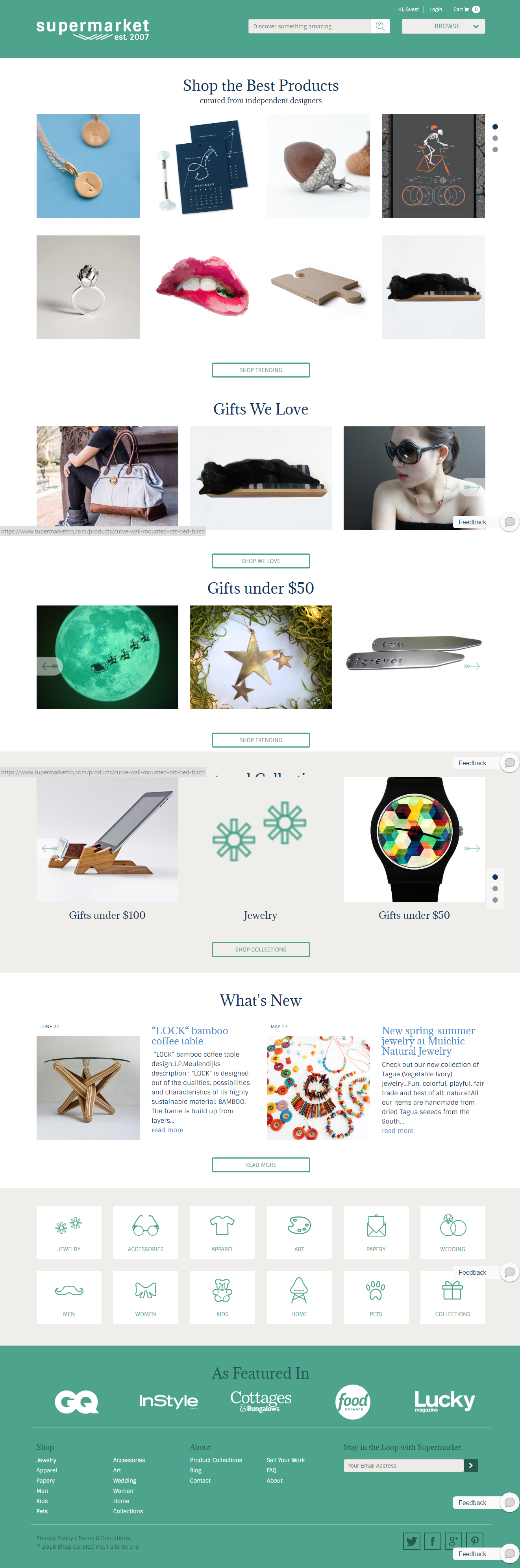
Surprisingly, our top performer, SupermarketHQ, had some design commonalities with our bottom performer, Slate: they both placed the navigation in the top right corner under a menu. However, there were some important differences:
- SupermarketHQ also listed visible navigation options at the bottom of the page.
- The hidden-navigation menu in the top right corner had a larger screen footprint than its counterpart on Slate.
- The navigation menu on SupermarketHQ was bigger and had good contrast with the green background.
- The hidden-navigation menu on SupermarketHQ had a clear label: Browse.
- The rectangular shape of the menu (and the arrow next to it) helped the element look like a standard button and signaled clickability.
Overall, we believe that navigation usage on SupermarketHQ was at least partially due to the salience of the global-navigation menu. That being said, it’s also possible that there are other explanations unrelated to the design of the navigation:
- SupermarketHQ was an ecommerce site. People are used to browsing and engaging in undirected behaviors on news sites and more likely to have a defined goal on an ecommerce site. That can lead to increased navigation (or search) usage. However, if that were the only explanation, we’d expect an even higher navigation usage for the other ecommerce site in our study (7Digital), which had visible navigation. But in fact, the navigation was used more on SupermarketHQ (this difference was highly significant).
- SupermarketHQ had poor content on the homepage. In fact, the items featured on the homepage did not have any text descriptions (these appeared only on hover) and the vague information may have prompted participants to use the navigation. However, in spite of this poor content on the homepage, users were highly effective in completing the tasks on this site — the success rate was 95% — and did not take more time to complete the tasks or rate the tasks as more difficult.
In general, we would recommend neither poor content nor putting the main navigation at the bottom of the page. In this case, the combination of 2 bad design choices turned out to save the site. A further saving grace was that the homepage photos were of high quality and intriguing, thus pulling people down the page even though the photos weren’t sufficiently communicative to facilitate navigation.
As for the visible list of navigation icons at the bottom of the page, these were less visible than the expandable menu at the top. People don’t usually expect navigation to be presented like this. And the text in the icons was small and not highly legible. However, these icons offered another shot at navigating the site if they users had scrolled too far down the page.
Most sites don’t want to dedicate such a significant amount of screen space on the page to navigation icons, and we agree that doing this is usually a misallocation of screen real estate. It’s better to make the main navigation visible and place it at the top of the page. However, to assist people who did not see the navigation at the top of the page and who scrolled down, we suggest repeating the navigation links in a fat footer over SupermarketHQ’s large, in-page icons. (Repeating navigation at the bottom of the page like SupermarketHQ did is pattern fairly common on mobile, where pages are long and people cannot easily scroll back to the top of the page. SupermarketHQ is in fact a responsive site, so it’s not surprising that it ported that pattern to the desktop.)
The other two sites where people used navigation significantly more than on Slate and Bloomberg (but less than on SupermarketHQ) were BBC and 7Digital: in both these cases, the navigation usage was over 43%. Both these designs had visible navigation placed in fairly standard position: at the top of the screen and on the left-hand side. It took people 18 seconds to use the navigation on BBC and 27 seconds on 7Digital (these numbers were not, however, statistically different from the other times to use the navigation on other sites).
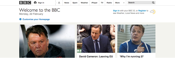
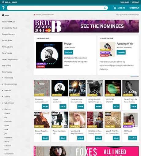
In addition to the visibility of the navigation, other traits that made the navigation easy to discover on BBC and 7Digital include:
- The navigation appeared in a standard, expected area: either on at the top of the page or on the left-hand side. These designs are fairly common on the desktop and people have learned to use them proficiently.
- There was visual separation between the content area and the navigation —though a subtle horizontal grey line on BBC and through a different background color (gray vs. white) on 7Digital.
- On BBC, the lines between navigation options signal buttons and clickability.
- Also on BBC, having the search box on the same level with the navigation options may have slightly directed the eye towards these. Note that on the poorest performers —Slate and Bloomberg— navigation was also placed close to the search field. However, in both those cases the search field itself was not salient enough and did not attract the eye: Bloomberg used a low contrast text box with a placeholder that blended in with the rest of the elements in the blue banner, while Slate had a search icon instead of a textbox. As a result, these sites did not get any benefit from placing search in the proximity of navigation.
Guidelines for Desktop Navigation Icons (Hidden Navigation)
This article gave several examples and discussed the delicate minutia that can impact navigation usability for better or worse. Below we summarize some of the main guidelines for helping users discover and find navigation on desktop devices.
- Use visible, exposed links for navigation instead of collapsing it under a hamburger, or any icon. Visible links are easier to discover, find, scan, and click.
- Position the links across the top or down the left side of pages.
- Make the navigation visually salient: use a background color that is different from the page background, good contrast between the text and the background in the navigation area. Potentially add rectangles around navigation options or other signifiers for clickability.
- Use clear, information-scent-heavy labels for the navigation options.
- If you choose to collapse the navigation under an icon, consider yourself warned: this will usually hurt your conversion rates because users will be less likely to navigate the site. To minimize damage, follow these guidelines:
- Don’t place navigation-menu icons in unexpected places, like within a right rail.
- Don’t group navigation icons with other unrelated design elements, such as the site logo or the utility navigation. On the big desktop screen, they could easily be considered one single unit.
- Place navigation at the top of pages, and if possible, near an exposed search field.
- Label the navigation menu with a word such as Menu or Browse.
- Signal expandability by adding a small down arrow next to the menu icon or button (for added assurance).
- Signal clickability by making the menu icon stand out as a button (e.g., by using shadow, bevels, a rectangular shape, an outline, or a different color. If you adhere to a flat aesthetic, adhere to our guidelines for clickability in a flat world.)
Remember that previously-learned user behaviors, the total page layout, and even what seem to be minor visual elements can play a large role in making navigation discoverable. Our study teaches us that details matter: sites employing partially visible navigation can suffer from poor navigation discoverability (like Bloomberg) or from great navigation discoverability (like SupermarketHQ). Usability guidelines are always circumstantial: they depend on the context in which they are applied. When in doubt, you’ll get the best answer by running a usability test tailored to your design and to your users.
Other Articles Related to the Study This Article was Based on
How to Make Navigation (Even Hamburger) Discoverable on Mobile
Hamburger Menus and Hidden Navigation Hurt UX Metrics
Hidden- and Visible-Navigation Study: Methodology
Mobile First Is NOT Mobile Only
Learn more in our full-day Navigation Design course.