
The floppy disk icon has long outlasted the hardware it represents. Many users today have never held a floppy disk, let alone saved a file to one, yet the icon continues to appear in some software as a way to represent saving, especially enterprise systems.
Its persistence despite its antiquity raises the question: Do people still understand the floppy disk represents “save”? Most do, even without firsthand experience of floppy disks. But saving today often involves cloud-syncing, auto-saving, or exporting rather than local storage. The floppy disk icon, while still understandable, may not always be the most appropriate symbol for many nuanced saving contexts.
Then: The Floppy Disk Icon Was a Clear Metaphor
When the floppy disk icon first appeared in digital interfaces, it was a resemblance icon — a direct visual representation of the object it referred to. This was a typical strategy for icons introduced in the first graphical user interfaces. Trash cans, file folders, calculators, printers, and floppy disks all mirrored physical items people already knew, and thus made the then-unfamiliar action of clicking icons to launch actions or programs more understandable.
In that era, saving was a distinct, deliberate act. The user made changes, then clicked the representative save icon to write those changes to a storage medium, which was often a physical disk. The icon didn’t just represent saving — it was saving, both visually and functionally. The metaphor was intuitive, immediate, and effective. And as graphical user interfaces continued to evolve and become more standardized, the floppy disk became a ubiquitous pattern for saving.
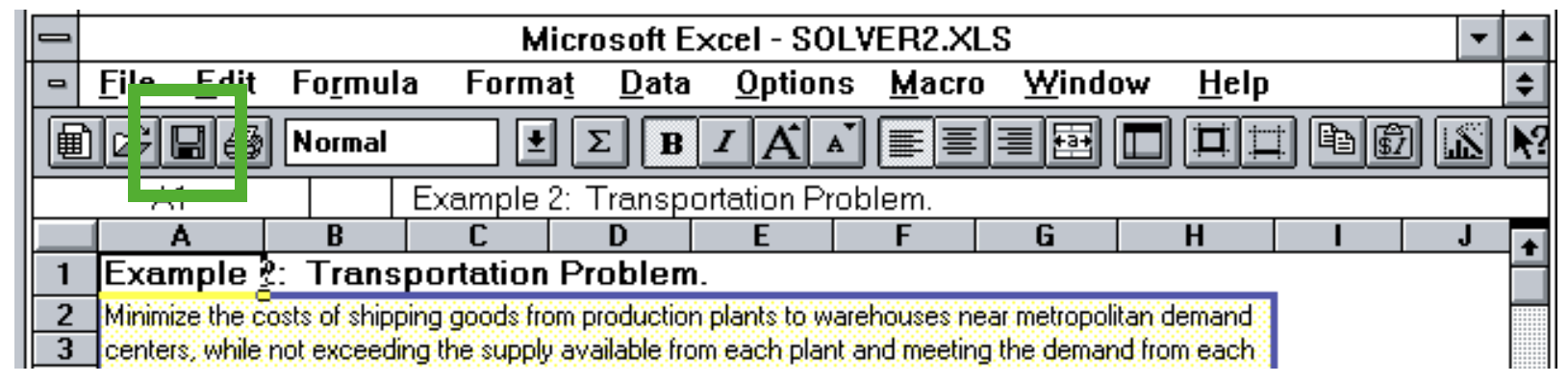
As technology evolved and floppy disks became obsolete, the icon remained, but it evolved from a resemblance icon to a reference icon: It no longer depicted a physical tool users actually used, but still symbolized the concept it once represented. The floppy disk icon continued to be effective because people had learned the pattern, and because it was used consistently over time and various interfaces.
Even if you yourself have never encountered an actual floppy disk, you can likely still recognize and understand the pattern. The use of the floppy disk icon is much like how modern smartphone interfaces still use the image of a classic telephone handset to represent a call.
Applications continue to use references to now-less-common physical objects for common functions, such as:
- Paper folders for grouping and storing digital files
- Desktop calculators with button layouts that mirror physical calculators
- Paper envelopes (or paper planes) for sending a message
Now: The Floppy Disk Persists
Despite the disappearance of physical floppy disks, the icon persists — especially in enterprise and domain-specific software where stability, predictability, and adherence to established workflows often outweigh the push for visual creativity. In these environments, interface changes can be slow, and rightly so: small visual changes can introduce risk, disrupt habits, or require costly retraining.
For many complex applications, the floppy disk icon remains because it works. Users in these contexts have learned to associate that icon with the save function, and removing or replacing it could cause more friction than benefit.
In fact, usability may suffer if the icon is removed: experienced users often rely on quick, visual scanning to locate familiar controls — especially in dense interfaces where efficiency matters. Complex applications supporting data modeling and analysis, like the examples below, often fall into this category.
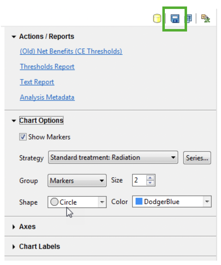
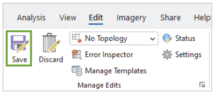
In these environments, the icon is less about visual metaphor and more about interface fluency — something familiar, fast, and stable in a complex system. While it may seem antiquated to some, the floppy disk icon still meets user expectations in many professional tools where consistency and productivity come first, and where users have come to expect that pattern. It serves as a stable beacon, just like the printer icon, telephone handset icon, and envelope icon most users still immediately recognize on modern interfaces. If it isn’t broken, and it’s serving users well, why change it?
Research Shows the Floppy Disk Still Means “Save” to Most Users
In a recent quantitative study I conducted for the book Digital Icons That Work, I showed the floppy disk icon below to participants and asked them to describe what it would do or represent in a digital interface. 83% of participants associated the floppy disk icon with saving.
Participants were asked to describe the action associated with the icon, not the physical object depicted. Still, another 13% described this object literally with responses such as “disk,” “disc,” or “this is an SD card for storing information.” These responses were not coded as “save,” but still suggest familiarity with the image.

In total, 96% of participants either recognized this object as a floppy disk or interpreted it as saving.
This study included a wide age range of English-speaking, U.S.-based participants. The majority of participants were between the ages of 30 to 50, with a median age of 41 years. While the findings suggest strong recognition across age groups, results may differ in other cultural or linguistic contexts.

This consistent recognition across ages highlights a broader truth in interface design: once a visual pattern is learned, it can persist long after its literal meaning fades. The floppy disk icon has become a kind of visual shorthand — understood not because users are intimately familiar with the physical floppy disk object, but because they've seen the icon used in consistent ways over time.
That said, recognition depends heavily on prior exposure. The floppy disk icon relies on interface familiarity, not object familiarity. For users who have seen it used repeatedly — especially in traditional software — it’s become a learned symbol. But for very young users or anyone new to digital interfaces and technology in general, the meaning may not be obvious. Unlike metaphor-based icons grounded in everyday objects, the floppy disk no longer reflects anything in their lived experience.
Is the Floppy Disk Icon Still the Best Choice for “Save”?
Although users recognize the floppy disk icon as meaning “save,” the concept it represents has evolved significantly. In early computing, saving was manual, discrete, and local. Today, it’s often automatic, continuous, and cloud-based.
Depending on the context, “save” might now mean:
- Sync changes to the cloud
- Export a copy to local storage
- Create a new version or snapshot
- Download a file from a web app
- Trigger auto-save functionality
In other words, “save” is no longer a single, uniform action. It may not even be necessary. The floppy disk icon’s visual metaphor — or storing something on a specific, removable medium, in general — can feel out of step with the actual behavior.
This widening gap between what the icon suggests — a one-time, manual action to save the current state of work — and how saving actually works can lead to confusion, especially in modern, cloud-based workflows where “save” may not be necessary or may behave differently than expected. While the icon doesn’t necessarily confuse users, it doesn’t always clarify either.
Unlike a few decades ago, “save” is no longer a one-size-fits-all concept. As the concept of saving has grown more nuanced, it’s worth matching your icon choices to the specific type of saving behavior your interface supports.
The table below outlines common save-related actions and the icons that best represent them.
|
Icon Tested |
Primary Associated Action |
Guidelines |
|---|---|---|
|
Floppy disk |
Save: 83% of participants |
Use to indicate: Save Widely understood as a means to indicate saving current work. |
|
Circular Arrows |
Sync, Refresh: 73% of participants |
Use to indicate: Sync, refresh Widely understood as refreshing the current state of something or syncing environments (e.g., current work and cloud-based versions). |
|
Arrow down to container |
Download or Save: 78% of participants |
Use to indicate: Download Widely understood to indicate downloading or saving files or content. |


Whenever possible, pair any of these icons with clear text labels. Used together, an icon and label reinforce one another and improve discoverability, helping users quickly grasp both what the action is and how it will behave.
Design Recommendations: Save Icon Best Practices
The floppy disk icon is still widely associated with saving, but that doesn’t mean it’s always the best option. As the meaning of “save” continues to diversify, designers should consider whether the metaphor matches the task.
Here are some guidelines for implementing save icons effectively.
- Pair the icon with a label. A simple text label like Save, Download, or Sync can clarify the intended action.
- Avoid using the floppy disk for non-traditional save actions. If the action involves syncing, exporting, or downloading, consider a more specific representative icon.
- Provide an explicit “Save” function even when auto-saving is enabled. To support user control and peace of mind, include a visible save action in workflow-oriented tools, even if saving also happens in the background.
- Maintain visual consistency throughout the interface. Don’t mix visual metaphors unnecessarily.
- Test with users. As with any icon, even well-known ones, test icons in context to see whether users understand both the symbol and the action it represents.
- Consider how legacy users visually identify actions, In long-standing interfaces, some users may rely on the icon’s shape more than its label — so replacing it with text alone could impair usability.
Familiarity may be high, but that doesn’t guarantee appropriateness. The best icon is not just one that people recognize — it’s one that accurately reflects what’s going to happen.
Most people understand that the floppy disk icon represents save, especially in power-user environments like enterprise software or productivity tools. In these contexts, it's still useful and appropriate. But in more modern, cloud-based interfaces, it may be unnecessary — or even send the wrong signal.
Relying on an outdated icon can also affect perception. While it won’t confuse users, it may make your interface feel dated or out of touch. That said, modernization for its own sake isn’t the answer either — avoid reinventing icons without clear benefit. Stick with metaphors that are familiar, effective, and matched to user expectations.
Conclusion: Recognized ≠ Relevant
Most users recognize the floppy disk icon as “save,” even if they’ve never seen or used an actual floppy disk. And in the right context, the icon still works effectively.
But recognition isn’t the same as clarity. A well-known icon can still introduce ambiguity if the action it triggers no longer matches what users expect. Syncing, auto-saving, exporting, and downloading are all more nuanced behaviors that don’t quite match what the icon originally stood for.
The takeaway? The floppy disk icon isn’t broken, but it may not always be the best fit, and it isn’t future-proof, either. Use it when it adds value, clarify when needed, and always make sure your interface reflects what users actually need to do, not just what they’ve learned to click