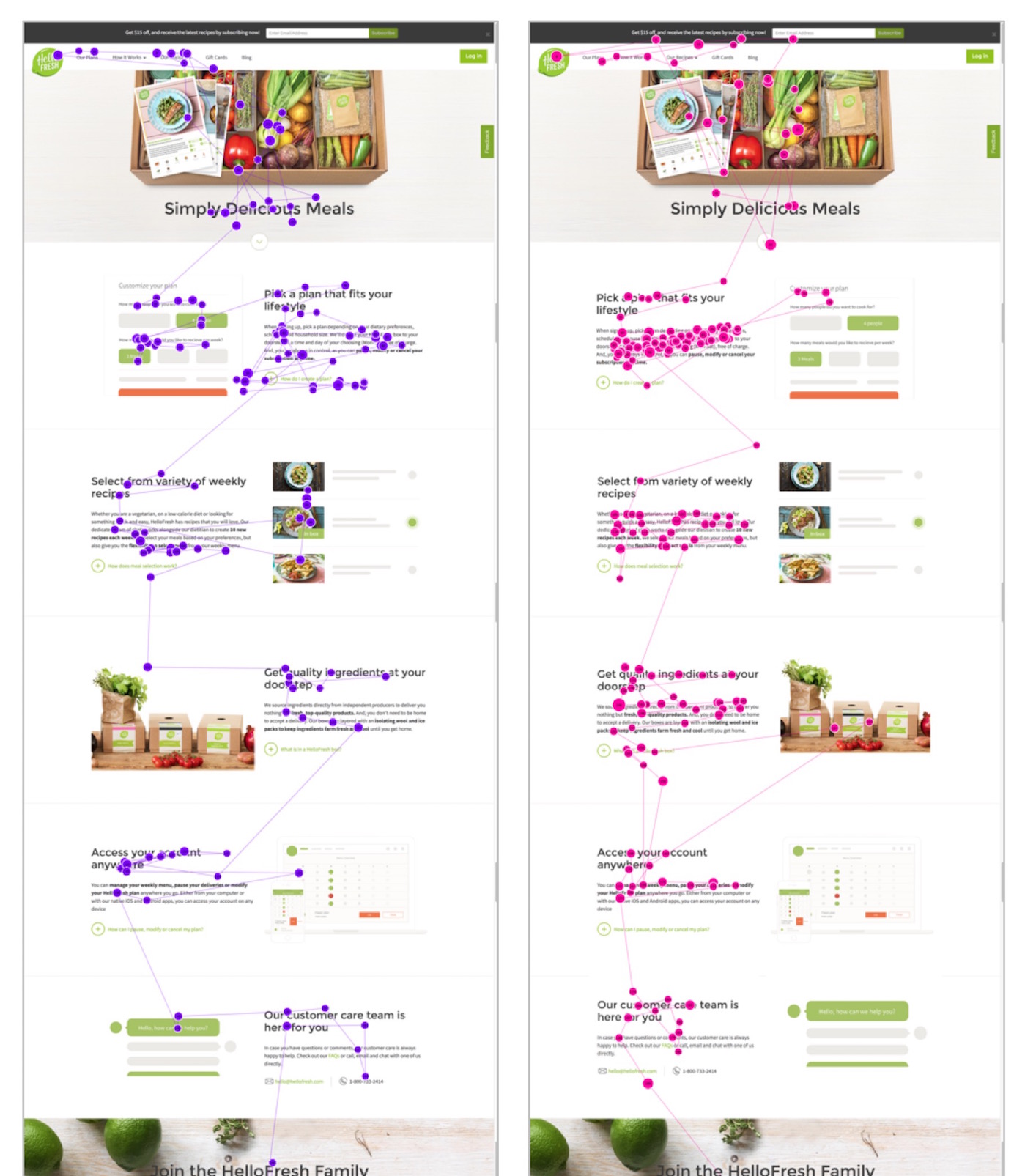
The study was conducted using stimulus interfaces created from live websites that used the zigzag pattern. For each page, we created a variation that displayed the content in an aligned layout, with all text and images maintaining position on the right or left in each row.
An additiona gaze plot comparison not shown in the larger article shows stumbling and redirect behavior that was observed on Hellofresh.com. The first gaze plot below shows a user viewing the information in the alternating layout. She fixates mostly on text and the first two images. By the third image she is getting a sense that the images don’t contain much information. But because the page is alternating how images are displayed, she still scrolls into these unhelpful images before looking away. We deem these as wasted fixations.
However, when the same information was presented on the page so images were aligned, it was easier for users to skip the images. The next images shows how a different user viewed a mockup of the same information with an aligned layout. He looked mostly at the text, and he looked at the first image four times. He could then ignore the rest of the images, looking only at the third image two times, probably as a sanity check that all of the images on the page were just decorative.