
Discoveries can be messy because there are many unknowns, which often necessitate the use of exploratory research methods, such as field studies, interviews, and diary studies. During discovery, many new things are learned about the problem space at a fast pace. It can be challenging to manage the amount of new information and make it actionable. Here enters mapping.
Why Mapping is Useful in Discovery
Humans have been mapping things for thousands of years. In addition to supporting wayfinding, maps have been used to orient people in their surroundings, manage complexity, and create a shared understanding of a terrain, whether physical or conceptual.
In discovery, maps provide many benefits. These include:
- Managing complexity: Large problems become easier to tackle when they’re broken down into small chunks. Mapping also highlights key actors, causal links, and root causes of large complex problems.
- Making insights more memorable: People remember and retain information better when it’s presented in a visual format (rather than in a text-based format) due to the picture-superiority effect, a well-established psychological phenomenon.
- Creating alignment: Mapping can easily be done with others. When people come together to map out what they’ve learned about the problem domain or user experience, the artifact becomes a shared representation in everybody’s minds.
- Exposing gaps and unknowns: Mapping forces creators to ask questions such as: What happens after this? What’s the process here? How does this event affect users or our business? These questions can expose important unknowns that a team needs to learn before it can move forward with making key decisions.
Of course, there are many, many maps that designers can use in discovery! This article focuses on 3 commonly used types of maps, but feel free to choose another mapping method that suits the problem you’re exploring. See our mapping-methods study guide for plenty of mapping methods to choose from.
Top 3 Mapping Methods in Discovery
The following maps can clarify the problem space:
This article focuses on maps for visualizing insights, rather than analyzing user-research data (such as affinity mapping.)
Ecosystem Maps
An ecosystem map is a visual representation of the people, organizations, products, and services that a user may interact with during a particular experience.
Ecosystem maps usually have a hub-and-spoke design — where people and things are connected to a central user (the hub) through lines of different lengths — or a ripple-like design, made up of concentric circles. Either format can be used, and both demonstrate the metaphorical distance between a person or thing and the user. People who have more influence or interact with the user for longer periods of time are closer to the nucleus, while people who interact with the user only indirectly or briefly lie further away in the structure. Ecosystem maps are not linear or chronological, although you can use the clockwise format to add a time element if you want.

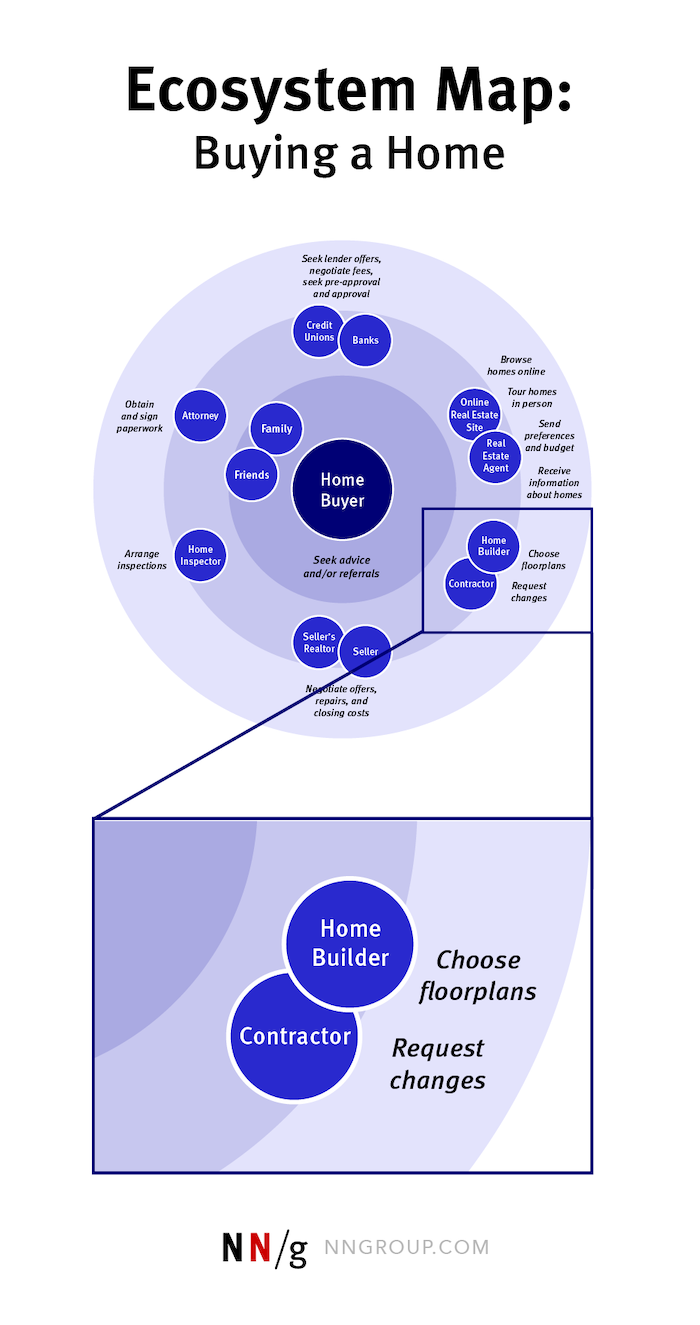
Ecosystem maps are useful at the beginning of a discovery, when there are many unknowns. For example, maybe you’re working with a new client or on a new project and you know nothing about the domain. This map can be constructed with stakeholders and subject-matter experts within a discovery kick-off workshop. It can highlight major actors that need to be researched and reveal how complex the problem space is.
To create an ecosystem map, there are 3 simple steps.
- What is the problem space you want to map? This will be the title and scope of your map. In the example above, the problem space is the home-buying experience.
- Who is the user? Place the user at the center of the diagram. In the example above, the user is the homebuyer.
- Who are the people or things the user could interact with in the problem space? Plot out all the entities (people, groups, organizations, etc.) that the user may interact with. Discuss the importance of each of these actors to determine where they should be placed in the map with respect to the user. Discuss the interactions they have with the user and write these next to each actor in the map.
Chronological Maps
Chronological maps visualize the experience of a user over time. They tell a story and capture areas where improvements can or should be made or where opportunities for new features, products or services lie.

There are 3 types of chronological map:
- Experience maps
- Service blueprints
- User-journey maps
An experience map is a visualization of the experience a person has while accomplishing a particular goal. It captures the broader human experience and is not tied to a specific product or service.
A service blueprint is a visualization of the experience a general user has while accomplishing a goal, alongside specific service components that directly tie to touchpoints in that user’s journey.
A user-journey map (or customer-journey map) is a visualization of the process a specific user of a product or service goes through to accomplish a goal.
While these maps may sound similar, they each take a slightly different view of the problem space. The table below highlights when each map is useful in discovery.
| Type of Map | When to Use in Discovery |
|---|---|
| Experience map |
|
| Service blueprint |
|
| User-journey map |
|
All 3 maps can be used in discovery, but using them all could be overkill. If you want to capture the end-to-end experience of a user, start with one map that ties most closely to your discovery goals.
Here are 3 steps to construct a chronological map:
- Choose a map that aligns most closely with your discovery goals: If you’re looking for opportunities to develop new products or features or offer a competitive product, an experience map might be the best mapping method. If want to learn how to improve your existing service for users and reduce inefficiencies, a service blueprint would be a better mapping method.
- Agree on your phases: These should come from research and tie to high-level themes. What are the typical stages the user goes through during the experience? Use these to divide up your map into phases. (Research, Try, Purchase, Own are examples of phases.)
- Plot insights from discovery research on your map: What are people thinking, feeling, doing at each stage? If you’re not sure, you may need to do more research.
Process Maps
As the name suggests process maps (or process mapping) is used to understand how a given process works. They can be applied to both user processes (e.g., how users go through a return process) or business processes (e.g., how the organization handles a return).
Often, chronological maps don’t go into a lot of detail about specific processes; in contrast, process maps offer a zoomed-in view of a specific area of the problem space. Maybe you’ve isolated the most crucial part of a user journey or business process and want to identify how it works currently to see if improvements could be made.
There are many formats that process mapping can take: flowcharts, operational-sequence diagrams, or HTA diagrams. Use whichever format you feel comfortable with. Process maps can be as granular as you need them to be.

Because process maps are more granular, they usually are created later in discovery, when a specific area of a service or journey has been isolated for investigation.
Mapping with Others in Discovery
Mapping done collectively can teach team members about users. It’s also a way for team members to actively engage with insights from research. Where possible, create buy-in for your discovery efforts by bringing in stakeholders who may be interested in your work.
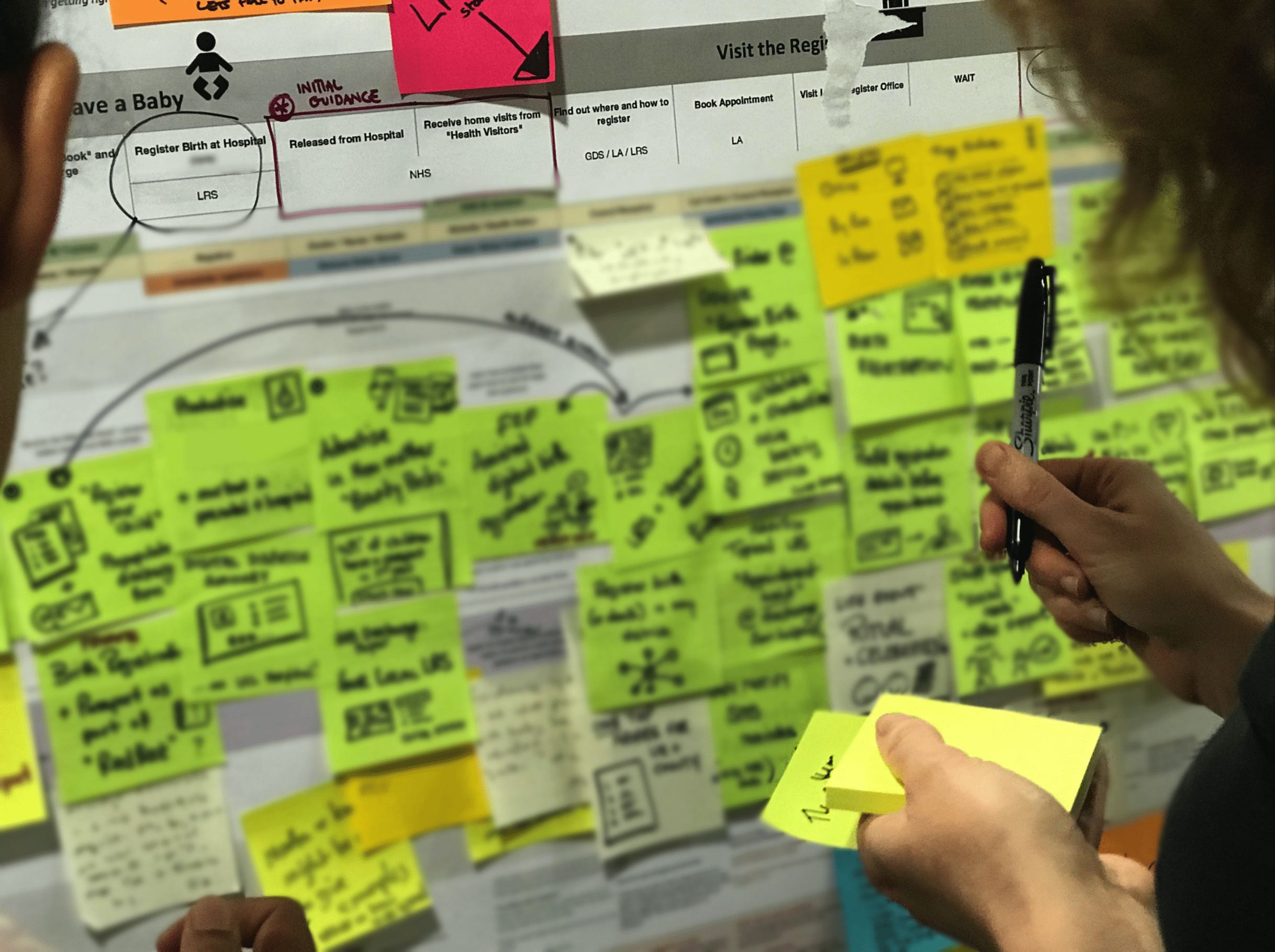
Mapping doesn’t have to be done in one sitting. In fact, mapping should be an ongoing process during discovery. Start a map, even if you don’t have much information. Keep it low-fidelity — such as a flipchart paper and stickies on a wall — to set expectations and communicate to others that it’s supposed to change as you learn new things.
Schedule team sessions to update a map. Mapping sessions can follow research debriefs. Make sure to share artifacts such as notes from user research sessions, so team members can actively contribute to the map. As a facilitator, you can oversee that anything added to the map reflects the research.
A collaborative tool (such as Miro or Mural) that everyone has access to can ensure that remote team members can take part in mapping. These tools are also relatively easy to update and use if everyone has had some basic training on how to use them.
If your organization works in person, hanging the map on a wall in a public space can garner interest in your work and ensure insight is easily accessible.
At the end of discovery, digitize or finalize your map. Anecdotally, I’ve found that maps become so useful that they end up being adopted by many internal users as documents for onboarding, training, and reference.
Summary
Mapping creates a shared understanding of the problem space. Use an ecosystem map if you want to understand the major actors and players in the problem space. Use a chronological map if you want to understand the experience of a user over time. Use a process map to break down complex processes. All 3 mapping methods can be used together in your discoveries.
For more information on mapping methods see our Mapping study guide. For more information on discovery, take our Discovery course.
References
Clive Thompson. 2017. From Ptolemy to GPS, the Brief History of Maps. Retrieved October 18, 2021 from: https://www.smithsonianmag.com/innovation/brief-history-maps-180963685/


