The computer watch (or smartwatch) will be the next important platform, extending the range of screen sizes to design for down one notch: desktop, tablet, phone, and now the watch. Or, really, we should say "soon" the watch, because current smartwatches are not there yet.
The 2 takeaways from this article are:
- Consumer advice: don't buy the Samsung Gear. Not useful enough and poor usability. Wait for the next generation before getting a watch computer.
- Business advice: do buy one, to support planning what services (if any) you should offer for the watch platform(s) in a year or so, when better devices become available.
Recently I bought a new watch to accompany my new Android smartphone: the Samsung Galaxy Gear smartwatch. The Samsung Gear is a fine addition to a James Bond-like arsenal of tech gadgets and comes in handy if you are eager to strike up conversations with strangers in airports or elsewhere.
Maybe it’s no coincidence that the Samsung watch has been first released as a companion to the Samsung Galaxy Note phablet. This phone is a large, 6-inch phone that, as the AT&T salesman pointed out, can be quite inconvenient to take out of the pocket or purse. For quick tasks such as checking text messages, answering a phone call, and taking a picture, users may spare themselves a workout and use the smartwatch instead. (A camera and a microphone are embedded in the watch wristband.)
In theory, the smartwatch could be a nice complement to a smartphone (as my colleague Bruce ‘Tog’ Tognazzini points out in his article on the iWatch). Does the Samsung watch live up to the hype?
Functionality
Samsung provides a small number of apps that come with the watch, and a few other 3rd-party apps are offered for download. Needless to say, it’s the range of apps available that will determine the utility of the watch.
Here are some of the apps that come preinstalled with the Gear:
- Notifications, which you can configure for events such as getting new emails or text messages
- S-Voice, a voice recognition app that lets you send a text message, call someone, check your schedule, find the weather, and a few other things, but, notably, does not let you search the web
- dialer and contacts apps, that allow users to call from their watch
- Gallery, a photo gallery of pictures taken with the watch camera
- Media Controller, a music player
- Pedometer
- Timer and stopwatch apps
- a calendar app that displays the schedule for the day
- a voice-memo app for recording voice memos
- a weather app for getting the weather in your favorite city
Besides these apps, you can install a few more using the companion phone. The most notable are:
- eBay, an app that display notifications for various eBay events (e.g., auction ending soon, being outbid on an item)
- Evernote, a simplified version of Evernote that lets users store pictures or voice memos to their Evernote account
- FBQuickview, a very minimalistic Facebook app
- Glympse, a location-sharing app
- My Fitness Pal, an app that helps you keep track of your caloric intake
- Pocket, which gives you access to the stories that you saved
- Vivino, an app that scans wine labels and provides additional information about the wine
- Zite, a news reader
The various apps for the smartwatch are installed and managed through an application called Gear Manager, which runs on the companion smartphone. The Gear Manager lets users install Gear apps, decide what apps get prioritized on the Gear screen and which apps can send notifications to the smartwatch. Samsung took the right decision in forcing users to do customization on the phone: the watch screen is too small to support even the fairly simple information architecture that characterizes most phone apps.

When the phone and the watch are in close proximity, the phone is automatically unlocked. When the phone can't detect the watch, the user needs to enter her password to unlock the phone. Entering passwords on mobile is notoriously difficult for many reasons, and this feature, while very useful, is just a small first step toward making authentication easy on mobile devices. Let’s hope that other apps will use the watch as an easy way to log in—maybe by taking advantage of passwords stored in the watch, as Tog suggests in his article.
Another useful functionality is Find my phone (provided that you are within the Bluetooth range); a symmetrical Find my Gear makes the watch beep if you have the phone but not the watch. (The entire idea of a watch-sized computer is that you strap it to your body to have the device available at all times, so hopefully you won't mislay it too often.)
Receiving a text message or an email triggers a notification on the watch. Text messages are fully displayed on the Gear screen (anecdotally, this feature seems to make the watch popular among teenagers who need an unconspicuous way to keep up to date with incoming text messages in class — although replying to these messages remains problematic if you must be silent). But emails are not shown, at least not if you use the Gmail app: your smartwatch screen may indicate just that you got a new mail in Gmail, but it will not display the subject or the sender of that email. However, if you picked up your phone immediately after that notification was received, you’d be immediately taken to the email app.

If you choose to use the Email app instead of Gmail, you can, however, see the sender, subject, and the first few lines of the message on the watch, and you can even erase it. Again, you can have that message opened on your phone right away, without having to navigate to the phone Email app.
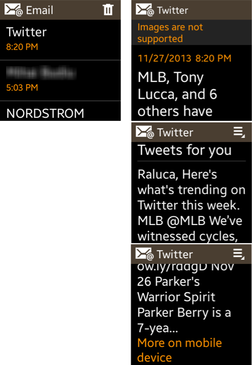
Clearly, the usability of watch-based email requires the watch to display enough information about a new message to allow the user to determine whether it's worth the trouble to pull out the phone to read the message. Just saying the equivalent of "you've got mail" isn't enough. In general, any application that requires the user to transition between devices should provide enough information scent on the first device to allow users to determine whether to go to the second device now or later.
Other apps such as eBay, Facebook, and Glympse can also send notifications to the watch. The content available in these notifications varies in complexity; for instance, the Glympse notification gives access to a full map, but the map is static: users cannot zoom in or move around it.

Gestures: A Part of the Interface
With the advent of the touchscreen smartphones such as the iPhone, we thought that we could forget almost everything we knew about feature-phone design and focus on larger-screen devices. Guess what? The small smartwatch screen takes us back in time to the feature-phone era. Its 1.2-inch screen is tiny compared with modern smartphones, but pretty standard for basic feature phones of yesteryear. (And it is quite huge for a watch, making it less appealing to those with small hands.)
These are 2 big differences, however: unlike feature phones, the smartwatch has a touchscreen, but no keyboard. (Well, that’s not entirely true — the phone app does have a soft numerical keypad that allows dialing a new number.) Inputting information into the watch is done either by voice or by using the camera. That seriously restricts the types of possible apps and their complexity.
Because the screen is so small, there is little room for displaying content, and even less room for interface widgets. Smartwatches, with their tiny screen space, are the natural application for gestural interfaces: by getting rid of the interface controls and replacing them with gestures, designers can take full advantage if the limited screen real estate. However, as described in this article (at jnd.org), gestures suffer from many problems, discoverability and memorability being the most serious ones.
The swipe is the primary way of navigating through Gear apps:
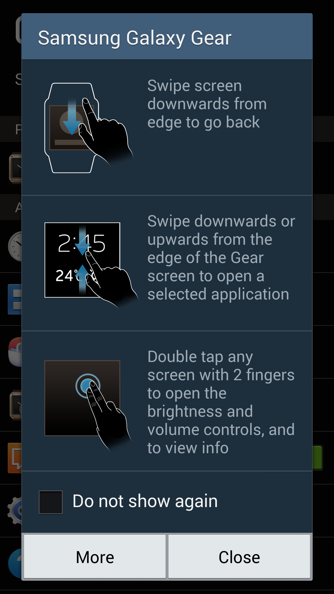
- Swiping left or right on the vertical edges moves back and forth in the app space (we count these 2 options as one gesture, because the left–right mapping to a linear progression is a direct mapping where left and right swipes are each others' natural opposite).
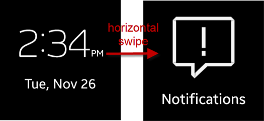
- Swiping up takes the user back to the previous screen.
- In many apps, horizontal swiping is the way to move from one page to the next. The gestures take a while to discover, because the watch touchscreen is not particularly sensitive (perhaps rightly so, to avoid accidental touches).
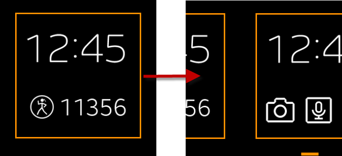
- Swiping down on the homescreen from the top edge provides quick access to the camera (or some other app that you may choose using the Gear Manager on your phone).
- Swiping up from the bottom edge on the homescreen takes the user to the phone app.
- Double tapping the power button (the only physical button on the watch) opens the voice app.
- Pressing and holding any screen with 2 fingers brings up the list of recent apps.
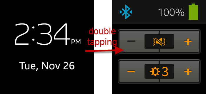
- And double tapping with 2 fingers on any screen shows a control panel displaying the battery status and the volume and brightness controls.
Are you confused yet?
- Besides these touchscreen gestures, the Gear can be woken up if you raise your arm. In practice, this gesture is difficult to execute correctly, given the sensitivity of the sensors — many times I ended up thrusting my arm violently to no effect. Better not stand next to a Gear user if you don't want a punch in the nose.
That is a lot to remember. The different meaning of swiping on the homescreen compared to the other screens goes against our guidelines for contextual gestures and command overload. (We got proof of how disastrous changing the meaning of a gesture depending on the context can be when we tested the first generation of Windows 8—users did not realize that the same gesture could expose different controls depending on which page they were on. Swipe ambiguity, most recently discussed in the context of iOS7, is another case where assigning different meanings to the same gestures —this time on the same page—trips users.) And the 2-finger gestures are really unfamiliar.
There are, however, arguments in favor of using this multitude of gestures: (1) they save precious screen space; (2) users are not forced to use all of them; in fact, some (e.g., the swipes on the homescreen) are redundant—that is, people can access the camera, the phone, and the watch settings in a more roundabout way if they do not remember these gestures; (3) these gestures are ingrained in the operating-system interface, so people will (presumably) get to make them often and thus have many learning opportunities.
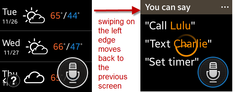
Unfortunately, although there are only a few apps available for the Samsung Gear (most of them provided by Samsung), some of these apps do not use the standard gestures in standard ways, destroying all hope of having users learn the gestures. For instance, in the Pedometer app (as well as in most apps), swiping down on the top edge takes the user back to the previous screen. However, in the S-Voice app, this gesture doesn’t work; instead, users have to swipe horizontally on the left edge to navigate back.
Content
The watch-screen size seriously limits the amount of content that can be displayed at once on the screen. Yet many apps waste screen space with fat sticky headings that take up almost a quarter of the screen. The Glympse screenshot above is one example. Other examples include the Help screen in the Pedometer app, deleting emails in the Notifications app, or the screen for selecting sounds for notifications, in the Settings app. (Note also how the different sounds for notifications in the Settings app are eloquently called Notification1, Notification2. And if a heading must be used, better choose one that is descriptive—“Notification sounds”?)


We seem doomed to rediscover the same usability guidelines again and again, as each new generation of designers commits the same blunders as their forebears. In our testing of WAP phones 13 years ago, we discovered usability problems from screens that provided too little new information because they allocated too much space to repeated information. As further discussed in our seminar on navigation design, it is definitely a guideline on big screens to situate people through confirmations of the user's current location and recent navigational actions. But as screens get smaller and smaller, such situating context has to be reduced and a bigger share of the screen spent on content.
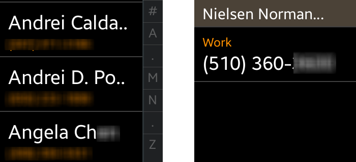
Another problem related to the screen size is that content sometimes is truncated. In the Contacts app, the names of the contacts get truncated, perhaps understandably so. What’s less acceptable is that you cannot see the full name even when you select a contact by tapping on it.
If you want to kill time and you are too lazy to take out your phone, you can quickly scan through the news of the day using Zite. Zite shows the title of the news story, and, or, sometimes, only part of that title. Even though people are unlikely to read long text on a small screen, it would be more efficient if they could at least read the full title. Tapping on the story just brings up a message that tells the user that the story is being opened in the mobile device. But there’s no way of saving the story so you can read it later if using your phone is not feasible or convenient— in violation of the law of minimum device switches. (Device switches have a high interaction cost; so designers should attempt to avoid them whenever possible.)
Why not show the full title, a button that saves the story in Zite for later reading, and then tell people that the story is being opened in the phone? Note how the Zite logo wastes the top third of the screen; also, the busy image background, while pretty, can make reading harder, especially in the variable lighting conditions in which the watch is likely to be used.

The app Pocket has an interesting solution to the problem of presenting content on the small screen: instead of having you read the content, it reads it to you. The phone transmits the sound, so if you want to listen to the stories that you saved while, say, exercising, you can do that easily, provided that you wear headphones connected to your phone. The assumption is that it’s easy to glance at your watch and select a story, and less convenient to take out your (huge) phone and do so.


Interaction
Much of the interaction with such a tiny small screen is done via gestures— there is just too little space for controls. Still, every now and then users do need to input information or press buttons.
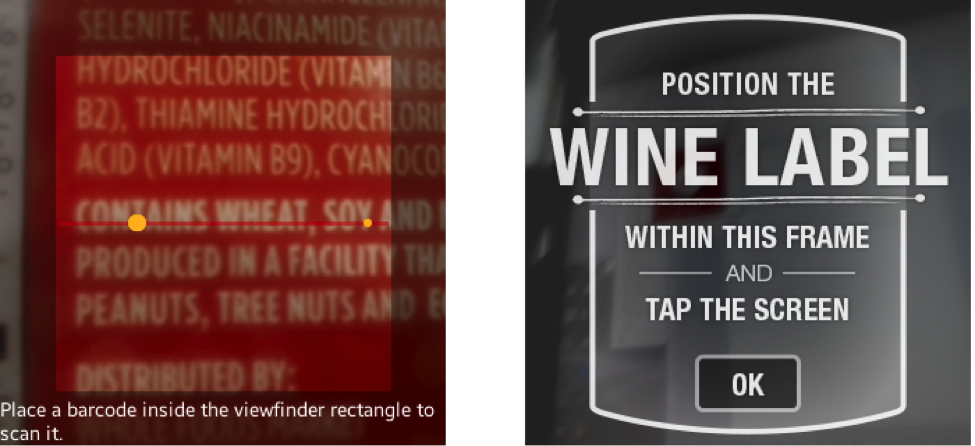
The other two ways of entering information are the camera and the voice. S-Voice lets users send text messages and open apps using voice. (Surprisingly, though, the other apps that I’ve looked at don’t use voice as an input method.) Apps such as Vivino and My Fitness Pal use the camera to let people search for products (wines, in the case of Vivino, and foods, in the case of My Fitness Pal).
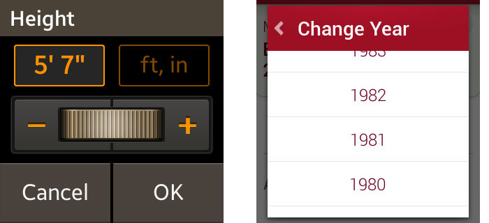
Sliders have their moment of glory with smartwatches: normally, any quantity is tediously entered with a slider (and we tend to recommend against them on desktops and on mobile devices; typing is often quicker and more precise), but in the absence of a keypad, they’re as good as it gets. In fact, they are much preferable to scanning through long lists of options.
In the Contacts app, a different type of slider is used for navigation. The letters on the right side of the screen are pretty much the equivalent of a scroll bar: they allow users to move to random regions of the name space (the targets are too small and crowded to be accurately reachable, and it’s unlikely that people would have any special predilection for names starting with one of the letters “A”, “M”, “N”, or “Z”). What’s more disappointing is that the displayed letters are the same independent of where the user is in the scroll space.
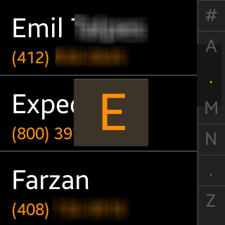
The tiny letters on the side of the Contacts app bring us to the question of target size. The Gear is a touchscreen device, and hence it does need fat targets suited for fat fingers. We normally recommend 1cmx1cm as the minimum touch-target size. However, the Gear’s screen is only 1.2 inches X 1.2 inches (or 3cm X 3cm); if you have two buttons you’ve taken up 22% of the screen area. (Sometimes even more, as in the slider screenshot above.)
So what does that mean? Can you get away with smaller targets? No, because our fingers don't get any smaller just because they're touching a watch instead of a phone.
Sometimes you may be able to pad the targets, in order to accommodate extra content. For instance, in the Vivino app, an edit button appears in the top right corner, next to the name of the wine. The name of the wine acts as a page title (and is not clickable or sticky), and the target is padded, so that if you can touch nearby and still trigger the edit action. (However, padding is not perfect because users do not usually know about it; according to Fitts’ law, the time they’ll take to reach the target will still be longer than if the target was bigger —see our class on Human-Computer Interface for a discussion of Fitts’ law.)
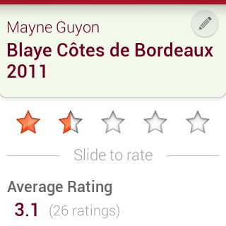
Other strategies that can be used to make it easy for people to reach targets is to mind Fitts’ law and place them at corners or around edges (not hard, if you consider the screen size), and to avoid having more than 1–2 targets on a screen. Otherwise, you may end up with too little content and many accidental touches.
Should You Design for Smartwatches?
When the iPad first came out in 2010, some were wondering what it was for. Would people find a use for it? After all, everything it offered was already available on your laptop or on your phone, only the laptop had a bigger screen and a real keyboard and the phone was more portable. Yet, tablets have shown tremendous growth over the past 3 years, and have proven to be a convenience device: You can live without them, but life is in fact easier with them.
Will the smartwatches prove to be the next platform, just like tablets provided a new platform to occupy the middle of the design space between desktops and phones? With a smartwatch, you can do some of the tasks you now do on your phone, only your phone is better and bigger. Smartwatches are convenience devices, like tablets. But will they simplify our lives enough? The answer is in the apps that we can invent for them.
One big reason to believe in watches is that this form factor has already been victorious. Historically, before wristwatches were invented, many people carried pocket watches. But the time needed to fish a device out of your pocket was much more than the time needed to whip around your wrist to face your face. Wristwatches are a much faster way to check the time (and maybe the date) than using a pocket watch. As a result, you hardly ever see a pocket watch these days.
In the case of computers, the wrist computer (smartwatch) will not eradicate the pocket computer (mobile phone) the way wristwatches eradicated pocket watches, because a phone-sized screen can do so much more than a watch-sized screen. Most likely people will carry both.
The key is simplicity (you can do it more easily on a watch) and spontaneity (you can do it right away). Phones already encourage spontaneous use; watches will be for those moments when phones are too big and too slow to access. We’ll need to learn ways to make the apps more direct and distill their essence, so that a quick glimpse on a tiny screen will be enough to get what we need.