
Real Design Scenarios
To simulate realistic design context, we defined 2 scenarios we faced in our ongoing design workflows at NN/G:
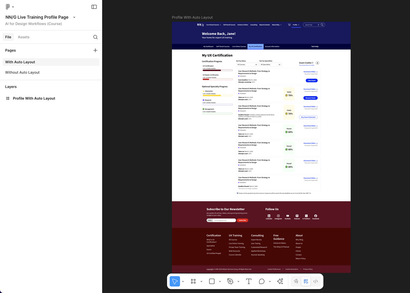
- Single-Page Design — Live-Training Profile Page: We asked AI to design the profile page for attendees of NN/G live online training; this page should display their course list and certification progress.
- Flow Design — Bulk Purchase: NN/G is expanding to offer an enterprise plan that allows teams to buy 100 or more credits for live online courses and receive a volume discount. We asked AI to design the purchase flow based on the outlined requirements.
We share the findings of this evaluation over a series of articles:
- Insights on single-page design scenario: Good from Afar, But Far from Good: AI Prototyping in Real Design Contexts
- Prompting tips: Prompt to Design Interfaces: Why Vague Prompts Fail and How to Fix Them
- Insights on multi-page flow scenario (coming soon)
- Insights on redesign scenario (coming soon)
All the designs generated by the AI prototyping tools tested are included in a FigJam board.
Evaluation Method
The evaluation took place in 3 key phases: writing prompts, generating designs with AI, and assessing AI-generated designs.
Writing Prompts
We used a real design context to develop the prompts used in our evaluation. We started by gathering design requirements and artifacts (hand-drawn sketches, design mockups, and Figma files) from these projects, and turned the information into AI prompts following prompting best practices. To keep the testing setup consistent and ensure results were comparable, we used prompts that included all necessary context. To compare design variations within the same tool, we added a second followup prompt within the same conversation:
“Create an alternative design with a distinctly different layout. Keep the same context. Do not modify or change the content.”
Generating Designs with AI
We ran those prompts through each AI tool and collected the outputs. In some cases, we reran the same prompt in new chats to produce additional variants. All designs were placed on a FigJam board so we could review and compare them side by side.
Assessing AI-Generated Designs
We conducted heuristic evaluations to assess the AI-generated designs. Each design was evaluated through the lens of the main tasks to identify design elements, features, or decisions that violate the defined criterion. We also compared the AI-generated design to real designs created by NN/G designers without using AI.
AI Tools Tested
We ran each prompt across 3 categories of AI prototyping tools that we considered to be most relevant to a designer’s workflow.
|
Category |
Primary design output |
Tools |
|
AI-assisted design |
Static wireframes or design mockups with limited interactivity |
UX Pilot, Figma First Draft, Uizard, Stitch (formerly Galileo AI), Relume |
|
AI-assisted (vibe)coding |
Interactive code-based prototypes
|
V0, Bolt, Lovable, Replit, Figma Make, Magic Patterns, Subframe |
|
General-purpose AI chatbots |
ChatGPT, Claude |
Note: We did not include AI code editors (such as Cursor and Windsurf) or command-line interfaces (such as Claude Code) as these tools require more technical setup and extend beyond a typical designer’s workflow.
Single-Page-Design Prompts: Live-Training Profile Page
To match our testing to real design scenarios across various stages of the design process, we created 4 types of prompts with various degrees of input specificity while maintaining the same context and request.
Prompt 1. Broad Text Prompt
You are a senior product designer at Nielsen Norman Group, a UX research consultancy that offers live online training on UX topics. Your task is to design a profile page in the desktop viewport for course attendees participating in online training. The page should allow attendees to view all the courses they’ve taken, access downloadable course materials for each course, check the status of summative course exams, and track their progress toward UX certification.
Prompt 2. Specific Text Prompt
You are a senior product designer at Nielsen Norman Group, a UX research
consultancy that offers live online training on UX topics. Your task is to design a
profile page in the desktop viewport for course attendees participating in online
training. The page should allow attendees to view all the courses they've taken,
access downloadable course materials for each course, check the status of
summative course exams, and track their progress toward UX certification.
## Page Components
### 1. Certification Progress Panel:
Show progress towards the following certifications:
- UX Certification: Requires completion of 5 courses.
- If the certification is completed, show users how to access the certification.- UX Master Certification: Requires completion of 15 courses.
- Specialty Progress Breakdown:
- Interaction Specialty: Requires 5 interaction-specific courses.
- Management Specialty: Requires 5 management-specific courses.
- Research Specialty: Requires 5 research-specific courses.
### 2. Course History Section:
Display a list of all past live online courses taken by the user.
- For each course, include:
- Course title
- Specialty (Interaction, Management, Research)
- Exam deadline (if applicable)
- Remaining exam attempts (3 attempts max)
- Course material access (including material password)
- Exam status:
- Passed/Failed indicator
- Option to take or resume the exam, if applicable
- Consider various course scenarios:
- If the exam deadline has passed, display a message indicating the exam is no
longer available.
- If the user did not take the exam but is eligible to purchase an exam extension,
provide a purchase link.
- If the user failed all three attempts, display an option to retake the course at a
discounted price.
- If the user needs to purchase an exam credit to take the exam, display a link to
purchase.
### 3. Exam Credits Component:
- Show the number of available exam credits.
- Provide a purchase option for additional credits if needed.
### 4. Course Sorting and Filtering:
Allow users to sort their courses by:
- Specialty (Interaction, Management, Research)
- Exam progress (Pending, Passed, Failed)
## Design Language
### Visual Style
- Mature
- Balanced
- Trustworthy
- Clear- Research-driven
- Practical
### Colors
- Primary button color: #002AF6
- Secondary colors:
- Interaction specialty: #FFD914
- Management specialty: #42C556
- Research specialty: #8952FF
- UX Certification: #4D0001
- UX Master Certification: #BB181C
- All colors and elements on the page should meet WCAG AA accessibility
standards
### Shapes & Icons
- Interaction specialty: Triangle
- Management specialty: Square
- Research specialty: Circle
### Typeface
- Source Sans
Prompt 3. Text plus Design Artifact
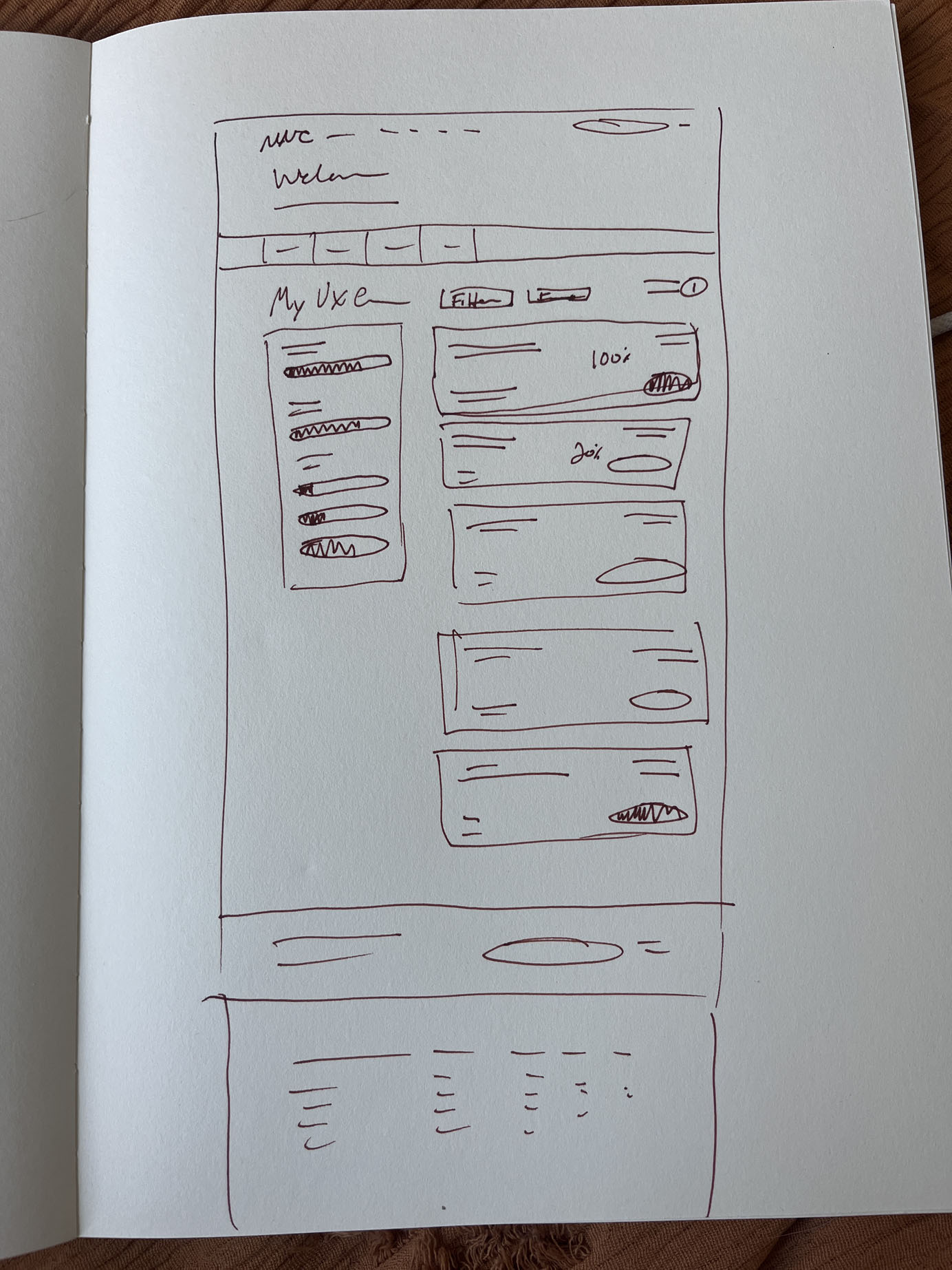
3a - Hand-drawn wireframeYou are a senior product designer at Nielsen Norman Group, a UX research consultancy that offers live online training on UX topics. Your task is to design a profile page in the desktop viewport for course attendees participating in online training based on the wireframe provided. The page should allow attendees to view all the courses they’ve taken, access downloadable course materials for each course, check the status of summative course exams, and track their progress toward UX certification.
🧷[ATTACH WIREFRAME IMAGE]
3b - Figma mockup screenshot
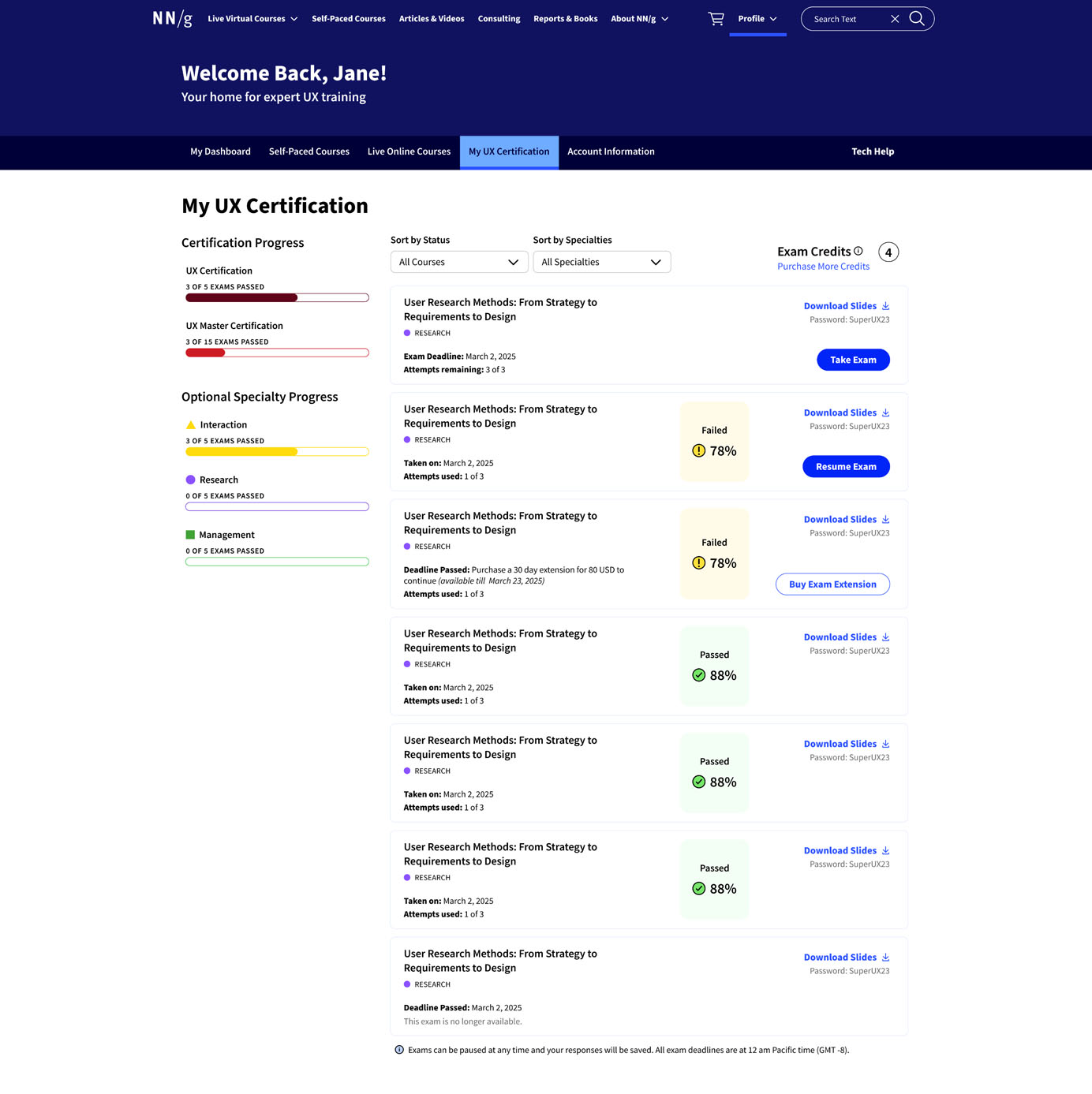
You are a senior product designer at Nielsen Norman Group, a UX research consultancy that offers live online training on UX topics. Your task is to design a profile page in the desktop viewport for course attendees participating in online training based on the mockup provided. The page should allow attendees to view all the courses they’ve taken, access downloadable course materials for each course, check the status of summative course exams, and track their progress toward UX certification.
🧷[ATTACH DESIGN MOCKUP]
3c - Figma design file
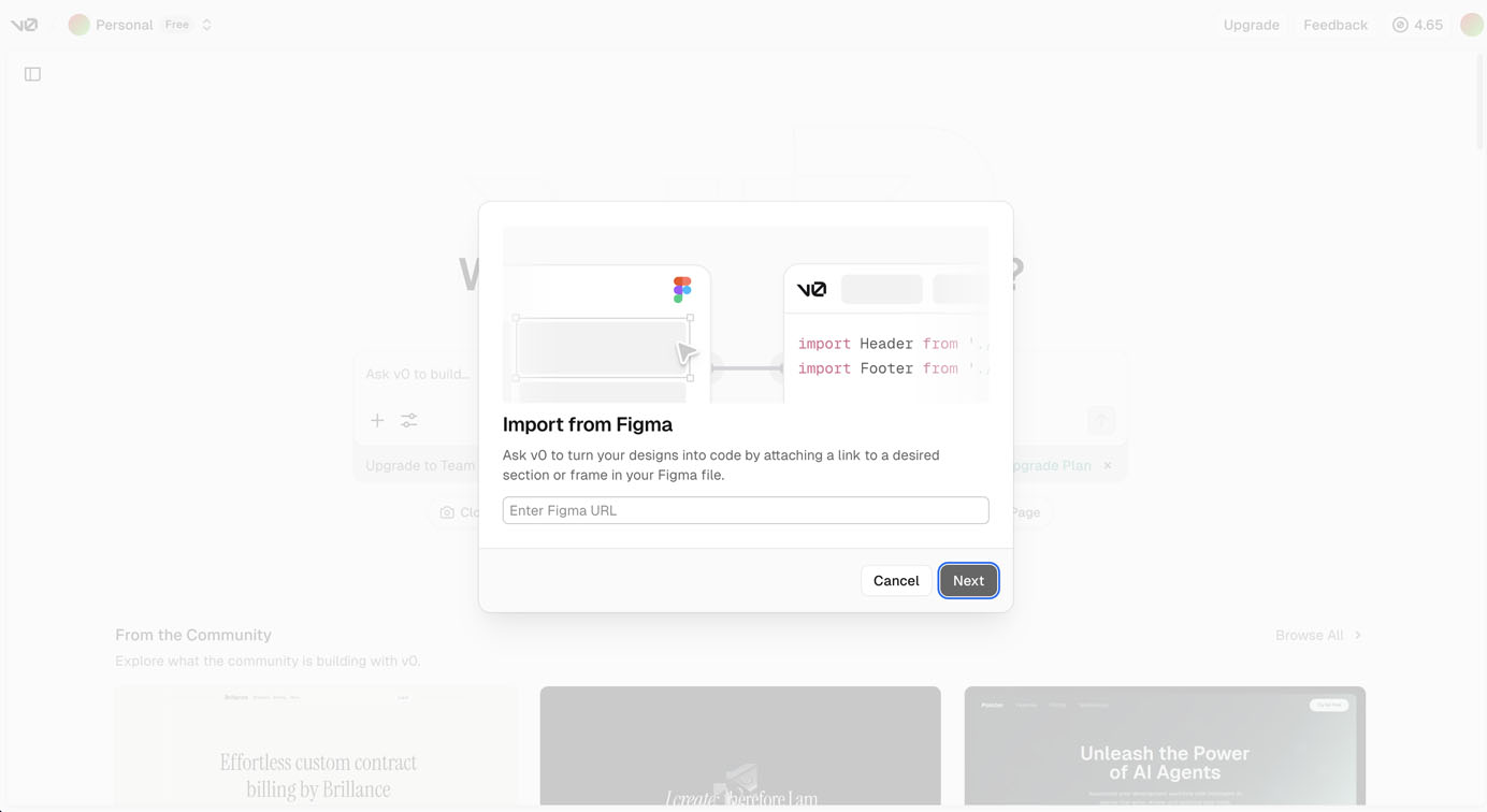
You are a senior product designer at Nielsen Norman Group, a UX research consultancy that offers live online training on UX topics. Your task is to design a profile page in the desktop viewport for course attendees participating in online training based on the design file provided. The page should allow attendees to view all the courses they’ve taken, access downloadable course materials for each course, check the status of summative course exams, and track their progress toward UX certification.
🧷[LINK TO FIGMA DESIGN]
Prompt 4. Redesign Prompt
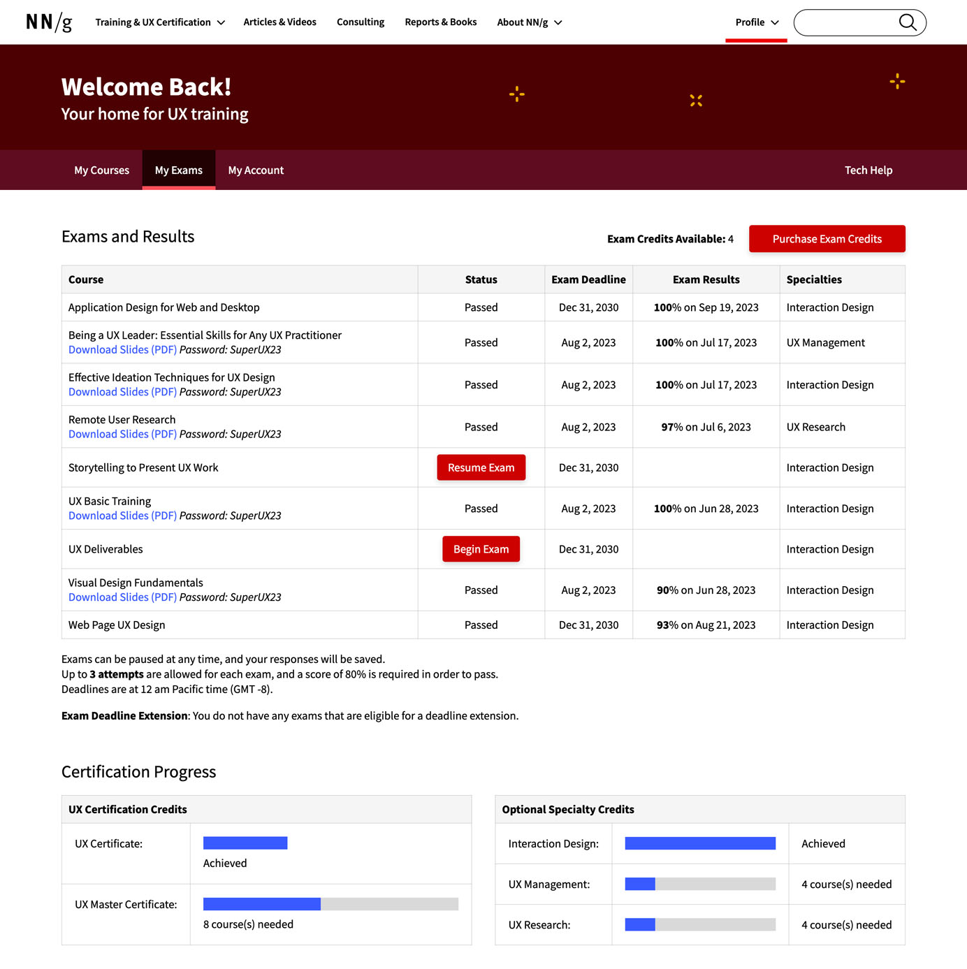
You are a senior product designer at Nielsen Norman Group, a UX research consultancy that offers live online training on UX topics. Your task is to redesign and improve the profile page for course attendees participating in online training. This page allows attendees to view all the courses they’ve taken, access downloadable course materials for each course, check the status of summative course exams, and track their progress toward UX certification. Based on the current design attached, create a new design that addresses the following problems:
Cluttered Layout & Poor Visual Hierarchy: The current interface packs too much information without clear visual organization.
Outdated Visual Style: The visual elements and color scheme appear dated and fail to project the modern, professional, trustworthy brand image.
Low User Engagement: The profile page lacks effective engagement mechanisms that make the experience delightful and encourage continued interaction.
🧷 [ATTACH IMAGE OF THE OLD DESIGN]
Flow-Design Prompts: Bulk Purchase
Prompt 1. Broad Text Prompt
You are a senior product designer at Nielsen Norman Group (NNG), a UX research consultancy that offers live online training on UX topics. Your company is expanding to offer an enterprise plan for organizations that want to purchase multiple seats for live training. This plan allows teams to buy 100 or more credits for live online courses and receive a volume discount.
A single company may have multiple teams with separate bulk orders. For example, Company A has two teams: Team 1 has purchased 200 credits, while Team 2 has placed a smaller order of 100 credits.
Your task:
Design an intuitive, accessible web application workflow that enables companies with bulk seat purchases to:
Log in to the business portal on our website
View the teams for which bulk orders have been placed
Access the order history for each team
Request more credits (i.e., create a new bulk order)
View the total number of available credits (both for courses and exams) per team
Copy and share a registration link for a specific team so employees can use credits to enroll in courses
View pending course requests from employees
Approve or reject individual employee requests
Track whether employees attended the courses they registered for
Create as many pages as necessary for an intuitive experience and follow accessibility standards and information architecture best practices.
Prompt 2. Redesign Text Prompt
You are a senior product designer at Nielsen Norman Group (NNG), a UX research consultancy that offers live online training on UX topics. Your company is expanding to offer an enterprise plan for organizations that want to purchase multiple seats for live training. This plan allows teams to buy 100 or more credits for live online courses and receive a volume discount.
A single company may have multiple teams with separate bulk orders. For example, Company A has two teams: Team 1 has purchased 200 credits, while Team 2 has placed a smaller order of 100 credits.
Your Task:
Redesign and improve the current flow to create an intuitive, accessible web application that enables companies with bulk seat purchases to:
Log in to the business portal on our website
View the teams for which bulk orders have been placed
Access the order history for each team
Request more credits (i.e., create a new bulk order)
View the total number of available credits (both for courses and exams) per team
Copy and share a registration link for a specific team so employees can use credits to enroll in courses
View pending course requests from employees
Approve or reject individual employee requests
Track whether employees attended the courses they registered for
Create as many pages as necessary for an intuitive experience and follow accessibility standards and information architecture best practices.
Address the following problems from the current flow:
Navigational Disorientation: Users struggle to remember where they are in the interface.
Outdated Visual Design: The visual elements and color scheme appear dated and fail to project a modern, professional, trustworthy brand image.
Current Flow:
Dashboard Page – Overview of all teams under a selected company. Shows each team’s pending requests, available course and exam credits, and registration link. Users can add new teams or companies.
Team Credits Page – Connected to the Dashboard Page. Displays the team’s remaining course and exam credits, registration link, and a breakdown of credit use per order. Includes a “Request More Credits” button to place a new bulk order.
Order Detail Page – Connected to the Team Credits Page. Order summary with key details (credits remaining, start/expiry dates, credits purchased, price per course, etc.) and billing information.
Course Request Page – Connected to the Dashboard Page. Allows users to manage employee course credit requests via four tabs:
Pending – New requests with request dates.
Rejected – Denied requests with dates and who rejected them.
Approved – Approved requests with approver, employee, course, approval/request dates, and order ID.
Course Attendance
Evaluation Criteria
Each design was evaluated through the following criteria.
|
Dimension |
Criterion |
Description |
|
Goal alignment |
Design‑objective fit |
The generated interface demonstrably supports the stated design objectives. |
|
Prompt compliance |
All requested features, states, constraints, and content appear as specified. No omissions or unauthorized additions. |
|
|
Concept quality |
Solution diversity |
Design iterations differ meaningfully. |
|
Creative judgment |
Generated ideas show thoughtful novelty and provide added value to the creative process. |
|
|
Visual design |
Information hierarchy |
Content priority is reflected through the proper use of visual weight. Important content and elements are visually dominant. |
|
Compositional balance |
Elements are thoughtfully arranged to create a balanced layout. |
|
|
Consistency |
Design execution is consistent and coherent across the interface. |
|
|
Aesthetics |
Visual quality meets or exceeds modern standards (appealing, clear, on-brand). The visual elements of the interface are intentional and support the page goal and band identity. |
|
|
Interaction and usability |
Best‑practice compliance |
The interface design follows established UX best practices and behaves as expected through the appropriate use of design patterns. There is no evidence of critical usability violations. |
|
Accessibility |
The design can accommodate users of diverse abilities: the content is easy to see and read, and the interface can be navigated using different input methods. |
|
|
Responsive performance |
Content can be rendered seamlessly across devices (mobile, tablet, desktop) without content loss or overlap. |
Challenges and Limitations
- Jagged capabilities: Some AI tools impose strict limits — for instance, Uizard caps text input at 500 characters, so we had to shorten prompts to fit. Others only accept plain text or lack the ability to connect with Figma frames. We had to adapt our testing process around these constraints.
- Tool and model updates: AI tools evolve quickly. While this evaluation wasn’t about chasing the “latest and greatest,” we did need to rerun tests in response to major updates (like the release of ChatGPT-5) to ensure our findings reflected current tool behavior.
- Free-trial limitations: We kept the testing at the free-account level. Some tools require a paid subscription to unlock certain features.
Lesson Learned
- Treat the evaluation like research. We approached the evaluation as a research project — drafting a plan, controlling variables, establishing evaluation criteria, and standardizing the process for testing and analysis. Applying research best practices kept the work structured and allowed us to generate insights that were both objective and useful.
- Pilot test and iterate on prompts. We first tested prompts with general-purpose AI chatbots before moving to specialized tools with stricter credit limits. This gave us space to refine and optimize prompts without burning through credits too quickly.
- Maintain strong documentation. A project of this scale requires consistency and collaboration. We created a shared prompt document as our single source of truth and used a FigJam board to track and display results across tools. This setup kept everyone aligned and informed throughout the evaluation process.