
In menu design, “global navigation” describes the top level of a site’s navigation, because it appears on every page. If an organization has multiple sites, each with their own global navigation, what happens when users need to be able to navigate higher up the chain or to a different site? That’s when you need universal navigation, which provides a menu structure for connecting related websites that each have their own global navigation.
Universal navigation provides a link to the main homepage of a website from subsites, sections, or microsites. Sometimes it includes links to the main site’s top categories, in addition to the link to the universal homepage.
Picture an exit sign in a large commercial building. There’s one in every room on every floor. It’s a reliable cue that tells you how to get out of the building. Most of the time you don’t need it. But on the rare occasion you do, you’re glad that it’s there and easy to spot. That’s the role of universal navigation.
In our building analogy, universal navigation is like a transporter that would take you from the groundskeepers’ shed directly to the main lobby. Only in Star Trek would that work, but the digital world is supposed to be better than reality. Most microsites are sadly too much like a real storage shed that’s so far removed from the main building that there is no easy route between the two.
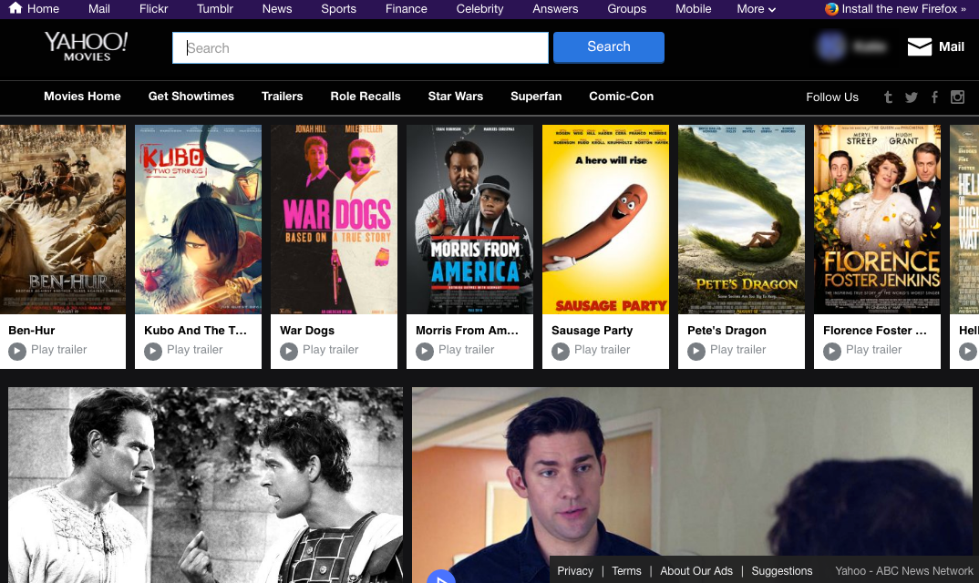
When testing large, information-heavy websites, we regularly see users get lost or stuck in a subsection. They wander around the site, looking for answers to their questions, following links here and there. At some point, typically when they are about to pursue another path, they look up, only to realize the navigation isn’t the same as before. They look around and try to find a way back to start, to somewhere familiar.
Now, I know what you’re thinking: that’s what the Home link is for. And you’re right. But what about subsites that have their own homepage and their own navigation system? How should users get out of the subsite and back to the main site’s homepage (the ‘universal’ home)?
In a recent study, a participant visited Unicef UK’s News & Blogs section, and eventually got to the Soccer Aid subsite. She did not realize she was in a subsite of the main page, and she struggled to get back to the main Unicef UK homepage.
In this video from a usability study, the user struggled to get back to Unicef UK’s main site.
Two main issues led to the user’s difficulty and frustration in this situation:
- At a glance, it’s hard to notice that the user is on a subsite of the main site. The header areas all look the same and the section titles (News & Blogs, Soccer Aid), placed on the right-hand side of the big banner, can be easily missed. (How to clearly differentiate sections while keeping a consistent look and feel is an important concern for many designers.)
- There isn’t a clear, reliable way to get to the universal homepage. (In fact, the News & Blogs page does have a link labeled Unicef UK Main Site, but users ignored it because of its highly unexpected position as the last category in the section’s navigation bar. Logos and home links should be on the left, not the right.)
If users get lost or stuck in a subsection, they become frustrated and confused, and those feelings can make them abandon the task or go to a competitors’ website. Not only that, but they will miss the chance of discovering other potentially relevant subsites of your site, and they may reach false conclusions about your site’s offerings, which can be devastating for business.
I first noticed this problem when doing research on the UX of university websites. But soon I realized that universal navigation is used (or at least needed) in lots of different industries, including software, banking, government, entertainment, news, healthcare, and nonprofits. Clearly, designers struggle with how to connect subsites to their parent organization.
6 Design Guidelines for Universal Navigation
Below are six recommendations for how to make universal navigation usable:
1. If your site contains several subsites, include a universal-navigation element on each subsite.
We saw in the example above that users need an easy way to go back to the main site. To come back to our initial metaphor, make sure that you provide that exit sign on every single subsite.
2. Keep the focus on the subsite’s global navigation; don’t divert attention to the universal navigation.
The subsite’s own internal navigation deserves the main focus and should not be in competition with the universal navigation. After all, most visitors to that section are probably interested in its content and should be able to explore it easily if they wish so.


3. Ensure a sense of hierarchy if the design displays two navigation bars.
At a glance, people should be able to identify the navigation related to the current site and distinguish it from the universal navigation.

4. Include the domain when using a link to the main site’s homepage; if possible, position it towards the left, near the logo.
Our research shows that placing the logo in the top left corner supports the navigation back home better than other logo positions. By placing the link to the site’s main navigation close to a left-placed logo, we take advantage of people’s tendency to direct attention towards that corner when trying to navigate back home.


5. List universal categories only if users benefit from seeing the site scope or are likely to move between universal categories frequently. Hide or collapse categories if users are unlikely to switch universal-navigation categories.

In general, hiding the main navigation on the desktop is a bad idea: our research proves that navigation gets used about twice as much when it’s visible. However, universal navigation is one notable exception: if people don’t frequently jump from one subsite to another within the same session, then chances are that having visible details in the universal navigation will distract more than help.

6. On mobile, deemphasize links to the universal home and universal categories if users are unlikely to use multiple sections of the site at the same time.
This guideline is the analogue of the previous one for mobile. On mobile, space is particularly scarce, and it would be a waste to fill up a navigation bar or even a navigation menu with rarely useful universal categories.

Conclusion
Like other secondary navigation schemes such as breadcrumb navigation and utility navigation, universal navigation is an element that most site visitors won’t use. That’s ok: its role is not to attract clicks. Instead, it should be easily discoverable and accessible when users need it. By clearly labeling it and making sure that it does not compete with the local subsite navigation designers can save users time, decrease confusion and frustration, and ultimately improve the user experience.


