
UX professionals advocate on users’ behalf. To do that effectively, they need to not only deeply understand users but also communicate this understanding clearly to colleagues and help prioritize users’ needs. Empathy maps, widely used across Agile and design teams, are a simple and durable tool for both of these goals.
Definition: Empathy Map
An empathy map is a collaborative visualization that captures what we know about a particular user or about a user segment. It externalizes knowledge about users to create a shared understanding of user needs and aid in decision making.
Empathy mapping can be driven by any qualitative research method, and a map can be sketched even if research is lacking, as long as the team is honest and clearly distinguishes evidence from assumptions. Maps help UX professionals understand what they know about their users and where they need to gather more data.
One User vs. Multiple-Users Empathy Maps
An empathy map may represent a single actual person (one-user/individual empathy map) or it can be an aggregate of data coming from multiple users (aggregated empathy maps) that belong to the same user segment.
Aggregated empathy maps represent a user segment rather than one particular user. They are usually created by combining individual empathy maps from users who exhibit similar behaviors and can be grouped into one segment. The aggregated empathy map synthesizes themes across that group and can be a first step toward creating personas. (However, empathy maps are not a replacement for personas, but they are one way to visualize what you know about a persona in an organized, empathetic form.)
Format of an Empathy Map
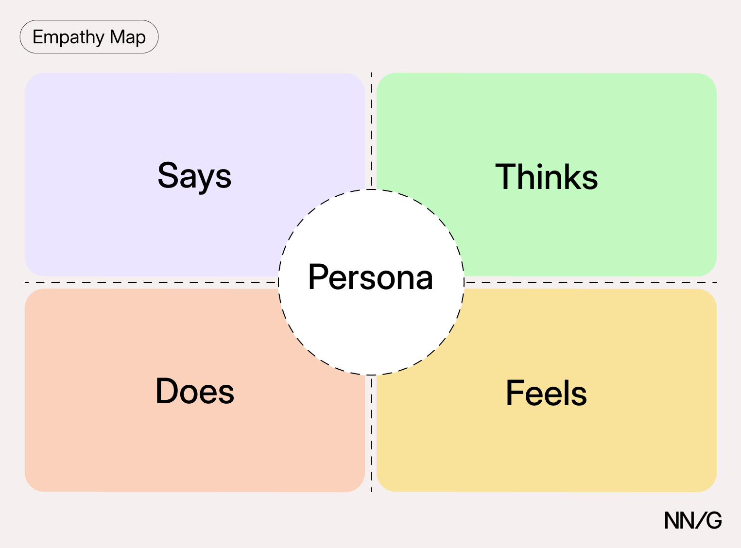
Traditional empathy maps are split into 4 quadrants — Says, Thinks, Does, and Feels — with the user or persona in the middle. The map shows the user as a whole and is deliberately not chronological or sequential. Whereas a journey map follows a sequence of steps, an empathy map captures a mindset.
Says
The Says quadrant contains (ideally) verbatim, direct quotes from user research.
Specific quotes are more useful than generic ones. A quote like “I want something reliable” could come from a user of almost any product, so it gives the team nothing to act on. A detailed quote pinpoints where the experience broke down:
“I am loyal to Delta because I never have a bad experience.”
“I don’t understand what to do from here.”
“I screenshot the confirmation page every time, because I don’t trust that the email will actually arrive.”
Thinks
The Thinks quadrant captures what goes through the user’s mind during the experience. Look at your qualitative research and ask yourself: what is the user thinking and what matters to them?
The same content can appear in both Says and Thinks. However, pay special attention to what users think, but are not willing to say out loud. Try to understand why they are reluctant to share — are they unsure, self-conscious, polite, or worried about how the answer will land?
“This is really annoying.”
“Am I dumb for not understanding this?”
Does
The Does quadrant captures the user’s behaviors — what they do as opposed to what they say. From the research, ask what the user actually does and how they go about it.
Refreshes the page several times
Shops around to compare prices
Keeps a competitor’s pricing page open in a second tab while filling out the form
If your participants use assistive technology, capture that here as well. How someone moves through a form with a screen reader or where they switch to keyboard navigation belongs in the Does quadrant.
Feels
The Feels quadrant captures the user’s emotions. Write each entry as an adjective plus a short phrase that explains it — what worries the user, what excites them, and how they feel about the experience.
Impatient: pages load too slowly
Confused: too many contradictory prices
Worried: they are doing something wrong
The context matters more than the adjective. “Anxious” on its own gives the team nothing to design against, while “Anxious: can’t tell whether the payment went through” points at a fix.
Across Quadrants
Users are complex, and it’s natural for the quadrants to occasionally disagree. You may encounter positive actions next to negative emotions.
Those contradictions are worth investigating, because they often point to something that your users did not articulate during research. It is our job as UX professionals to investigate the cause of the conflict and resolve it.
Additionally, some quadrants may feel ambiguous or overlapping — for example, it may be difficult to distinguish between Thinks and Feels. Do not focus too much on being precise: if an item could fit into multiple quadrants, pick one and move on. The quadrants exist to deepen your understanding of users and to make sure no dimension gets left out. If you cannot fill a quadrant, it’s a strong signal that you need more research before moving further in the design process.
Why Use Empathy Maps
Empathy maps can be used throughout any UX process to establish common ground among team members and to understand and prioritize user needs. In user-centered design, they are best used from the beginning of the design process.
Both the process of making an empathy map and the finished artifact have important benefits for the organization.
Capture Who Users Are
The empathy-mapping process distills and categorizes your knowledge about the user in one place. Use it to:
- Organize and make sense of qualitative data such as research notes, survey answers, and interview transcripts
- Discover gaps in your knowledge and plan the research needed to fill them — a sparse map is a sign that you need more data
- Create personas by grouping the empathy maps of similar individual users
Educate Teammates About Users
An empathy map is a quick, digestible way to illustrate user attitudes and behaviors. Once created, it should act as a shared reference point for a project and protect the team from bias and unfounded assumptions.
Keep empathy maps current by revising and adjusting them as you do more research. A map nobody has touched since the kickoff workshop will not hold up the next time someone challenges a design direction.
Collect Data Directly from Users
Empathy maps can also be used as a research instrument. At the end of an interview or usability session, hand the participant a blank template and ask them to fill in the four quadrants for the experience they just went through. Their answers give you a supplementary data source and a ready-made starting point for summarizing the session.
Also, the Thinks and Feels quadrants often surface reactions that participants did not volunteer during the session itself. Treat the Does quadrant with some caution, though: what people report doing is not always what you observed them do.
Process: How to Build an Empathy Map
Go through the following steps to create a valid and useful empathy map:
1. Define Scope and Goals
Decide what user or persona you will map. Always start with a one-to-one mapping: one user or persona per empathy map. If you have several personas, build a map for each.
Define your primary purpose. If the goal is to align the team on a user, be sure everyone is present for the activity. If the goal is to analyze an interview transcript, set a clear scope and timebox the effort so you have time to map several interviews.
2. Gather Materials
Your purpose should dictate the medium. For an in-person team workshop, have a large whiteboard, sticky notes, and markers ready. If you are mapping alone, any format works as long as it’s easy to share with the rest of the team.
3. Collect Research
Gather the research that will fuel your empathy map. Empathy mapping is a qualitative method, so you need qualitative inputs: user interviews, field studies, diary studies, listening sessions, or qualitative surveys. Support tickets and call logs also work well, because they capture what users complain about unprompted.
Every sticky note on the finished map should trace back to a specific research artifact — a line in a transcript, a moment in a session recording, an observation note. If you can’t point to the source, the note is an assumption, and it should be labeled as one.
4. Individually Generate Sticky Notes for Each Quadrant
Once you have research inputs, you can proceed to mapping as a team. Everybody should read through the research individually. As each team member digests the data, they fill out sticky notes that align to the four quadrants. People should not see each other’s notes in this phase, to prevent early opinions from anchoring the group. Once the individual stickies are generated, workshop participants can then add their notes to the shared map.
Assign a facilitator for the next clustering step.
5. Converge to Cluster and Synthesize
Together, the team goes through the notes on the board and clusters similar ones within each quadrant. Give each cluster a name that captures its theme, such as “validation from others” or “workarounds”; the same theme can appear in more than one quadrant. Clustering is where discussion and alignment happen: the goal is for everyone on the team to leave with the same understanding of the user.
Once your empathy map is clustered, work through it out loud as a group:
- What outliers (or data points that did not fit in any cluster) are there?
- What themes were repeated in all the quadrants?
- What themes only exist in one quadrant?
- What gaps exist in our understanding?
6. Polish and Plan
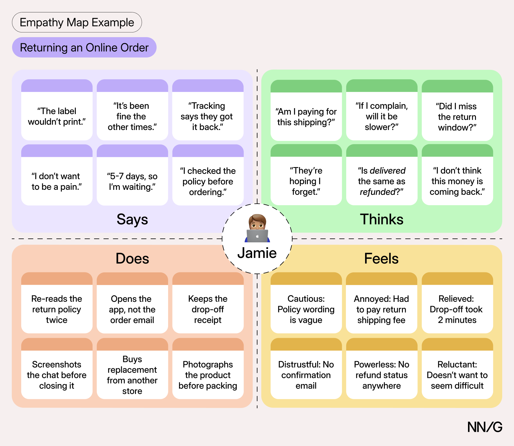
If you need more detail, adapt the map by adding quadrants — Goals is a common fifth, shown in the example below — or by increasing the specificity of existing quadrants. Polish and digitize the output accordingly. Include the user, any outstanding questions, the date, and a version number, so a reader six months from now knows how current the map is.
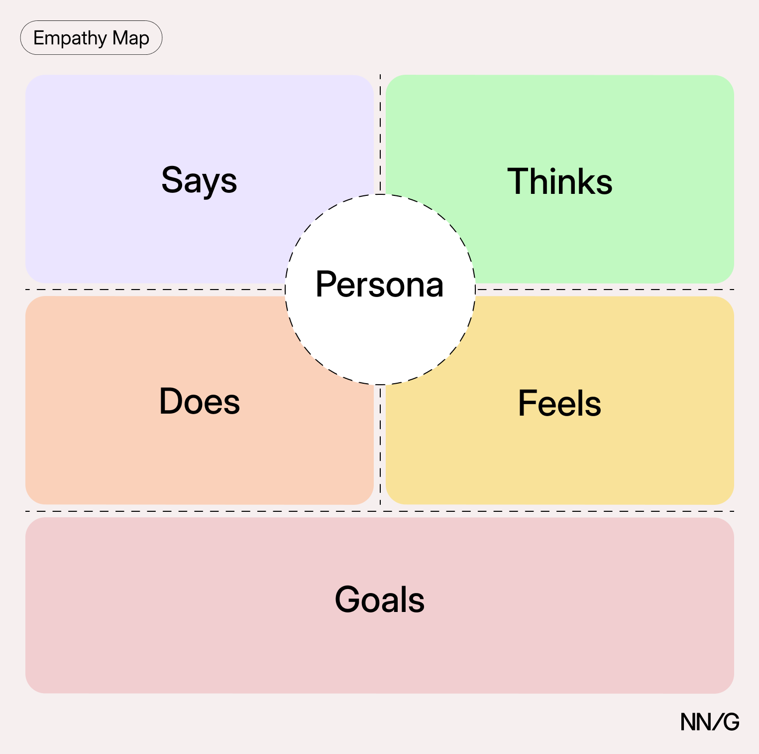
Plan to return to the map as more research comes in and use it when UX decisions come up.
Using AI in Empathy Mapping
AI tools have an obvious appeal for empathy mapping, because the method is labor-intensive and the output looks like something an AI tool could produce quickly, so the temptation to hand it over to AI is understandable. What matters is what you hand over: asking AI to organize evidence you already have is very different from asking it to generate evidence you don’t have.
Never rely on AI tools to perform all your analysis. Before using AI at any step of the process, ask:
- Can I trace this sticky note back to actual research evidence?
- If I had written this note myself, without AI, would I call it a finding or an assumption?
Common Mistakes
Mapping assumptions instead of research. A team that fills a map from memory produces a record of its own beliefs, then treats that record as evidence for the rest of the project. If you are mapping before research, label the map as a set of hypotheses and plan the study that will test them.
Treating the map as a deliverable. A map that gets exported, presented once, and filed away isn’t valuable. The value comes from returning to it when a design decision is contested and asking what the map actually supports.
Defining the segment too broadly. A map covering “our customers” ends up holding notes that contradict each other because they come from different people with different goals. If the contradictions can’t be investigated, the segment is too wide.
Letting the map go stale. Users, products, and markets change. Date the map, version it, and put a review on the calendar for the next time the team plans research.
Conclusion
Empathy maps help teams build empathy with end users. When they are based on real data and combined with other mapping methods, they can:
- Remove bias from designs and align the team on a single, shared understanding of the user
- Discover gaps in research
- Explain what drives user behaviors
- Guide the team towards meaningful innovation