
In a previous article, we reported a quantitative study that found that hiding global navigation degrades the user experience both on desktop and on mobile. However, the impact on mobile was not as big as on the desktop, and it did vary from site to site. In this article we discuss site-design differences that affected mobile navigation usage. (See our companion article for an analysis of navigation on desktop sites.)
About the Study: Sites Tested
NN/g partnered with international remote-usability-testing firm, WhatUsersDo, to test three different types of navigation: hidden, visible, and a combination of hidden and visible navigation. As described in the study methodology, 179 users participated in our study; they completed tasks on 6 different websites, on both desktops and smartphones:
- 7digital (music, e-commerce)
- BBC (news)
- Bloomberg Business (business news)
- Business Insider UK (business news)
- Supermarket HQ (e-commerce)
- Slate (news)
We collected 5 metrics:
- Navigation use: whether participants used the navigation links at all
- Time to navigation: the time from the beginning of the task until the first use of the navigation in that task
- Task difficulty: participants’ assessment of task difficulty
- Content discoverability: whether participants were able to discover the content on the site
- Task time: the time it took people to complete the tasks
The first 2 metrics are related to navigation usage, while the last three refer to the quality of the user experience. Since this article focuses on what makes navigation discoverable and findable, we refer mostly to the first 2 metrics. (Our other article discusses all hidden navigation study metrics in detail.)
Mobile Navigation: Site Differences
Whereas the actual numbers suggested that some sites were better than others, the statistical analyses painted a slightly different picture:
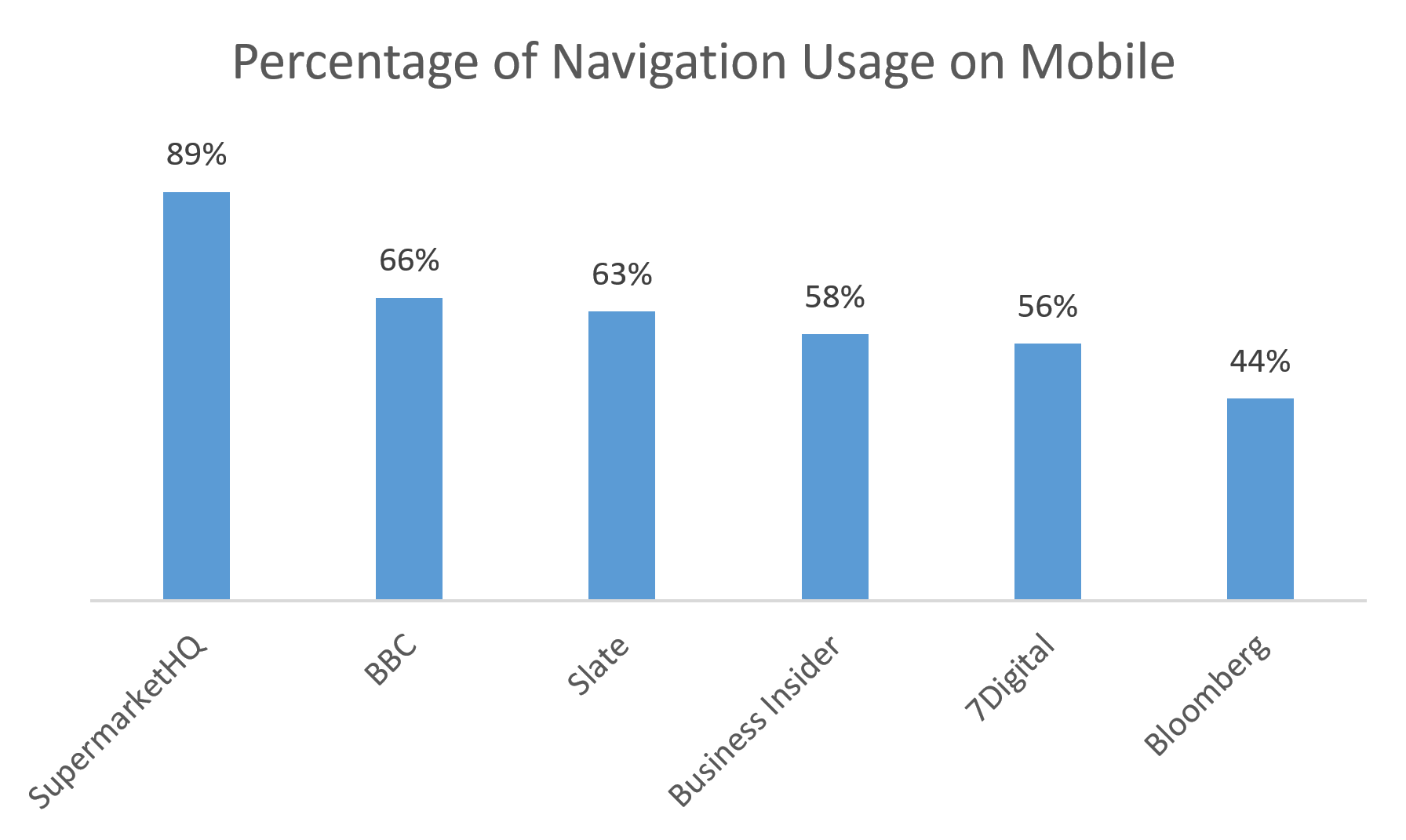
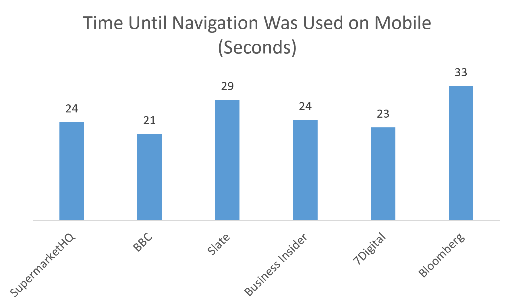
- People used the navigation significantly more on SupermarketHQ (89% usage) than on Bloomberg (44% usage). The time until navigation was used was also significantly shorter on SupermarketHQ compared to Bloomberg (24 vs. 33 seconds).
- There was a marginally significant difference in the use on navigation on SupermarketHQ (89% usage) and 7Digital (56% usage).
- There was a marginally significant difference in how fast people used the navigation on BBC (21 seconds) vs. SupermarketHQ (24 seconds).
SupermarketHQ and Bloomberg were not different from the other sites on either metrics.


Bloomberg’s design had arguably the least salient global navigation. Besides the fact that the navigation was hidden under an expandable menu, several other features of this design likely contributed to its low navigation usage:
- Menu icon was placed next to the logo and looked (at least peripherally) as part of the logo. Some users seemed to mistake the entire top section to be the site’s banner, and swiped down immediately.
- The menu icon has low visual salience: the thin white arrow inside the gray square is tiny and easy to ignore.
People using Bloomberg on their phone often seemed to miss the navigation altogether. For example, one person scrolled the articles, scrolled back up to the top of the screen, then searched. He sorted and scrolled the search results but didn’t find what he wanted. He noted, “Very difficult to find anything, actually, on interest rates with that search.” He continued to scroll and scan headlines, tried searching again, then said, “Very disappointing…” Rather than trying the menu, he gave up on doing the task, and rated the usability as 5.5 out of 7, with 7 being most difficult. He didn’t mention the menu or tap it at all.
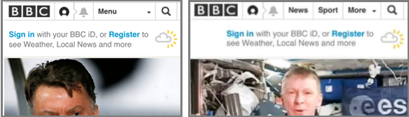
Unlike all the other sites, the better performers Supermarket HQ and BBC (whose time to use navigation was the shortest) had a combination of visible and hidden navigation. (On some phones, BBC’s navigation was completely hidden, whereas on others it was partially visible). On both these sites, the navigation was salient and placed at the top of the page: Supermarket HQ used a big Browse button, while BBC had a visible navigation bar. SupermarketHQ also repeated the navigation at the bottom of the page. This pattern was helpful to mobile users, especially because the page wasn’t overly long (by mobile standards) and many participants did scroll down and resorted to the visible icons at the bottom of the page.
People were drawn to the SupermarketHQ menu more than they were to the menus on the other sites. People often clicked the menu before even scrolling. In one example (depicting a fairly common chain of events) the person hit the site, immediately opened the menu, chose a link, and said, “That’s easy.” Use caution, however, if making a menu that spans the width of the mobile screen because it can appear to be a banner rather than a tappable menu.
The BBC navigation, when visible was also attractive. In on example, a user had already used a few other sites and had mostly scrolled, and did not use menus, to complete task on them. But when she hit this site she immediately tapped the “Menu” button, then a link in the menu, and quickly completed her task.
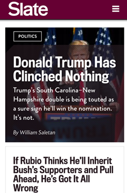
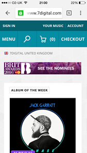
The other three sites (Slate, Business Insider, 7Digital) all used hidden navigation: Slate and Business Insider used a hamburger menu, while 7Digital hid the global navigation under a button labeled Menu. In all these designs, the navigation had a relatively small footprint compared with the screen area (although not as small as Bloomberg). One user who found the menu on 7Digital said, “The drop-down menu on the side, I couldn’t see it straightway, so I didn’t realize it actually worked.”

Guidelines for Navigation on Mobile
- Consider using the visible or combination navigation instead of hiding the navigation under a menu:
- Use visible navigation options (if you have only 4-5 top-level choices), or
- Use a combination navigation where some options are exposed and the rest are collapsed
- Assign a larger footprint to navigation (hidden or visible) to make it more noticeable.
- Consider making the navigation (hidden or visible) sticky to ensure easy access and visibility.
- If you have to hide navigation under a menu:
- Make the menu visually salient by ensuring that it stands out on the page.
- Make sure that the menu is visually distinct from the logo (either placed farther away or in a different color scheme).
- Make the menu look tappable by using the right signifiers.
- Label the menu to add some information scent and to also help users who are not yet familiar with the hamburger icon. The label should be legible and have high contrast.
Remember that previously-learned user behaviors, how much people can see on a cluttered or sparse small screen, and even what seem to be minor visual elements can play a large role in making navigation discoverable. Our study teaches us that the hamburger menu is not so universal that everyone knows it or immediately looks for it. Also, usability guidelines are always circumstantial: they depend on the context in which they are applied. The hamburger is an imperfect answer to the small space constraint, but it works okay when there is nothing else to click. And, experimenting with alternate icons is fine in the lab, but not with your paying customers. When in doubt, you’ll get the best answer by running a usability test tailored to your design and to your users.
Other Articles Related to the NN/g Hidden-Navigation Study
Beyond the Hamburger: How to Make Navigation Discoverable on Desktops
Hamburger Menus and Hidden Navigation Hurt UX Metrics
Hidden- and Visible-Navigation Study: Methodology
Mobile First Is NOT Mobile Only
Learn more about navigation design in our full-day course.