Routing pages — including product-listing and search-results pages — play a crucial role in product selection on ecommerce sites. Product-listing pages organize and present multiple product options in a single page. They usually include useful sorting and filtering tools to help customers explore the product set. Search-results pages on ecommerce sites often look very similar to product-listing pages — on some sites, they’re identical.
On these pages, customers browse products, compare options, and sometimes make purchase decisions. Support those important tasks by displaying product photos on listing pages that are large, consistent, specific, dynamic, contextual, and inclusive. These characteristics are particularly necessary when the look of the product is a big factor in purchase decisions – for example, for clothing, accessories, makeup, furniture, or décor.
Large
Product images should be big enough and detailed enough for users to get a sense of the product. They don’t have to show every detail of the product, but users should be able to see what the product looks like and what characteristics differentiate it from similar products.
Users often know what the product they want looks like. Even when they do not have one particular product in mind, it is likely that they know some requirements for how the item should look.
For example, a customer wanted to buy a smoker (a large device used to cook meat using smoke) on the Home Depot site. He relied heavily on product images on product-listing pages to distinguish which smokers would best suit his needs.
“These ones that sit on four legs take up too much space. I don’t want something that big. So, I would look at something like this that stands up and takes up less deck space. […] I would usually just compare these here, ones that have similar features. Has windows, is upright.”

Another shopper on Home Depot’s site also appreciated the large images while she shopped for a new ceiling fan.
“I’m visual. I like the larger pictures of the items. That’s helpful. They’re big enough that I can see enough detail. It helps me decide if I want to click or open in a new tab.”

Some sites did feature relatively large photos on listing pages, but still failed to show the featured items. For example, Helmut Lang used product photos with relatively large dimensions. However, each photo showed a full-length photo of a model’s entire outfit, with lots of white space around each model. This approach made it difficult to tell which item of each outfit (e.g., top vs. bottom) was featured and to see it in detail.

Consistent
Especially for small inventories, sites should have consistent images for all products shown on routing pages. This does not mean that all images need to be identical, but they should be consistent in terms of style. When images are consistent, they are easily scannable and comparable.
When planning for consistency in product photos, consider:
- Background (e.g., white, outdoors, studio)
- Orientation and direction (e.g., facing the camera, angled to the right)
- Context (e.g., in a house, on a model, being held)
- Lighting (e.g., flash, natural light)
- Scale (e.g., closeup, full length)
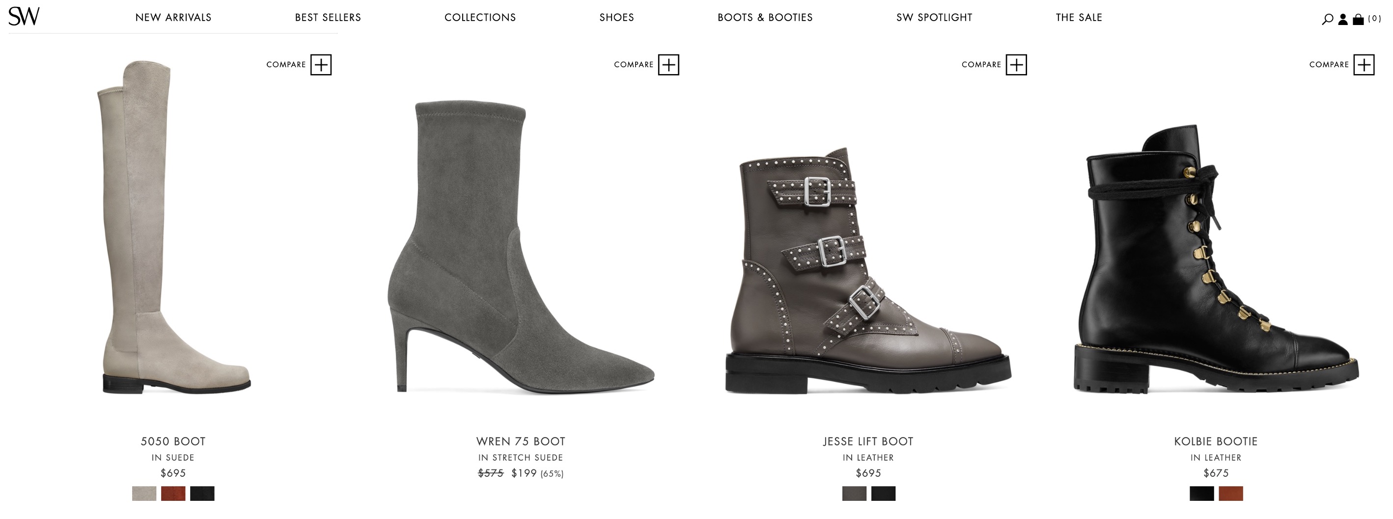
The shoes on designer Stuart Weitzman’s site were extremely consistent: all photographed with flash lighting, on a white background, in the exact same side view. One participant appreciated the photography on the site, because she was easily able to scan through and see which shoes had the heel height she wanted.
“I find this site really well laid out for me. I scan scroll through all the boots pretty quickly to see. […] When I look at heels on this site, I can immediately tell the heel height. Like this one, it’s too tall, so I don’t want that one. I find it very easy. I know what I like, so I can go down and pick out anything with lower heels, which I would wear.”
Consistent photos don’t have to be identical or boring — they just have to feel like they’re all in the same style. For example, Aritzia used an edgy, fashion-magazine style with unique poses and backgrounds. Despite the diversity of poses and backgrounds, Aritzia still managed to achieve a cohesive feel by ensuring that all photos had a similar visual style — urban and editorial, like you might see in a fashion magazine.
One participant appreciated the creativity in the photos.
“I think a lot of other clothing brands don’t really put a lot of work into modeling. And they’re just kind of standing there. But on this site, they’re in all different positions, sitting, standing… They’re different, not cookie cutter. They have different backgrounds: in the city, outside, different models, hair colors. It’s more creative than the average clothing store. It isn’t all monotone.”

Create strict, specific product photo guidelines, and ensure they’re followed by sellers and suppliers. For example, Amazon did a good job of keeping its photos roughly consistent, despite its enormous number of sellers.


Specific
Product thumbnail images on routing pages should reflect the user’s expressed interests as much as possible. For search-results pages, product photos should relate to the characteristics from the user’s query (for example, show the blue version of a skirt if the query was “blue skirt”). Also, for both results pages and listing pages, ensure that the product photos match any user-selected filters (like color). These details allow users to see at a glance that the results fit their expectations and builds confidence in the site.
REI.com failed to match the product thumbnail to the user’s exact query. A search-results page for “green water bottle” included many water bottles available in green. However, only a few of the product thumbnails showed green water bottles.

When a user searched for “red sandals” on DSW.com, she saw 302 items returned, all available in multiple colors. Unlike REI, DSW did a good job of showing the correct thumbnail (in this case, red) to match the user’s query.

Dynamic
Providing multiple images of each product on listing pages gives users additional details to help them decide what to click on. Alternate views can be displayed on listing pages using a carousel-style presentation, where a default image is shown and users can click, hover, or swipe to view additional images.
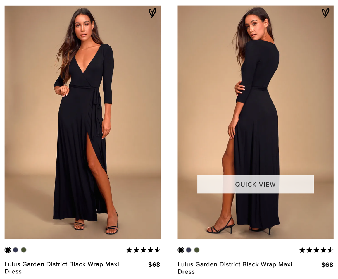
Clothing retailer Lulus.com offered excellent alternate views of its products as users hovered over them. These alternate views included:
- The same item on a different model
- A closeup or full-length shot of the item
- The back view of the item
- A closeup of the item’s fabric to show its texture

To avoid the flicker effect that changing content on hover can create on larger devices, slightly delay the animation to consider the intent of the user. Sites that show alternate product photos immediately upon rollover can quickly become annoying when the images constantly change while the user is merely scrolling down the page or attempting to move their mouse to the filter or sort function.
However, too long of a delay can also cause issues. Consider the speed of the user’s mouse or cursor over the product listing before changing or altering the content: a slower speed or stopped cursor indicates intent to look closer at the product, while moving quickly over a product listing indicates the user was simply moving the mouse across the page and should not trigger the rollover effect.
Contextual
Showing items in the context in which they’ll be used helps shoppers get a sense of the scale and look of the product. For example, this might mean showing:
- Furniture in a room
- Clothes on a model
- Toys next to a child
- Wedding rings on a hand
When one participant scrolled through closeup photos of rings on a jeweler’s site, she was disappointed that they weren’t shown in context on a hand.
“It’s average at best. It just looks like any other boring jeweler’s page. Others put the jewelry on models. It just makes it more real, and it stands out more. I’d like to see these on a hand model.”

Dynamic product-listing photos can help show products both alone and in context. For example, Tiffany’s showed closeup photos of its rings against a white background, like Mignon Faget. However, when shoppers hovered over each product, they could move through a carousel of photos that included the rings being worn by a model.

Inclusive
Customers like brands that share their values. Many study participants appreciated ecommerce sites that employed models of diverse ages, races, and sizes. While this inclusion has an obvious ethical benefit, model diversity is helpful for shoppers as well.
Showing different sized models was particularly useful on clothing retailers’ sites, because the model’s size and body type can have a substantial impact on how clothing looks when worn. On skincare and makeup sites, showing the same product on different skin tones was also especially helpful for participants.
This approach can be expensive, and typically works best for brands with small to medium-sized product inventories.
If your site offers model choices on product-detail pages, consider also offering the choice on listing pages, to help users get an idea of how the clothing might look on them, without navigating to the product-detail page.
For example, the Good American site offered three model choices in size 0, 8, and 16.


Conclusion
Help your customers find products they’ll love on your listing and search-results pages by showing detail and context. Display product photos that are relevant to user needs, and which will help them decide on the best products for them.
For more advice on how to design ecommerce user experiences, explore our Ecommerce User Experience report series.