Users like calculator and quiz tools because such tools offer an opportunity to get expert advice without having to speak to anyone or make long-term commitments. However, these tools quickly become frustrating and get abandoned when they aren’t easy to use.
The following guidelines help you increase the usability, trustworthiness, and usefulness of calculators, quizzes, estimators, converters, or of other similar types of tools. This article refers to all these tools as “calculators.”
- 1. Optimize Calculator-Tool Pages for SEO
- 2. Embed Calculators Directly in Webpages
- 3. Accommodate Variable Amounts of User Input
- 4. Do Not Force Users to Register to Use a Tool
- 5. Provide Immediate Results on the Website
- 6. Facilitate Easy Input Adjustments and Restarts
- 7. Offer to Explain the Purpose of Inputs
- 8. Help Users Understand Inputs
- 9. Contextualize Outputs in Meaningful Ways
- 10. Avoid Misleading Defaults
- 11. Consider Exposing the Algorithm of the Tool
- 12. Do Not Assume AI Is Necessary
- Conclusion
1. Optimize Calculator-Tool Pages for SEO
Incorporate keywords such as "calculator," “quiz,” or “estimator” in the title of the page that hosts the tool. Users looking for guidance frequently start on a search engine and are willing to open a calculator tool directly from the search results, even if they are unfamiliar with the organization.
2. Embed Calculators Directly in Webpages
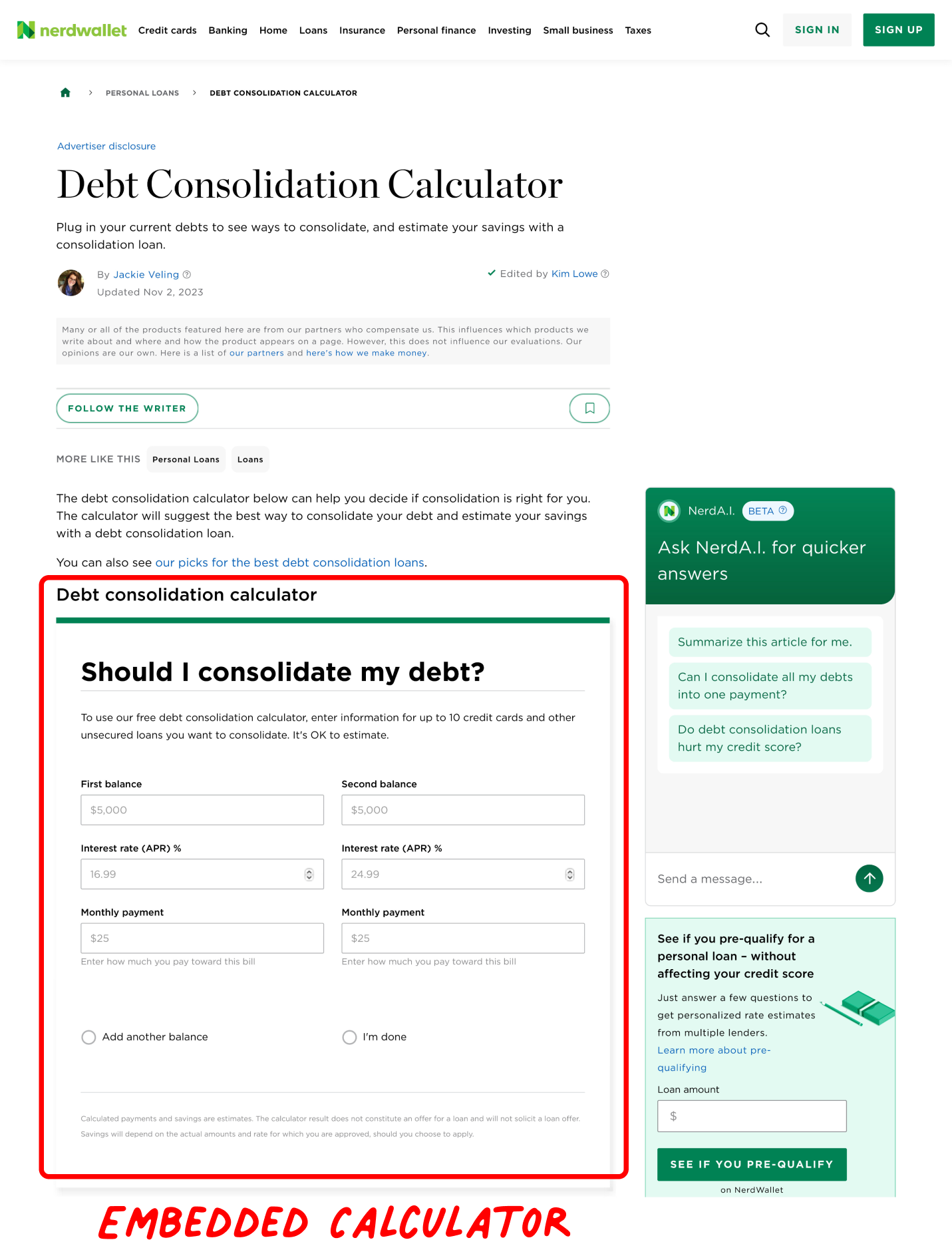
Users prefer tools that are readily accessible and embedded on relevant pages rather than in popups or on dedicated pages. However, the embedded tool should load quickly. Some users in our research skipped over the calculator they were looking for because they scrolled too quickly, and the tool had not yet loaded.
3. Accommodate Variable Amounts of User Input
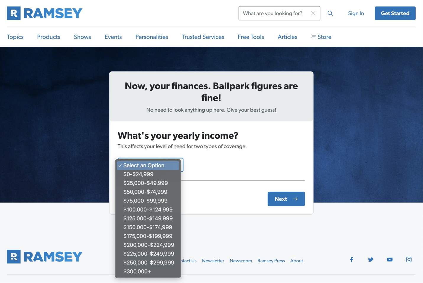
Users assume that the more information they enter, the more accurate the results will be (somewhat like in a filter). However, not all users will be prepared to enter the same amount of information in a calculator. Make only essential inputs required.
Dropdowns and sliders are sufficient when precision isn’t required, such as when indicating a general level of risk tolerance. Open-text fields are essential when users must enter unique, detailed information, such as their monthly budget. When in doubt, let users type things in rather than forcing them to use a slider.

4. Do Not Force Users to Register to Use a Tool
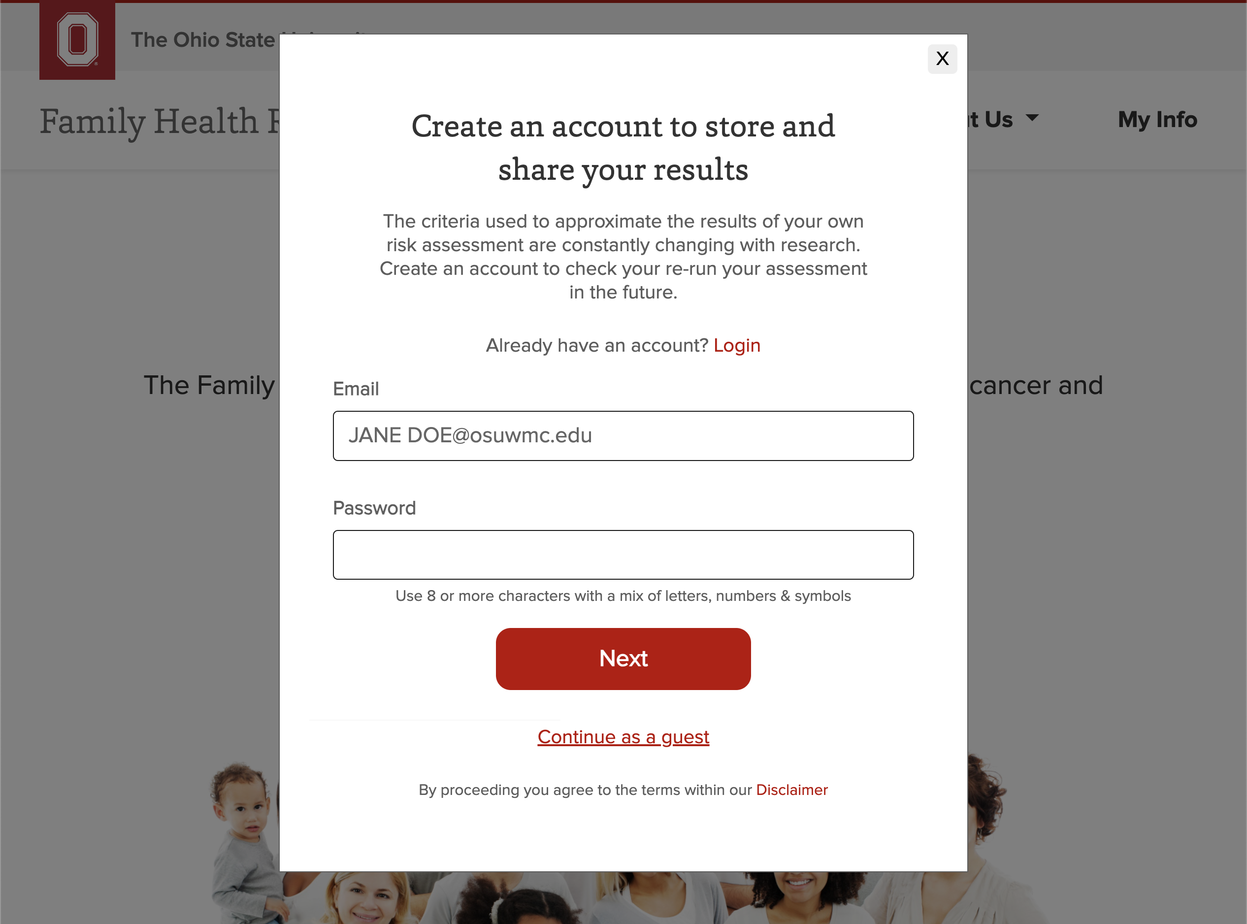
Users commonly turn to calculator tools while exploring information and trying to understand a problem space. They will almost always choose to continue as a guest or otherwise use the tool anonymously when given the option. They don’t want to be bombarded with follow-up communications.
5. Provide Immediate Results on the Website
Users do not like signing up for an account or waiting for an email to see their results because, when they are using a calculator, they are just exploring, not committing. At the very least, present users with their results right on the web page, in addition to any forced registration. Users especially like it when the output is dynamically calculated as they input their information, so they can see how different inputs affect the outputs.

6. Facilitate Easy Input Adjustments and Restarts
Once users have seen outputs, they should be able to:
- Change individual inputs without having to reenter all the other inputs
- Easily erase all inputs and restart the whole process
Facilitating small tweaks to inputs without forcing complete restarts is most important when users have entered more than a handful of inputs. They don’t want to have to start all over in order to make a few adjustments. However, when the tool only accepts a few inputs, users are more likely to want to erase all inputs and start again.
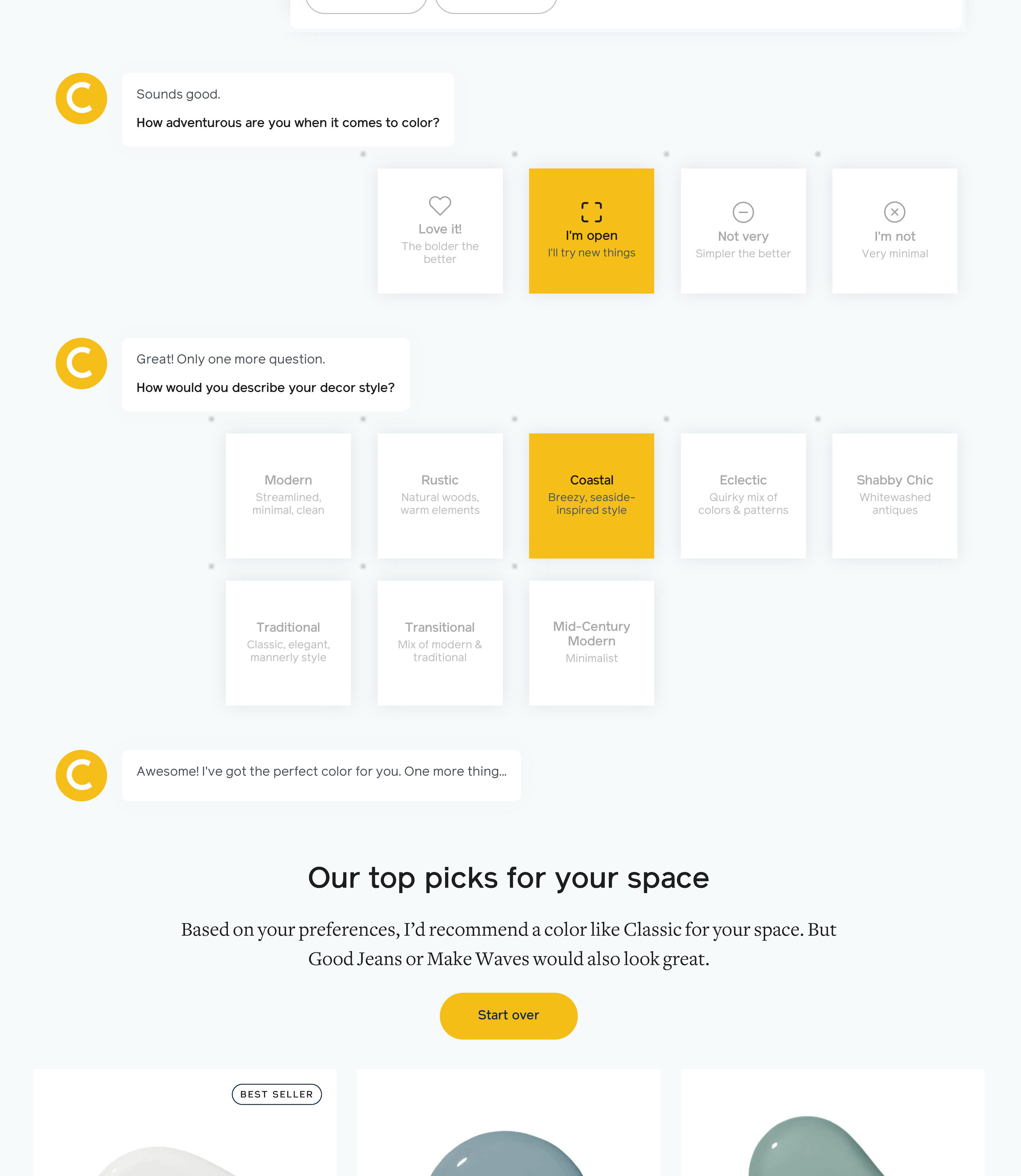
This flexibility supports iterative exploration and helps users understand the impact of different inputs on the outputs — particularly since users often begin by putting in rough, estimated information to gauge the value of the tool. Do not expect users to be wholeheartedly committed to outputs.
7. Offer to Explain the Purpose of Inputs
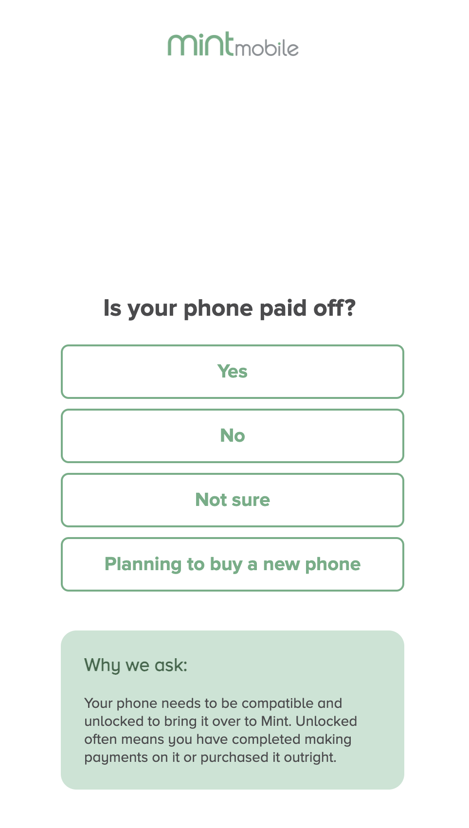
Users are happy to enter information when they understand how it impacts the value of the outputs. However, they hesitate when they feel the calculator is asking for either too much information (because it takes too much effort) or too sensitive of personal information (because they worry about privacy). In both cases, provide a rationale for why the information is important for generating useful outputs to motivate users. This rationale can be visually deemphasized in the interface.
8. Help Users Understand Inputs
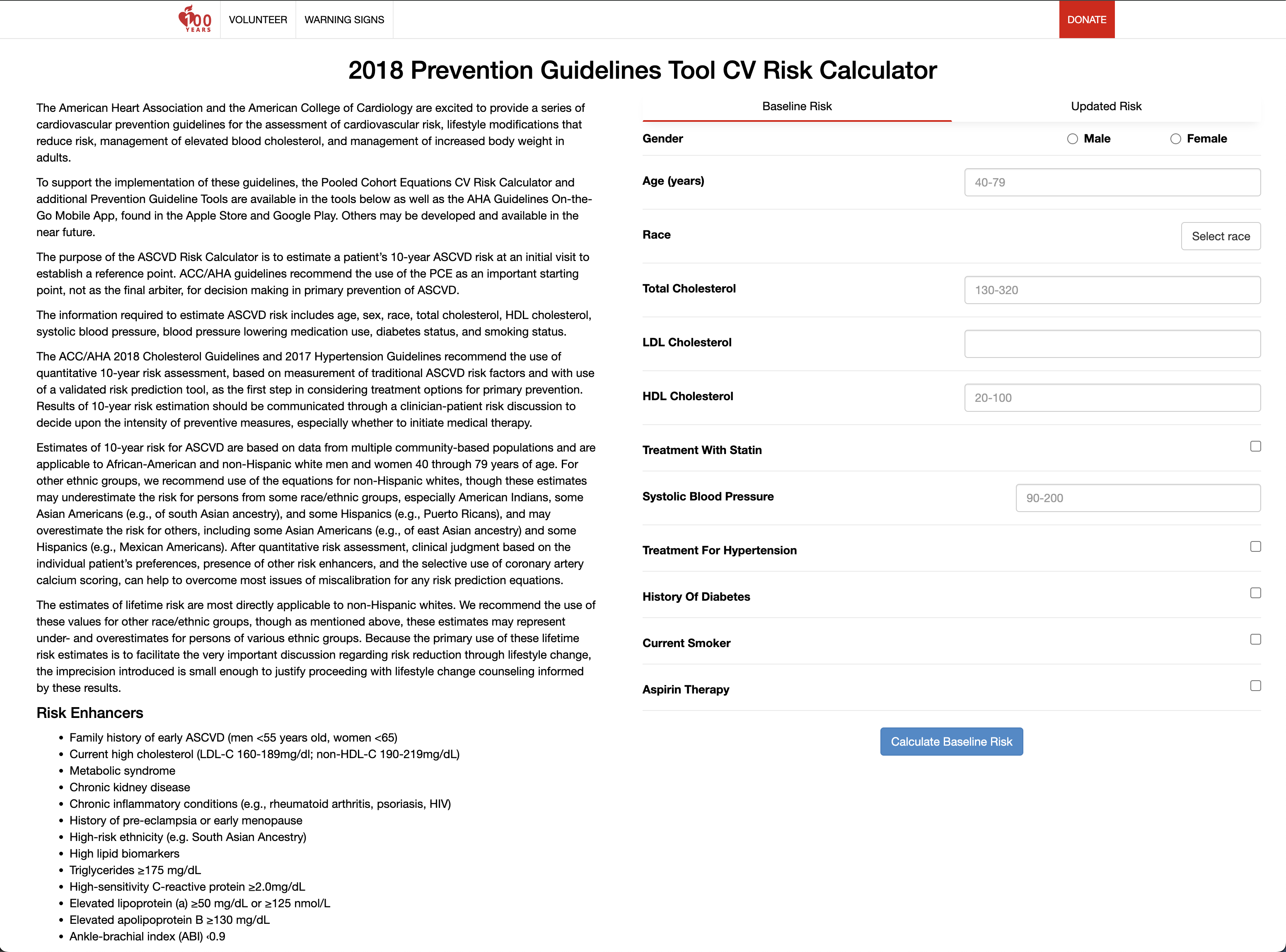
Offer clarifications and examples of inputs if they are likely to be unfamiliar to nonexperts. Such clarifications could include the required format, what others commonly enter, an anchor to decide what’s reasonable, or an explanation of unfamiliar terms. (Do not recommend values when requesting factual information that the user cannot change — for example, the amount of savings a user has, as one investment calculator did).
Clarifications should be in line with the associated input fields, to help users refer to them as they input information. They should not be listed in an instruction block, below or off to the side of the calculator.
9. Contextualize Outputs in Meaningful Ways
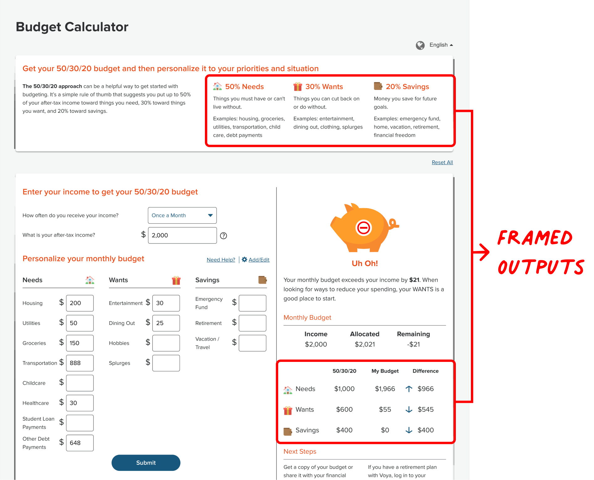
Frame outputs in meaningful ways, offering interpretations or context to make information actionable. Users often turn to calculator tools because they are unfamiliar with the domain and cannot be expected to understand outputs immediately.
10. Avoid Misleading Defaults
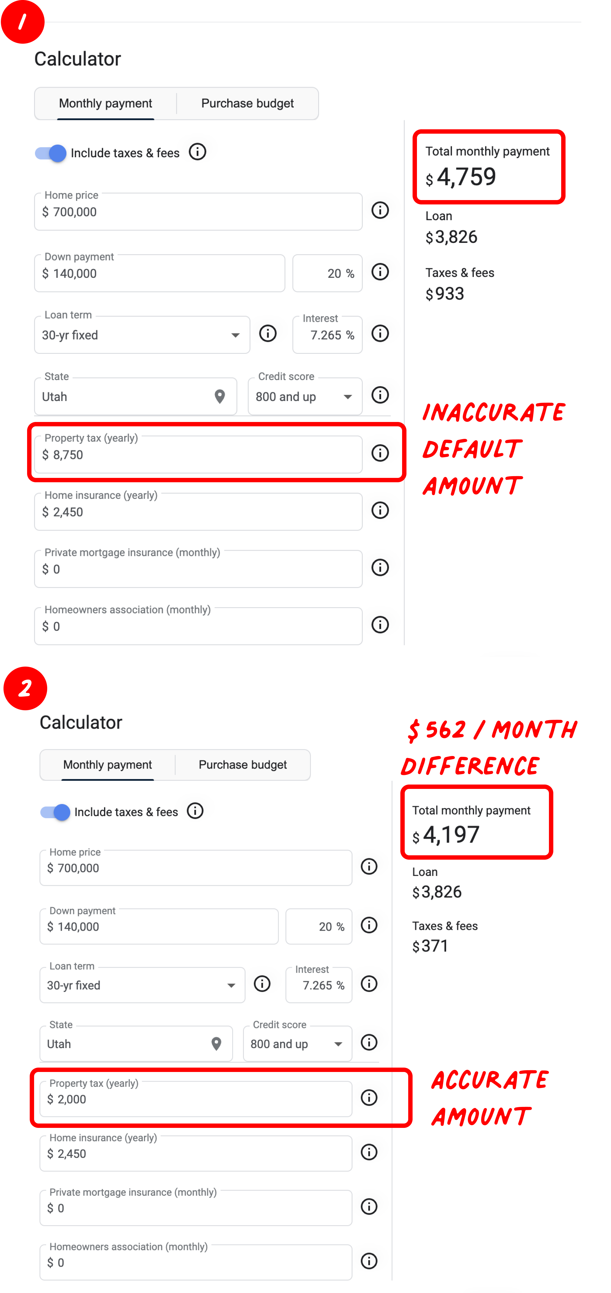
Be cautious with default values that can influence user assumptions about what's reasonable. For example, one user was discouraged to see he could not afford a home while using a mortgage calculator, only to realize later that the default property-tax amount provided by the tool was more than four times the typical amount in their area.
11. Consider Exposing the Algorithm of the Tool
This is not always essential, as many users automatically trust the calculator based on their trust in the provider. However, transparent explanations of how the tool calculates results can enhance user trust and comprehension. A clear understanding of the tool's mechanics can align user expectations with actual outcomes, fostering more effective use.
12. Do Not Assume AI Is Necessary
While AI can add sophistication and power, it isn’t always essential for generating useful outputs. Users’ trust in a tool's algorithms comes from their perceived reliability and usefulness, not necessarily from the use of AI.
Conclusion
Developing a calculator tool can be difficult — especially in complex decision-making domains. However, complex domains are exactly where calculator tools are the most valuable because that is where decision makers struggle the most. Accept as much information as users will provide and iterate the design to generate more and more personalized outputs for differing circumstances.