Providing ways for users to share their thoughts, feelings, and issues during or after an interaction with your site or app helps UX teams plan user research, make design decisions, and improve their digital product’s overall user experience.
UX teams often refer to feedback-survey data obtained during or after an interaction as a voice-of-customer (VOC) program. This article offers guidelines for effective feedback surveys.
1. Task, Then Ask: Tailor the Timing of the Ask
Don’t flood users with intrusive popups asking for feedback as soon as they land on a page. How can they give feedback about their experience if they haven't done anything?
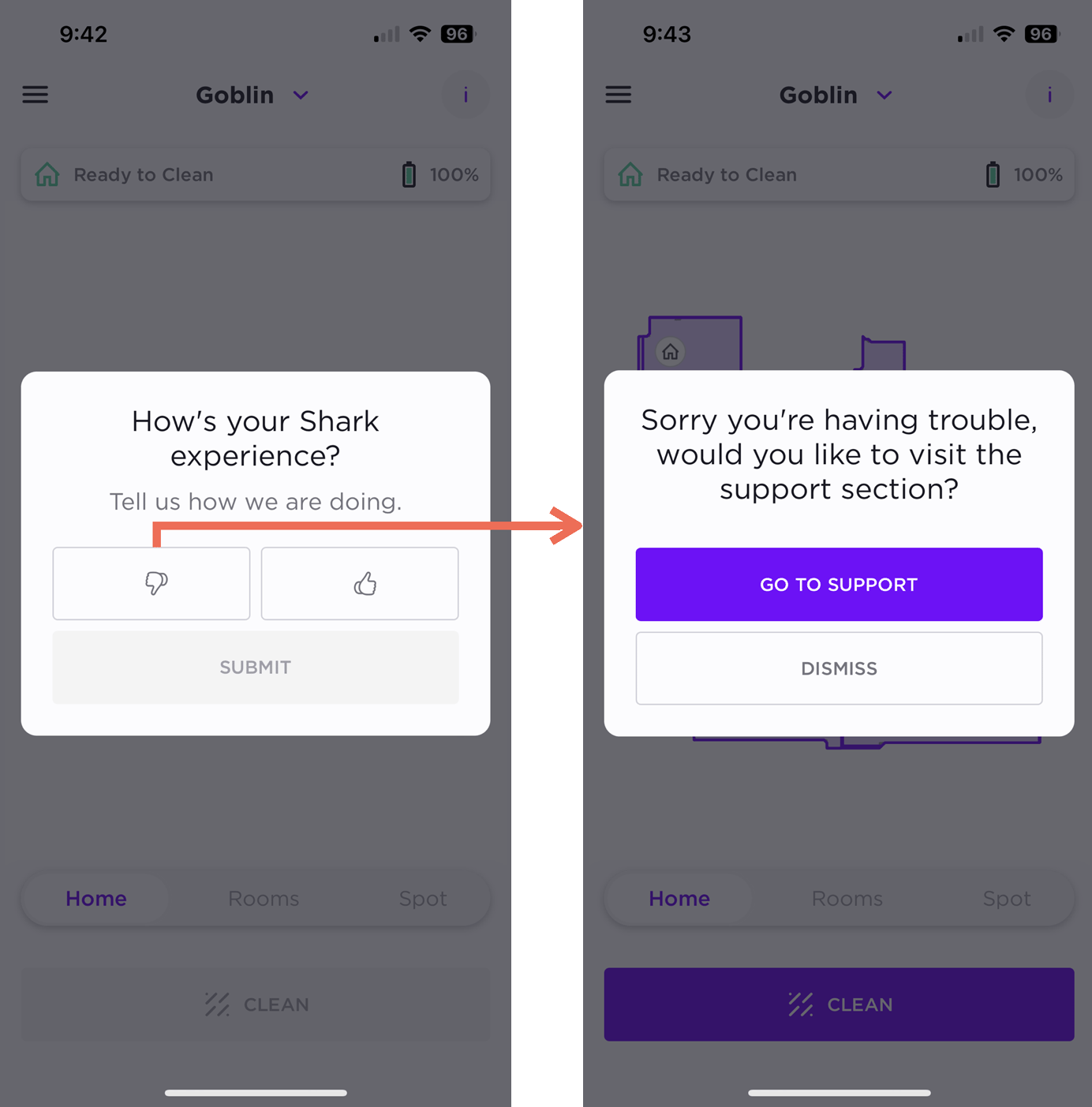
For example, a user encountered a poorly timed feedback popup as soon as he opened Shark’s mobile app to run his robot-vacuum. There was no neutral option in the feedback prompt, and he was forced to make a choice before using the vacuum; he couldn’t skip it! The user chose the thumbs-down feedback option, largely because of the popup, and was directed to Shark’s Support section. This flow insinuated that, because the user chose the thumbs-down option, it was his fault for not understanding how to use the product. A better approach would have been to ask the user for feedback after running the vacuum and providing a form field to elaborate on their positive or negative reaction.
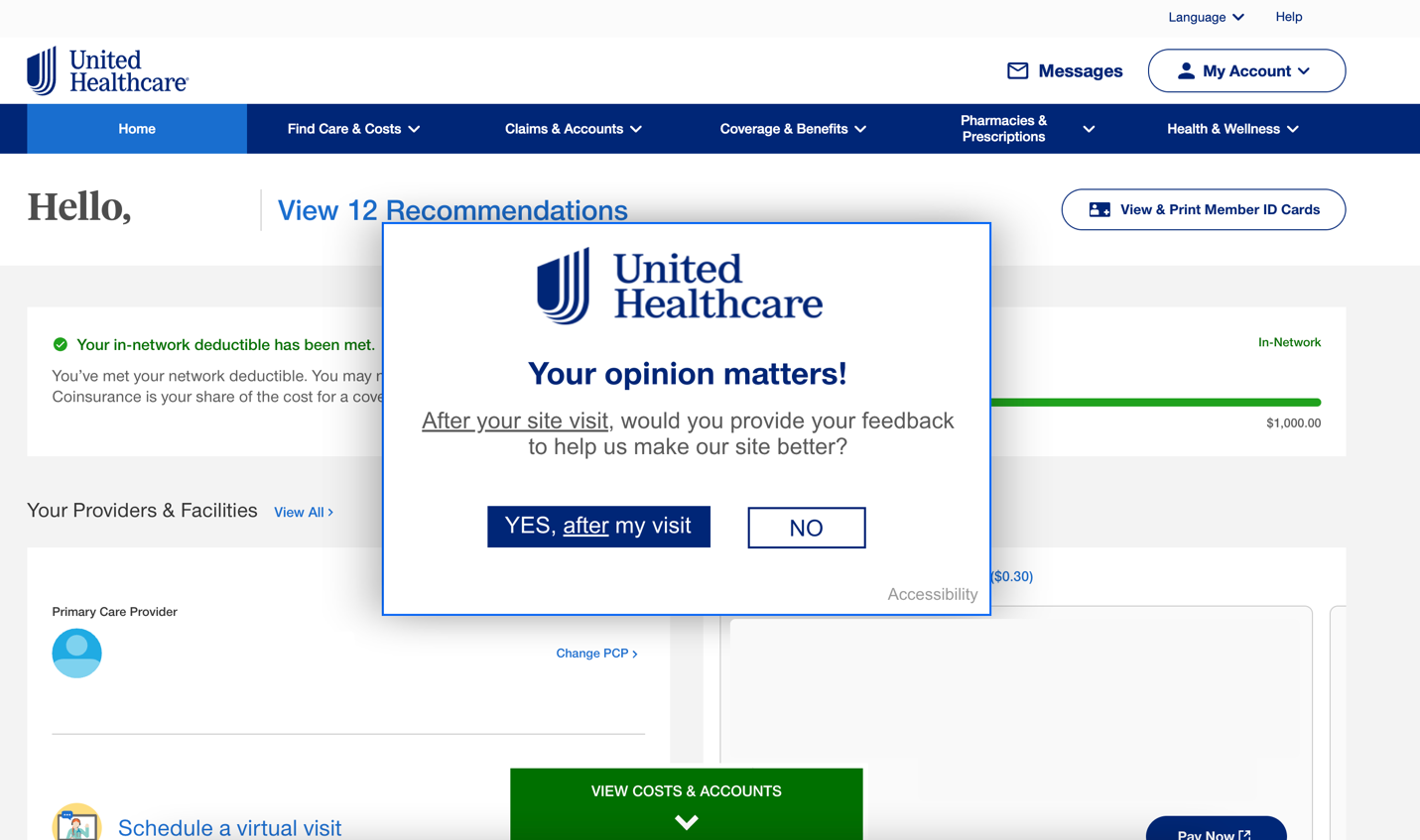
Interrupting people right away is annoying and decreases the likelihood they'll provide real feedback after completing a task. It also increases the likelihood that you’ll get low-quality or irrelevant feedback. United Healthcare and Xfinity interrupted users at the beginning of tasks to ask if they would provide feedback afterwards. Though this may seem better than disrupting users to ask for feedback right away, it’s still an unwelcome distraction and something users are not likely to remember after completing their main tasks.

Wait until after users complete a real task to ask for feedback. Ensure the request is subtle and does not obstruct important information they need to reference. Include easily accessible, on-demand features, such as a small Feedback tab on the right side of the page, so users can provide feedback when they’re ready or even if they dismissed the initial request. Remember: task, then ask.
Southwest Airlines’ website asked for feedback after users completed key tasks such as booking a new flight or canceling an existing one. The request for feedback was contextually relevant and appeared at the exact right time — when the user was done with the task. Additionally, the feedback prompt did not get in the way of important information like the flight’s confirmation and the flight credits. In case of accidental closure, a feedback tab on the right side of the screen was available for relocating the feedback prompt.

2. Ease the Eager Emails
Avoid sending incessant emails asking users for feedback after every minuscule interaction they have with you. As organizations realize the value of asking for feedback after users have interacted with their products, users are becoming overloaded with feedback-request emails.
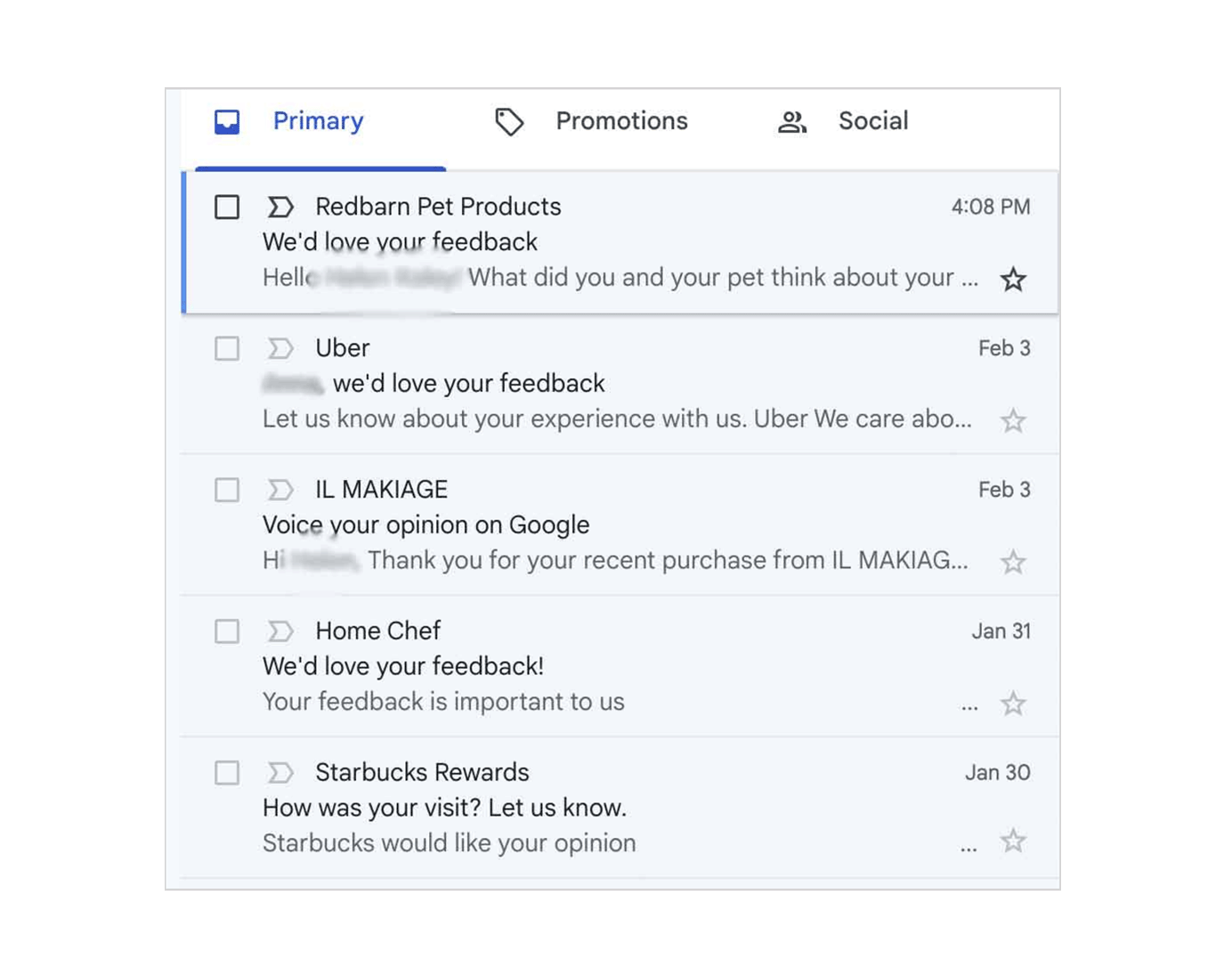
Send emails only after make-or-break moments, like an important phone call with customer support, completing an online training course, or picking up an order. Instead of defaulting to email, ask users for feedback in the same channels where their interactions took place. For example, if they interacted with your company via a mobile app, use a push notification after the interaction to ask for feedback.
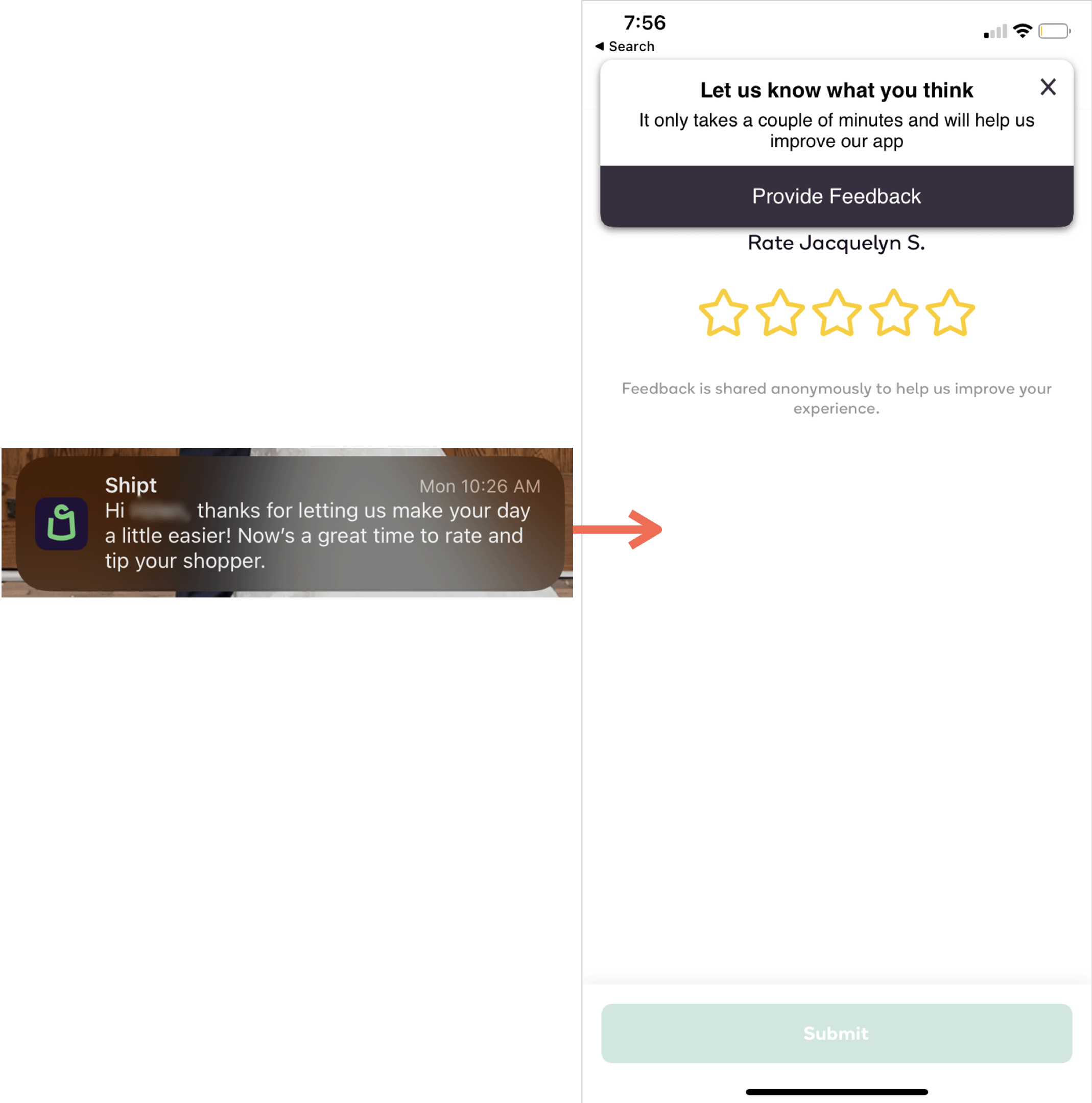
After users placed an order with the grocery-delivery app Shipt, a push notification invited them to rate their Shipt shopper and give a tip. This approach is the right one — except for the fact that, once the user tapped the notification to rate the shopper, another popup immediately asked for feedback about the application experience. It would have been better to ask for this feedback after the user had finished rating the shopper.
Even better is to allow people to choose how to give feedback. Some users may find that a push notification is less intrusive and avoids cluttering email inboxes and texts, while others may find clearing out app notifications to be just as cumbersome. Offering users options and a choice in how they provide feedback in the experience increases the likelihood of getting honest feedback. For some interactions, a text, a social-media message, or even a phone call may be more effective, feel instantaneous, and help offset the feeling of excessive emails.
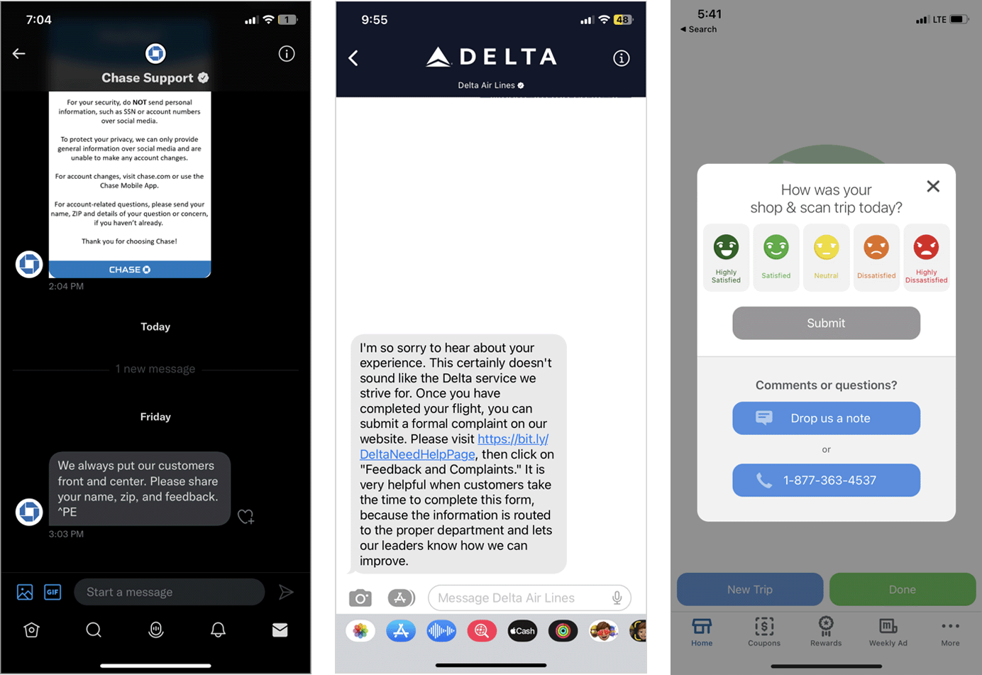
For example, Chase Bank’s customer support on Twitter offered the ability to share feedback about a social-support interaction, Delta Airlines asked for feedback via text message, and Meijer Grocery Stores’ mobile application allowed shoppers to share feedback either through an in-app message or through a phone call.

3. Keep Surveys Short
Long surveys aren't helpful: either for UX researchers or for users filling them out. 20 questions will yield a lot of information for you to keep track of and analyze. On the user’s side, there's nothing worse than wanting to report a broken link or that the experience was easy, only to be met with 10 pages of required survey questions.
A feedback survey should take around 1 minute to complete. In our research, we commonly saw timeframes of 2–3 minutes, which are too long for users. Aim for quality over quantity.
Tell users how many questions the feedback survey will include and how long it will take to complete.
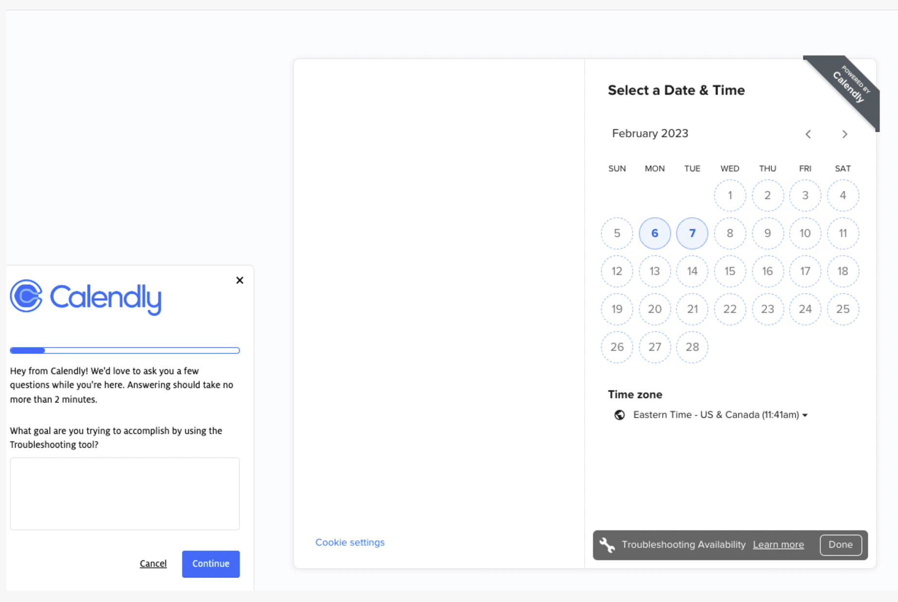
In the meeting-scheduling tool Calendly, after users clicked on a troubleshooting feature, a popup appeared stating that giving feedback would take no more than 2 minutes. 2 minutes is too long for a professional in the middle of a busy workday! Additionally, the progress indicator suggested that the survey was long and likely to take much longer than 2-minutes.
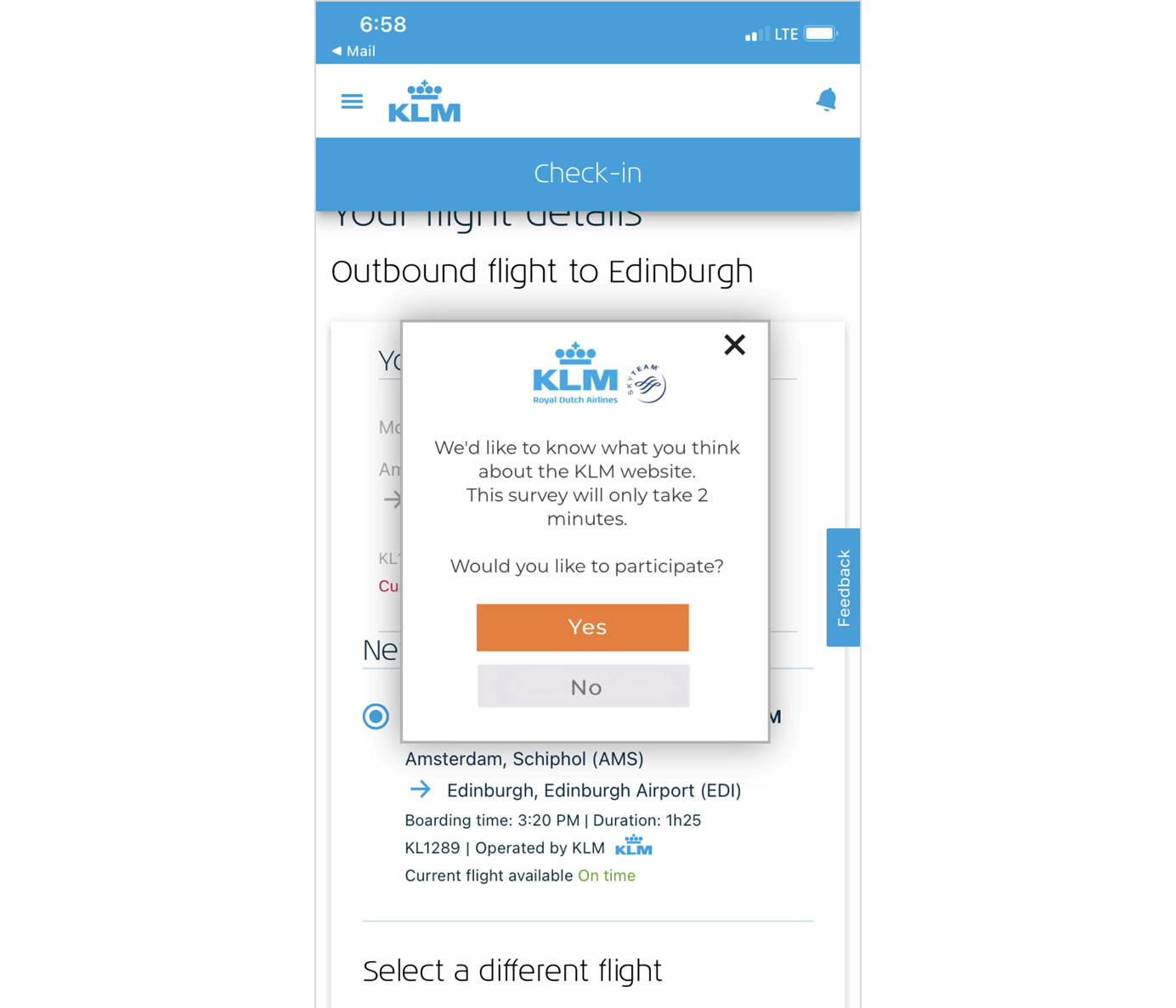
In another example, a user was checking in for a KLM flight after a series of delays and changes. In the middle of the check-in process, a popup appeared, requesting 2-minute feedback about the website. This is the last thing a customer would want to do after numerous delays — take 2 minutes to interact with a survey instead of checking in!
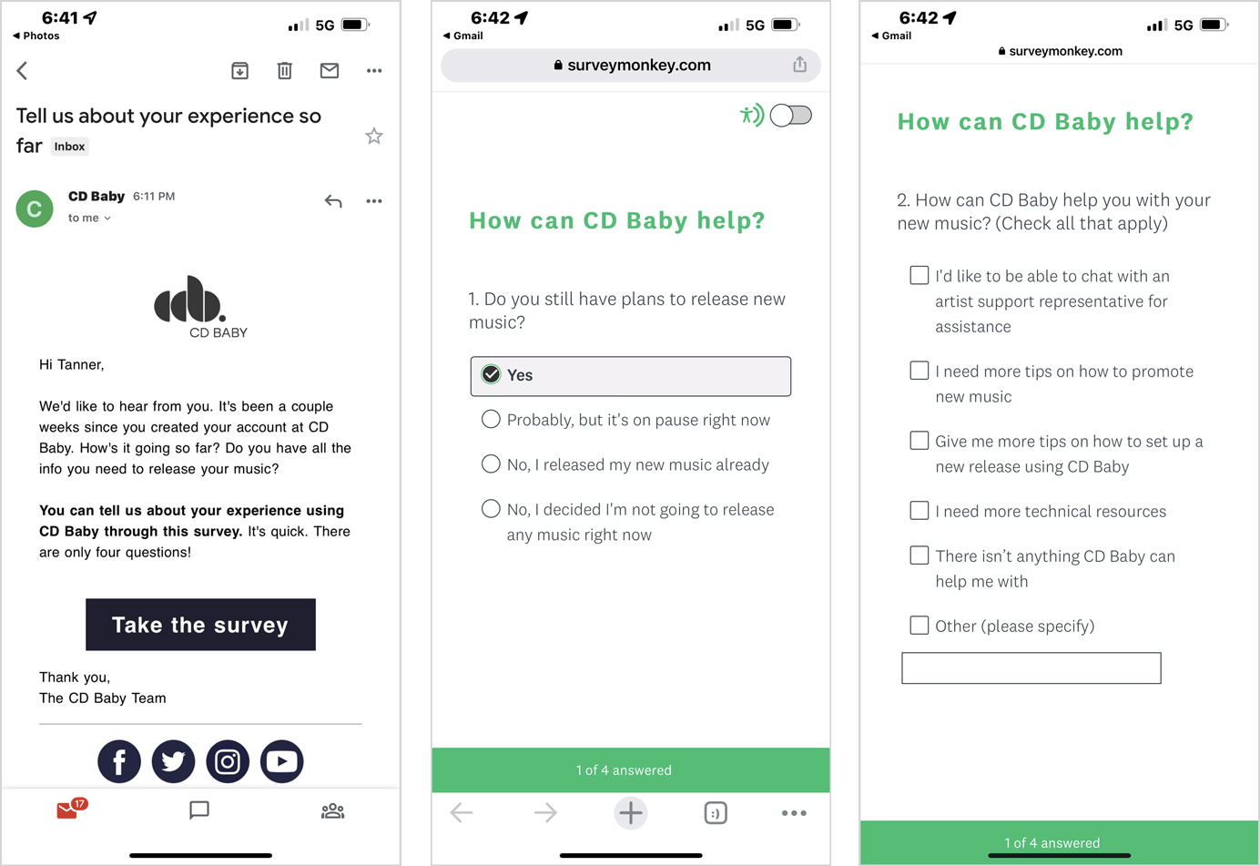
CD Baby, an online distributor of independent music, asked users for feedback via email several days after they created an account. The email copy set users’ expectations for the interaction by saying It’s quick. There are only four questions. An even better approach would be to use the numeral 4 in the email copy, instead of writing out the word, four, as online readers skim and scan for visual clues.

4. Offer Flexible Feedback Formats
Question formats can include:
- Clickable ratings such as numbers, stars, thumbs up-or-down, or smiley-faces (Always clearly indicate which options represent positive feedback and those that represent negative feedback.)
- Multiple-choice survey questions with either single-select or multi-select answers
- Open-ended questions
Closed-ended questions like ratings and multiple-choice questions are easier than open-ended questions; however, along with the structured options, you should offer an optional form field where users can freely type their feedback. In this way, they can provide comments or describe issues that were not captured in the closed-ended questions. Include a character limit on the form field to promote concision and efficient feedback analysis.
Place the form field at the end of the survey: if people see an open-ended question at the very beginning, they may feel it’s too much work to answer it and may abandon the flow.
For example, after making a purchase, a user received a feedback request from Ikea. The email communicated the value of the user’s feedback and how it would be used, but, upon landing on the survey, the user was met with an open-ended field. He said, “I will admit, that first open-ended field was a bit annoying. It's not very motivating to type a whole thing when you are hit with such a broad prompt.”

You can also present optional form fields after qualifying questions. For example, if a respondent selected Yes to the question, Did you encounter any issues today?, an optional form field can appear to give them the opportunity to describe the issue.
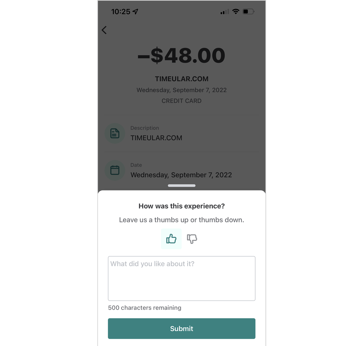
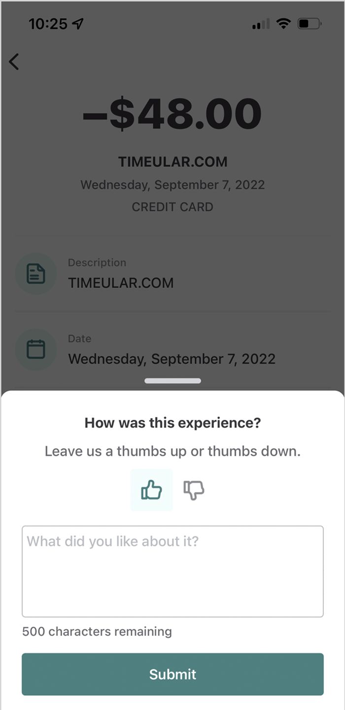
The expense-tracking mobile app, Mint displayed a feedback prompt after a user changed the category on an expense. Since the user had finished his task, the timing of the request was appropriate. The simple, easy-to-answer survey offered a thumbs-up or thumbs-down option and an open-form field where users could type additional information. The character counter gave users enough freedom to provide feedback, while effectively preventing oversharing.
The Sonos website used a subtle, unintrusive request for feedback that took users to a simple 5-question survey. The survey included single-select questions and a series of ratings. On each rating scale, values were marked to indicate which end was positive or negative.

5. Appreciate and Incentivize
Users don't have to give feedback: they can simply complete their task and go about their day. When you ask for feedback, use microcopy to briefly explain how it will be used — hopefully, to improve the experience, so it's faster, easier, and better next time. Express gratitude and appreciation for the time users take and, to drive participation, offer an incentive, like loyalty points or a discount on their next purchase.
For example, after a user placed an online order and picked it up from the store, Starbucks sent an email asking for feedback about the omnichannel journey. The email expressed appreciation and mentioned that it will use the feedback to make the experience better. It also explained that survey respondents could enter into a sweepstakes for a chance to win a $100 gift card.

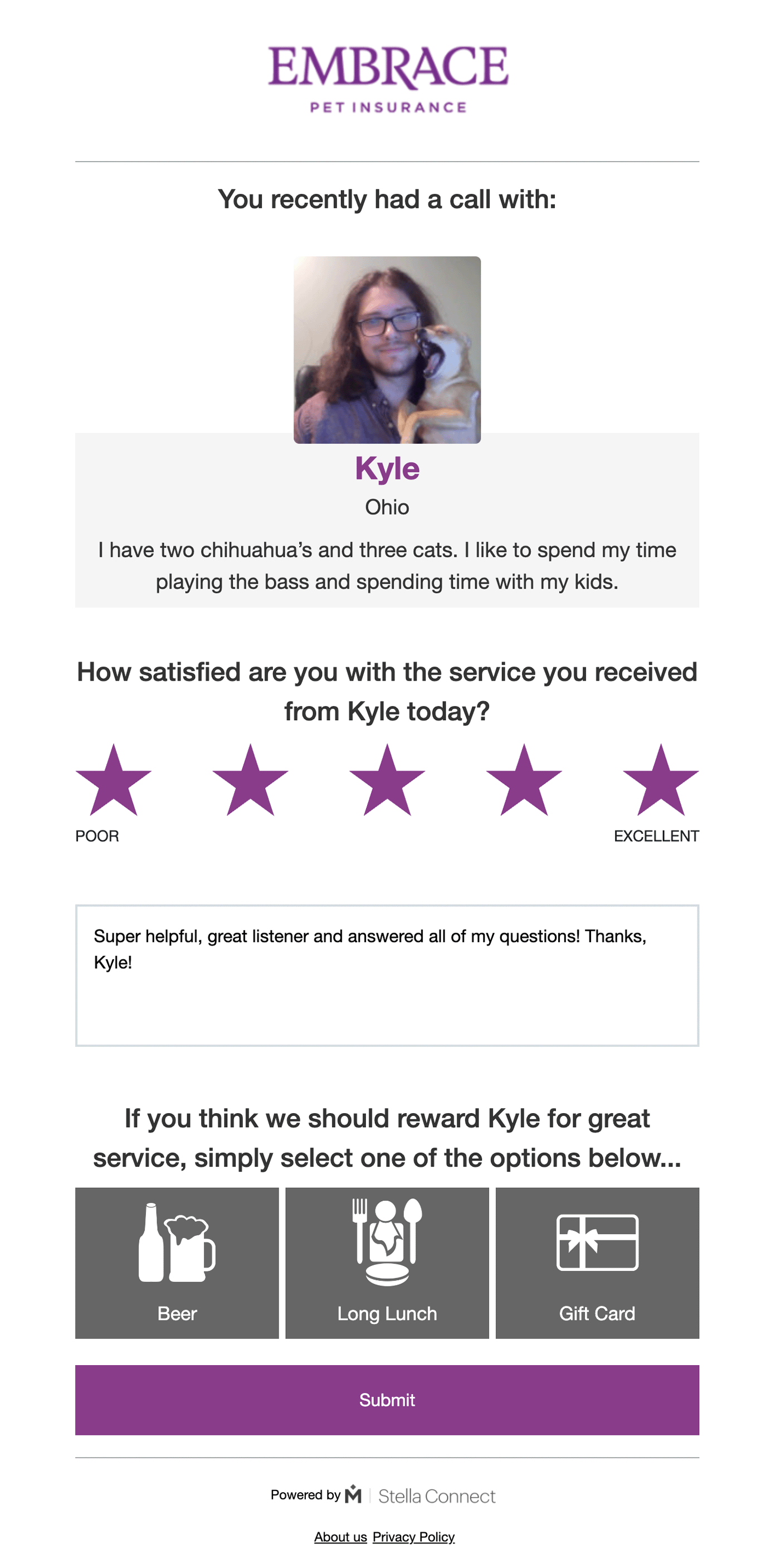
Additionally, where appropriate, allow users to express their satisfaction by directly rewarding the store or customer-service associates with whom they interacted. After all, these people have one of the hardest jobs! For example, Embrace Pet Insurance asked for feedback about a phone call with customer support. As part of the request, the user could rate the overall interaction, provide comments, and reward the customer-support representative with a beer, a long lunch, or a gift card.
Analyzing the Feedback
Read through the feedback on a monthly or weekly basis and group similar pieces together to find patterns, themes, issues, and insights. An ongoing approach to analysis will help you prioritize where you need to fix bugs, resolve UX debt, or conduct more user research. And, when the feedback is positive, you’ll know when to congratulate your team for a job well done!
Asking for users' feedback during or after they interacted with your product is also an efficient content strategy, as it can help you understand how you can improve your content to address users’ questions.
Time and budget for formal user research are only sometimes available. Integrating the ability for users to asynchronously share positive, negative, or neutral feedback gives you ongoing feedback and user input about the experience they have with your products. However, it shouldn’t be the only way you get feedback; use the findings to direct and prioritize in-depth user research.