
UX visualizations (commonly referred to as UX mapping methods) are artifacts that describe various aspects of a product or processes associated with it. There are many different types of UX mappings: empathy maps, customer-journey maps, service blueprints, and roadmaps, to name a few.
Each map has a unique purpose and, thus, varies in structure and content. Though many of these maps begin in rough formats (for example, as a set of sticky notes or a collaborative spreadsheet), they are often transitioned to a polished form in order to be shared with others. This article outlines some visual-design tips for improving the appearance of your UX maps.
When the Visual Design of a Map Matters
There are times when it doesn’t make sense to take time to polish a map. For example, imagine you are working with crossdisciplinary peers and realize, as you are prioritizing work, that you all have different ideas about what your users do. A solution may be to create a customer-journey map to bring everyone on the same page. In this case, the collaboration and discussion are more important than the map and investing time in the map’s visual design is not necessary.
However, it makes sense to spend time polishing a map if:
- There will be many people seeing the map. The bigger your map’s audience, the more polished it should be. This is often the case for maps that are broadly distributed as a single source of truth. It’s worth spending the time to make sure the map can be easily understood, especially since many will consume it on their own, without anybody there to answer questions or point out the most important insights.
- The map will be public-facing, not just an internal artifact. If your map will be distributed widely to clients, third-party partners, investors, or board members, it’s a good idea to refine its visual design.
- The map’s stakes are high. Stakeholders often equate a polished visual appearance with legitimacy. If there is a lot weighing on the success of the artifact and you need buy-in to move forward, creating a refined, “official”-looking artifact can increase perceived legitimacy.

Choosing a Tool
The best tool will depend on your expertise, what you already use, and your goal. When choosing a tool, consider the following factors:
- What do you already have and use? Choosing a familiar tool will be easiest, as you won’t have to both learn a new tool and design a UX map. Some creation tools include slide decks (e.g., PowerPoint, Keynote), spreadsheets (e.g., Excel, Google Sheets), and wireframing tools (e.g., Figma, Sketch, Adobe).
- What is your primary goal? If you have multiple tools to choose from, ask yourself what your primary goal is with the map. Do you want the map to be easily shared with others? Do you want others to contribute and maintain it over time?
Identify the primary obstacles you will face when creating and maintaining a UX map, then choose a tool with capabilities to overcome those obstacles.
Creating a Consistent Visual System
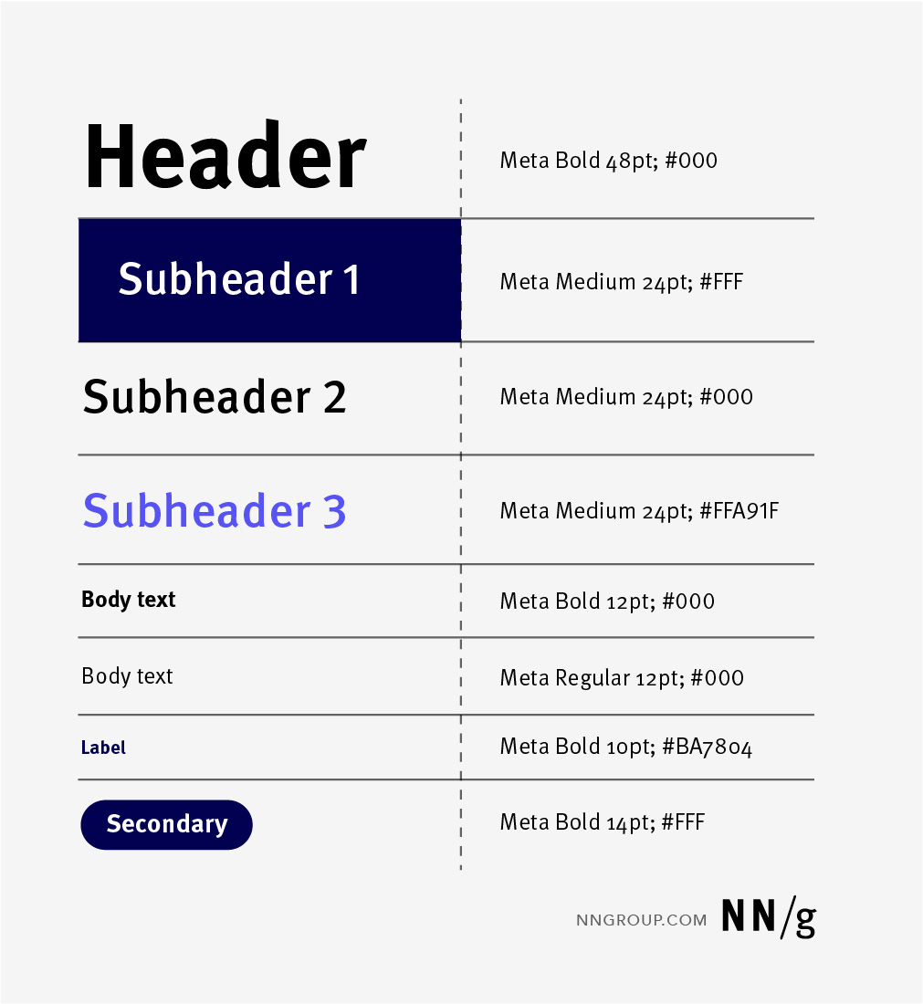
Start by designing a visual system for the map. It may be tempting to jump right into plugging in your content, but a visual system will reduce the choices you have to make later and will ensure you stay consistent as you create your map.

Make styles for:
- Header text: This will be the style of your map’s title text. You will need to decide on the typeface and text size. The header-text size can range up to 60 or 80 pts depending on how big your artifact is and how long your title is. Assuming that your background is white, your header text should be black for easy reading.
- Primary text: This text will make up your body copy. Unless you are an experienced visual designer, you will most likely want to use the same typeface for the header and the primary text. Depending on how much content your artifact includes, the primary-text size can range anywhere from 12 to 18 pts. The more content you need to include, the smaller the text will need to get. Try not to go below 12 pts, as small-sized text is hard to read. Primary text should also be black (assuming your background is white).
- Secondary Text: This text often lives in shapes (likes rectangles or squares) or bullets and can be colored so that it’s easy to distinguish it from primary text. You can have multiple styles of secondary text if your artifact is robust. Once again, be mindful of the contrast with the background and of the text size.
- Arrows and Lines: Arrows and lines show relationships between different map elements or separate distinct conceptual groups. Include the different variations (e.g., solid or dotted, varying line weights, arrow ends), so that they are used consistently throughout the map. Assign one use to each variation.
- Labels: Labels are identifiers for quadrants, swim lanes, or axes. Labels differ from primary or secondary text because they explain the map format, rather than the map content. Hence, text that serves as a label should be different from your primary or secondary text — for example, it could be bold, italic, or underlined. Labels can sometimes be a bit larger (16—22 pts) than primary text.
Then create a color system by selecting the following elements.
- Color palette: Color palettes are a range or set of colors that work well together. Some organizations will align their UX map’s colors to their company branding, while others will create a color-coding system to communicate important map attributes. For example, for a recent client project, we established a different color palette for each persona and, for all maps related to that persona, we used the corresponding color palette. In this way, anyone reading the map could immediately tell which persona that artifact referred to.
- Color application: Often, in mapping artifacts, color is intentionally applied in several ways. For example, you may different user types and assign a different color to each. Or, you can have a multistage map in which each stage has a different color.


Building a Foundation
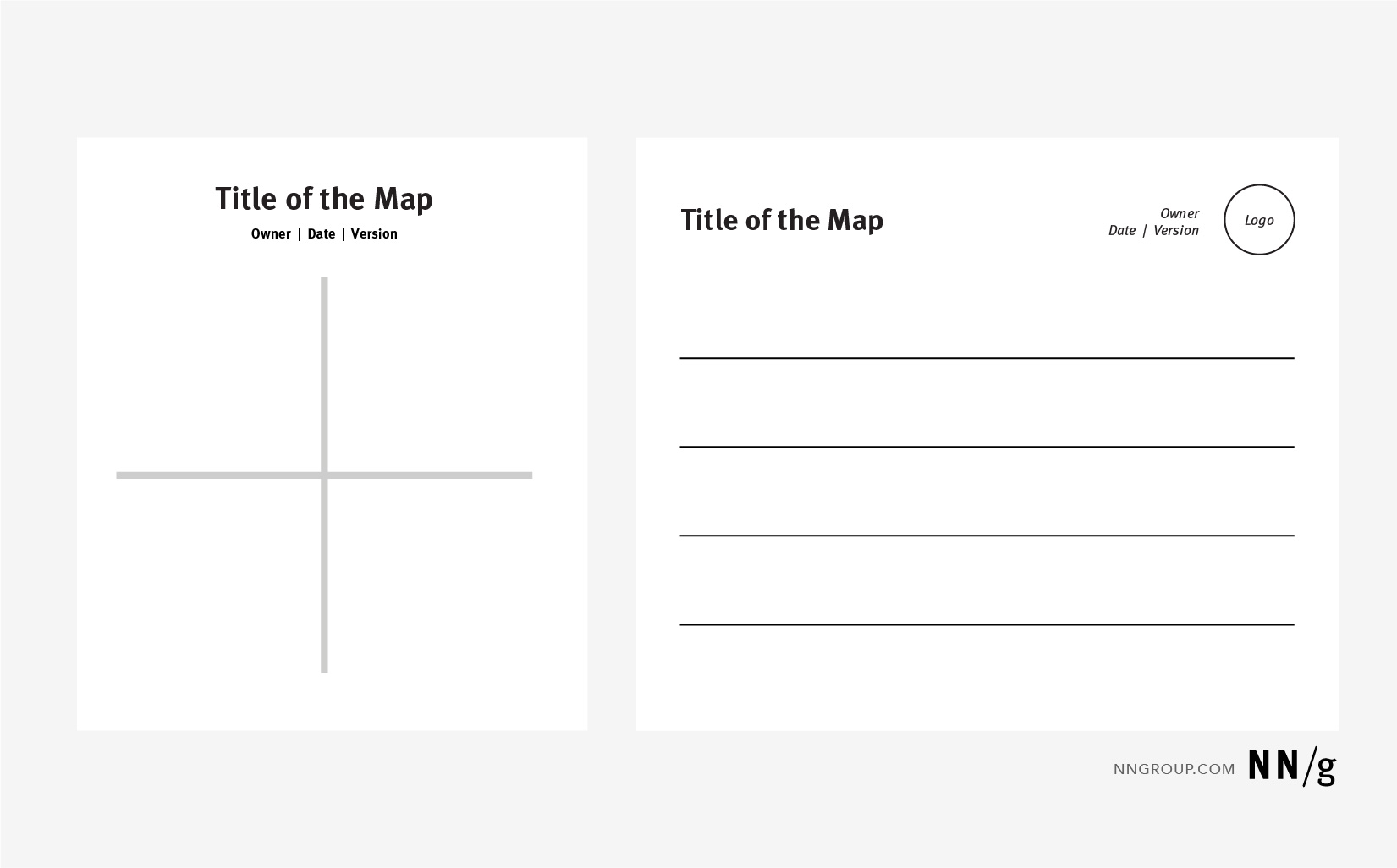
Now that you have a visual- system, you’ll want to build a structure for your map. The foundation is made of the following two elements:
- The context. Include the title in your header-text style. Add an owner (usually the creator of the map) and the date you created or updated the map. This information should be a secondary-typeface style to visually show it is less important but related to the title.
- The structural lines. Consider the skeleton of your UX map. Some UX maps follow a swim-lane layout, others are matrices. Structural lines visually represent the map’s framework and serve as the foundation for your content. The structural lines of your map should be thicker and colored in gray or black.
Adding Content
Once you have your visual system and foundation, you can add content to your map. If you already have a rough map, you will need to copy and paste its content into the polished format. Remember to use your visual system.
We recommend starting with your primary content, which includes elements like labels for your swim lanes, columns, or quadrants. Once you have those, add the remaining content of the map. This approach ensures that you are placing content in the right places. Don’t try to get everything perfect yet, as it’s not worth wasting your time until everything is on the map and you have a feel for what you’re working with.
Refining Your Visual
Once all your content is into your map, play with the spacing and sizing of various elements. Depending on the amount of content you have in different areas of your map, you’ll need to move things around and adjust as needed. Think about:
- Alignment. Most tools have alignment features that make it easy to get text boxes and other shapes perfectly aligned.
- Distribution. Components within the same group should be evenly distributed across the swim lane or row (meaning that there should be equal space between various elements).
- Consistency. Follow the visual system you create consistently. For example, if you change the size of a shape in your map, don’t forget to change others. The goal is to keep all components in your map consistent and cohesive. These minute details contribute to the overall polished feel of your artifact.
As you make adjustments, you can layer in additional visual components like fills (solid background colors on specific elements) and icons. We love using Noun Project to get a head start on a visually cohesive icon set. Depending on the tool you are using, you may be able to edit the icon to change its color or line thickness. Having similar line weights for all icons will make them feel visually consistent and intentional.
In some cases, it is beneficial to create a map key or another kind of explanation document to help your audience understand the artifact. If certain icons mean something specific in your map, add a legend to the map to explain what each icon stands for. If you are making several related maps, consider creating a graphic that shows the relationships between them.
Conclusion
Don’t make a map pretty for the sake of making it pretty. Invest in creating a visual system for your map. Once you’ve created a map, it’s important to test it like you’d test an interface. Get feedback and iterate as needed. And later, reuse the same visual system and apply it to a new map.