Informational microcopy helps users understand an interface and complete their tasks. Without clear information, users struggle to make informed decisions and navigate UI effectively. Follow the 3 C's — clarity, concision, and character — to ensure your microcopy delivers what users need.
Clarity
When writing for clarity, make sure your copy delivers the key information clearly and usefully. Treat this goal as the primary task of all informative microcopy; since, without clarity, informative microcopy fails to achieve its purpose.
You can ensure your informative microcopy is clear by considering the following:
- Signposting, so users know their location on the site
- Information scent, so users are informed where to go next
- Relevance, so users know why something applies or is valuable to them
- Appropriate terminology, so users are informed of what words and phrases mean
Example: Mastercard
When advertising credit cards, Mastercard strives to be relevant and use appropriate terminology for its target audience. The following content appeared on Mastercard’s student-card comparison page.
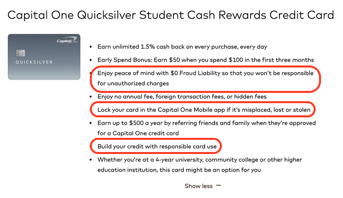
The credit-card industry is filled with jargon and industry standards that people new to credit (like students) may not understand. So, to better address the needs of this specific audience, Mastercard explains common card features like fraud liability, card locking, and emphasizes the card as an opportunity to build credit.
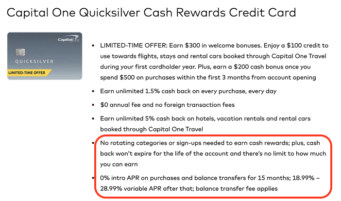
In contrast, the listing on Mastercard’s comparison page for low-interest cards featured more specifics and industry jargon like APR and rotating categories to target the needs of a more general, interest-focused audience.
Concision
Concision ensures that your microcopy is read by busy users and that essential, clarifying information doesn’t get cut off by truncation. Out of the 3 C’s, concision should come second, meaning that a few extra words can be included if they increase the understandability of a phrase or sentence.
Still, concision should not be ignored. Microcopy is, by definition, shorter than 3 sentences, so every word must serve a purpose.
To achieve concision,
- Avoid common errors that unnecessarily lengthen text
- Follow standard character lengths for titles and descriptions, as set by search engines, to prevent confusing truncation or search-engine revisions
- Focus on the words essential to the message and cut down as many of the rest as possible.
Example: Owala
This microcopy from Owala is an excellent example of how to deliver multiple pieces of information concisely. When replacing the Add to Cart button label with Out of Stock - Notify Me on its product pages, Owala leads with the most salient information (Out of Stock), ensuring that users reading the bare minimum understand the barrier to their task. For users with the time to read a little bit further, Owala uses quickly scannable fragments to detail a second piece of essential information, providing users with a solution and getting them back to shopping faster.

Example: World Health Organization (WHO)
Concision boosts both scannability and SERP appearance. For example, notice how WHO’s page title Vaccination Information Hub does not include the article “the” upfront. Adding this extra word would decrease scannability and also increase the title length. Page titles over 60 characters tend to be truncated when appearing in search results.

There are standard character limits for other forms of microcopy, like summaries and descriptions (e.g., 160 characters). These often come from search engines, which prefer meta descriptions and titles that fit neatly in their results pages. Knowing these limits and writing within them in mind, like WHO did, helps prevent titles from getting cut off or rewritten on search-engine page results.
Character
Character refers to tactics like tone and humor, or anything else that humanizes microcopy and makes it memorable.
Character should be the third priority for informative-microcopy writers, meaning it should be considered, but not get in the way of concision and clarity.
When crafting character, focus on your audience. Tailor tone, references, and strategies to their preferences; there’s no universal list of best practices. Start by choosing an appropriate tone of voice, then add other tactics if needed.
Example: Ace Hardware
This header Top Brands Under One Roof, which appears on the Ace Hardware homepage, uses a professional tone but a unique delivery to describe the major brands Ace carries in a memorable way.
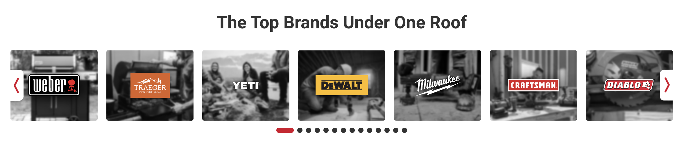
As a hardware store chain, Ace appeals to its wide, yet action-oriented audience by maintaining a standard professional tone focused on no-frill information delivery. At the same time, the phrasing under one roof makes this header stand out without compromising clarity.
Example: OpenAI
Rather than opting for a formal phrase like Sora Launches Today, OpenAI chose a more conversational, casual tone with Sora 2 is here. This strategy helps the brand appear approachable and personable, steering clear of the sense of detachment that AI products sometimes evoke. The straightforward style also gives the news a fresh, on-trend, and practical feel, heightening enthusiasm around this model.

Conclusion
Informative microcopy acts as the backbone and scaffolding for most interfaces, guaranteeing that users know what to do and how to do it. Make sure your writing delivers the essential information as effectively as possible by using the 3 C’s framework.