
Relevant, appealing, and informative images — whether they are icons, illustrations, photographs, or data visualizations — engage users and help them accomplish their tasks. Imagery conveys brand identity and personality, communicates complex concepts, and leaves an impression on users. This article discusses best practices for leveraging imagery in design.
Common Types of Imagery

In user interfaces, four types of images are commonly utilized:
- Photographs are ideal for showcasing products, environments, and people. They add dimension, texture, and realism to a design.
- Illustrations are digitally created visuals that represent workflows, processes, people, or concepts in a more artistic or less overly detailed way. Illustrations may also be accompanied by text or be incorporated into an infographic to convey information effectively.
- Iconography relies on simplified and recognizable symbols. These icons are used to represent menu items, actions, or objects within a system. They offer users more intuitive and efficient visual cues to navigation and interaction.
- Data visualizations are representations of complex data or information. They transform raw data into meaningful visuals and are used to communicate data-driven insights in an easily understandable way.
The images you choose have an impact on the first impression and perception of your brand. They contribute to the overall aesthetic of your site or application and help create an emotional connection with users. It’s important to choose imagery that will resonate with your target audience.
Tips for Using Imagery in Your Designs
Whether you’re choosing imagery from a stock-photo site, receiving images from your internal branding or marketing department, or creating images from scratch, it’s important to follow these best practices:
1. Choose Images with Similar Characteristics
When your design requires multiple images, match their characteristics as much as possible. For example, when choosing photographs, look for consistency in exposure, brightness, and contrast. The result will be a consistent visual experience where no single photo draws the eye too much.

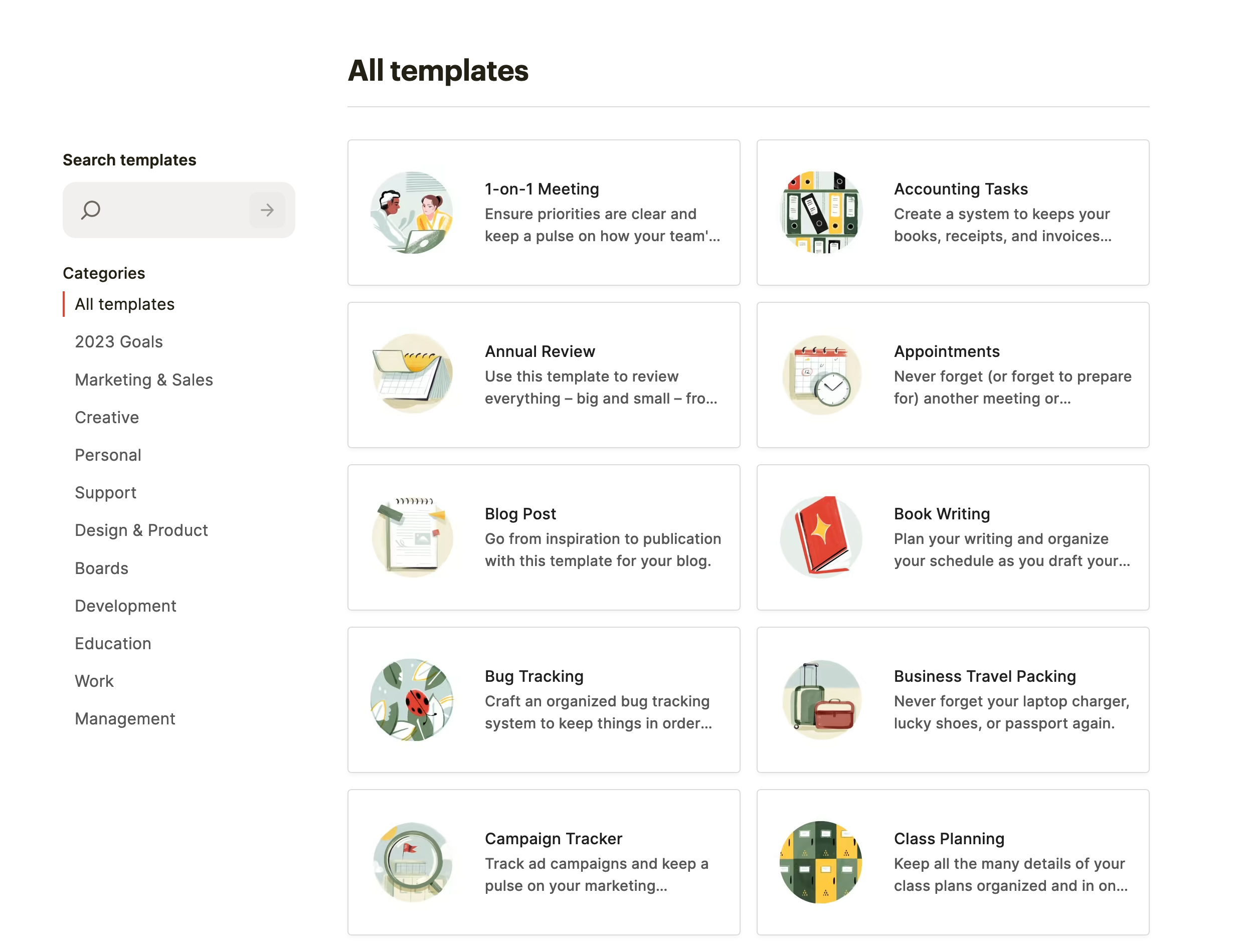
Similarly, with illustrations, pick similar color palettes, levels of detail, and overall illustration style. If one of your illustrations uses bright, jewel-toned colors with no outlines and another illustration uses pastel colors with thick outlines, this mismatch in styles will break cohesion on the page.
2. Match Icon Stroke with Text Weight
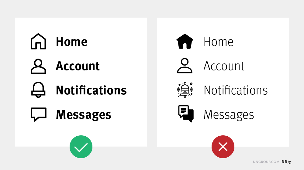
When choosing an icon set, all icons should share similar attributes, such as stroke weight, height, width, type of corners (rounded versus square), or fill (whether they are filled in versus outlined).
You can go one step further by matching your icon set’s stroke weight to the approximate stroke weight of your typeface. For example, if your icons have thicker strokes, use a bold typeface that closely matches the icon set. Or, if your brand guidelines dictate a typeface that is on the thinner side, look for a thin, minimalistic icon set. This way, all design elements will look uniform and no one aspect of the design will pull unnecessary focus.
3. Balance File Size and Image Quality
Images from stock-photo sites or internal-marketing departments tend to be very large, with high resolutions, since it’s always easier to reduce the image size than it is to make it bigger. The images on a webpage are too big if they don’t fully appear as soon as you navigate to that page. If this is the case with your designs, reduce the size of each image, aiming for a total page weight somewhere around 1–2MB. (You can check the total page weight of a site in your browser’s developer tools, which typically provide a summary in the Network or Performance sections.)
On the other hand, you don’t want to make images so small that their quality is degraded. If you’ve made the image’s resolution too low, you’ll notice that the image becomes pixelated, the color detail is coarse, and the edges are jagged, such as in the example below.

Make sure that you resize and optimize images in a design tool or image-editing software. If possible, select images that are appropriate for the intended display size on your website and test how they look on multiple devices.
4. Prioritize Information-Carrying Images Over Decorative Images
Decorative images, such as stock photos, take up space and bring little additional value to the site content. Decorative images can support the brand personality and tone of the site, but they should not overpower information-carrying images.
Information-carrying images, such as product photos or infographics, are used to help make decisions or take in important information. These are the images that users spend time with, examining details, making purchase decisions, or learning about something new. They are most important to showcase.
Also, remember that if your site features a free stock photo, many other sites may utilize that same free stock photo. When users have seen the same image many times, they are more likely to overlook it because they assume that it doesn’t have real value. As a result, they may also overlook other images on your site.
5. Balance Images with Text
Balance is one of the basic principles of visual design. Balance comes into play in the positioning of text and imagery on a page. A balanced design that displays a lot of text will use images that include more detail, such as texture, shadows, and multiple colors. If, on the other hand, your design prioritizes white space over text, the imagery should be simple.


In addition to focusing on the positioning of images on the page, consider the emotions that are conveyed through them. Ask yourself: if you removed all the content and left just the images, would the overall vibe still make sense? When users come to your site for the first time, the images will likely catch their attention before the text. You want to make a good impression.
6. Avoid Unnecessary Graphic Elements in Infographics and Data Visualizations
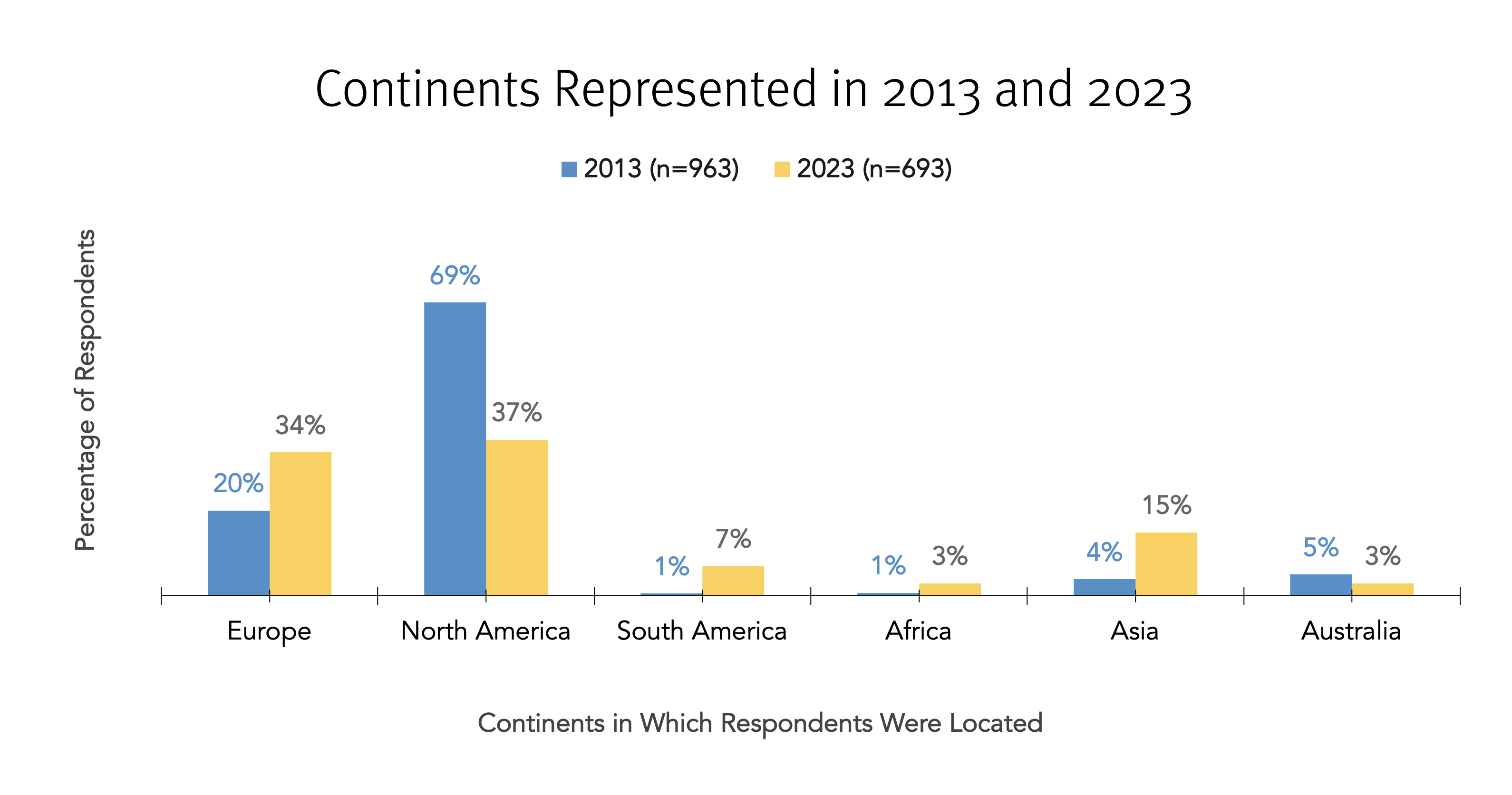
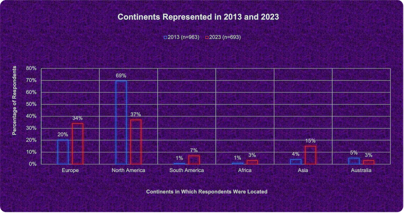
Infographics and data visualizations are born from the need to share a lot of data or convey insights in a simplified and engaging way. It may be tempting to use many colors and graphical elements in these visuals to make them stand out against text content, but unnecessary graphic elements can overpower and diminish the value of these images.
Edward Tufte, a pioneer in the field of data visualization, coined the term data–ink ratio to describe the amount of ink used for presenting the data versus the total amount of ink used in the graphic. Aim for high data–ink ratios — that is, ensure that in your visualizations, you prioritize conveying information without excessive, unnecessary decorative elements, such as shadows, background textures, unnecessary grid lines, 3D, and so on.
7. Provide Alternative Text
There are many visual treatments one can employ for better accessibility — and, in particular, to help users using screen readers to interact with a website. When a screen reader encounters an image, it will describe that image to the user using the provided alternative text.
Whenever possible, write alternative text that conveys the content of the image. Don’t replicate what is already provided in a caption and never use alternative text as a substitute for search-engine optimization.
Conclusion
The use of imagery in visual design plays a critical role in engaging users and conveying brand identity. While visual design often feels like a matter of taste more than a science, following these best practices will help you choose imagery that works well within your designs. And, if you’re doubting the effectiveness of your decisions, test with users.