When Vanguard set out to massively overhaul its mobile app for personal investors, it faced a problem that is common for many digital product teams: the app had several diverse user groups with many different needs. The Vanguard mobile-UX team had to prioritize its work to maximize user satisfaction while balancing conflicting needs and resource constraints.
In an interview with NN/g, Teil Wise (UX and design manager) shared the team’s strategic approach to prioritization.
Background: Vanguard Group and the Vanguard Mobile App
Founded in 1975, the Vanguard Group is a global investment-management company. Vanguard is famous for its index funds, as well as its advocacy for a “buy-and-hold,” passive-investment strategy. This philosophy argues that people aren’t very successful when they try to time the market (i.e., when they attempt to buy low and sell high), so it’s best to buy investments and hold onto them for a long time.
Vanguard’s App for Personal Investors
Vanguard’s mobile app targets its personal-investor audience (as opposed to, for example, financial intermediaries and institutional investors, who are served with other digital products). Vanguard refers to the users and account holders as clients.

A Pivot Towards More Aggressive Digital Investment
Despite its popularity, Vanguard hasn’t historically been known for cutting-edge digital experiences. In recent years, Vanguard’s leadership recognized the importance of customer experience as a key differentiator and set out to change that perception. Leadership’s decision to invest was the catalyst that allowed Vanguard to build out new crossfunctional teams.
Vanguard also decided to launch an upgrade of the mobile app’s tech stack to make it more stable, reliable, and secure. Such top–down support from the company’s leadership was a huge advantage that many struggling product teams lack — without it, it’s extremely difficult to achieve meaningful improvements in UX maturity or customer experience.
However, the scale of these changes (particularly the decision to move to a new tech stack) meant that the Vanguard team wouldn’t be able to deliver small, incremental changes over time — it needed to move to an entirely new app.
Capturing User Needs
As any good design team should, Vanguard prepared for this major app redesign by turning to research. The research involved a combination of online surveys, analytics data, and qualitative usability testing. The team set out to take stock (pun intended) of the wide range of activities that are most important for Vanguard. Instead of focusing only on the use of the current mobile app, the team decided to determine the most critical needs of personal investors across all Vanguard products.
Top Tasks
The team started with a true-intent survey — it intercepted users interacting with Vanguard products and asked them questions about their motivations for visiting.
True-intent survey question:
Which of the following reasons have you had in mind when visiting a Vanguard digital experience?
As a result, the team narrowed down the high-level, top 10 most critical tasks that clients wanted, and that the new app had to support.
Because of Vanguard’s historic affiliation with the long-term, buy-and-hold approach to investment, many of its clients follow that passive-investment philosophy. As a result, the top-task survey showed that most users were using the app to occasionally check the overall value of their investment balances, download tax documents, and contribute money to their investments.
Less-Common Power-User Needs
In addition to this set of simple, common user needs, the team also identified several more-complex tasks that were primarily used by active investors. These individuals wanted powerful, complex tools to analyze the performance of their various assets and track them over time — for example, a tool to compare their holdings’ market indices to see if their assets were under- or over-performing the stock market.
Helping New Investors
When it comes to investing, different people have different experience, knowledge, and comfort levels. People’s behavior patterns also vary depending on their particular investment strategies.
Investing is a complex domain with scary-sounding jargon. The stakes are high because, in many cases, a mistake could have severe consequences for users’ investments or tax bills.
The design team realized that the app could provide some education and contextual help for those clients who were new to investment. This became a core goal of the new design.
“Investing can be very intimidating for most people. We’re trying to make investing more approachable for everyone.” — Teil Wise, UX and design manager
To achieve that goal of helping novice investors, the visual-design team created a strong visual hierarchy to reduce the feeling of complexity in the app.

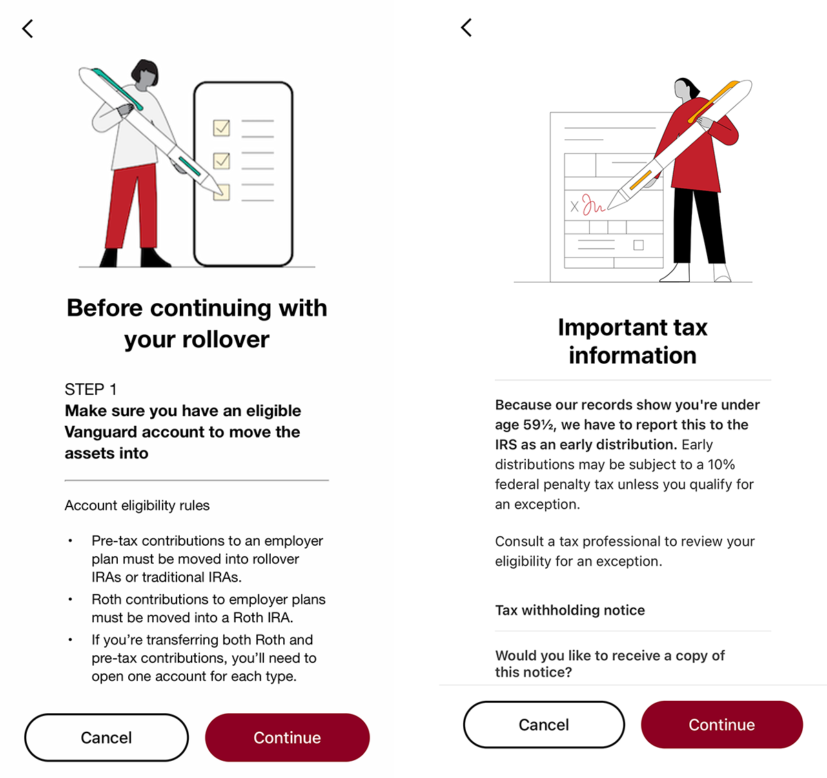
The team also looked for ways to leverage existing user knowledge as much as possible. For example, it gathered design inspiration from contexts other than finance, like eBay and Airbnb. The team’s goal was to use patterns that customers were likely to have experienced in other designs and, thus, to lower the effort required to figure out how to interact with the app.
“Booking an appointment with your advisor is like booking a space on AirBnb. Buying a mutual fund or an ETF — well, people buy things on Amazon and eBay all the time. So, we leveraged common UX and UI paradigms to make sure it [the process] felt familiar. It’s about removing the intimidation, and guiding people through the process.” — Teil Wise, UX and design manager
Prioritizing and Planning
After gathering these research findings, the Vanguard team was left with a complex challenge — supporting the top client tasks and the power-user features, while not overwhelming novice investors with an overly complex app.
Additionally, because the team was moving to an upgraded tech stack, it wanted to migrate all app users over to the new version as soon as possible. As a result, the team decided to use a “crawl, walk, run” approach — deliver the key functionality for 75% of top tasks with the app’s first version, and then slowly build out more power-user features and complexity over time. It focused on creating an app that was as simple and approachable as possible, with room to build more functionality later.
This strategy relied heavily on progressive disclosure: presenting simple, commonly used features and information upfront and deferring secondary details behind a tap. For example, the most common task, checking overall account balances, is satisfied as soon as users open the app. The home screen shows the total balances for each of the user’s accounts, along with total performance returns across all accounts.

When users want additional details about one of their accounts, they can select that account and see the individual holdings, along with the current balance and unrealized gain/loss (the amount of money the investor has made or lost on that holding) — pieces of information that most clients cared about, according to Vanguard’s research.

If users want more information about each holding, they can toggle on the DETAILED view, which shows a mobile-optimized table with horizontal scrolling to reveal sortable columns for each piece of holding metadata. This allows investors to sort their holdings by current balance or percent change, for example.
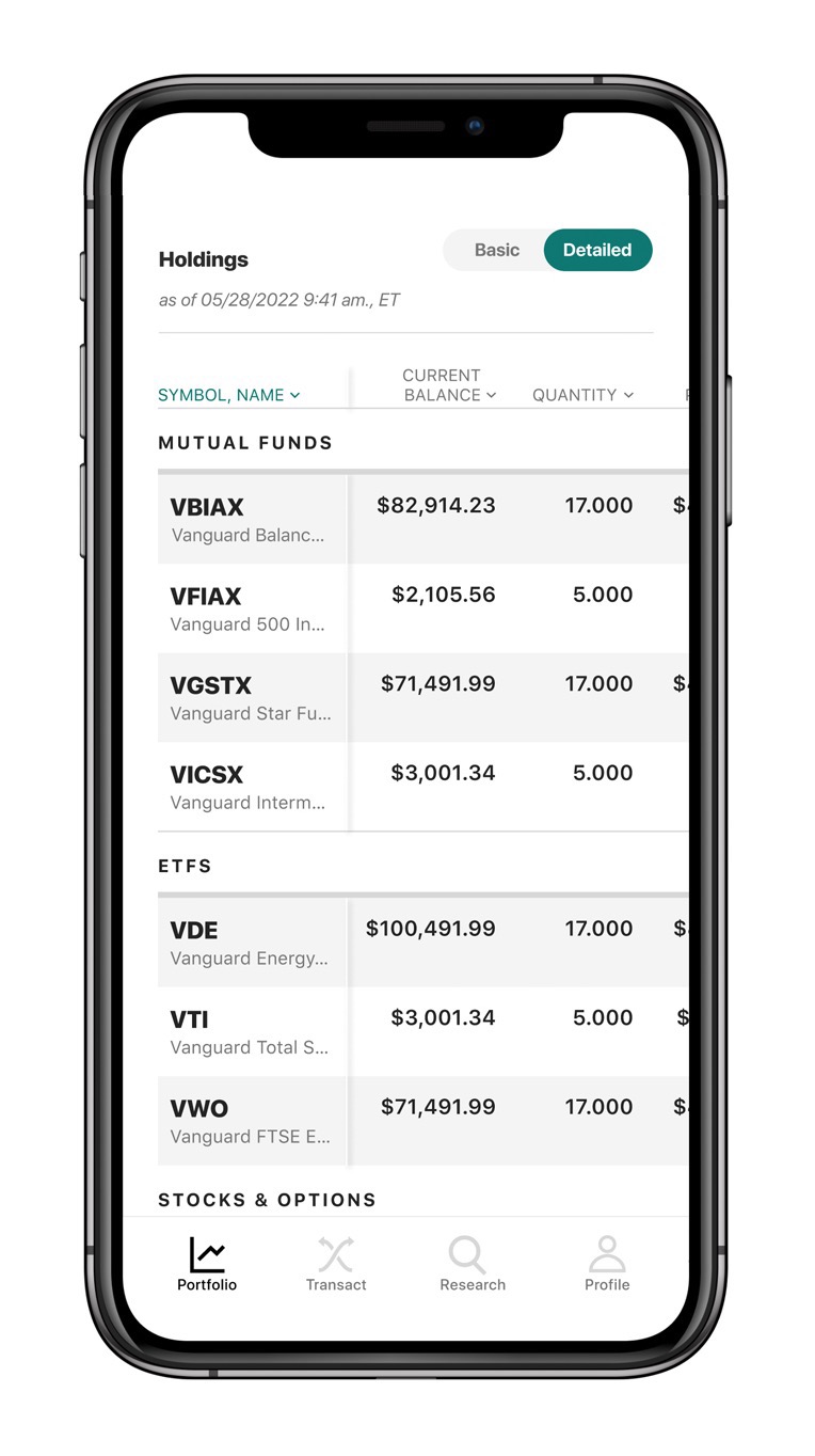
This progressive-disclosure approach provides comprehensive detail without overwhelming novice users. It also leaves room in the app’s design to build more power-user features in future iterations.
Mixed Reviews, but the Right Decision
The app’s initial release in 2021 included 75% of top tasks identified in the true-intent survey. While many users appreciated the improved visual and interaction design, some customer feedback and user reviews complained that the new version lacked power-user features. Vanguard used machine-learning to analyze and prioritize that customer feedback.
"We leveraged machine learning to organize large volumes of client comments, identify actionable feedback, group them into themes, and prioritize them according to feature enhancements with the greatest impact on improving client experiences." — Mark Correale, data analyst
Since the launch, Vanguard’s design team has been working to deliver the additional power-user features to satisfy those clients. Such features include the ability to filter transactions, to see tax documents, and to research potential new investments. As a result, the app’s average CSAT score has improved slightly.
The team has more advanced features on its roadmap and will continue to prioritize delivering powerful functionality without overwhelming users — particularly novice investors.
"Prioritization is a collaborative effort led by product, UX and analytics teams, leveragingboth customer feedback, data and Vanguard's strategic priorities." — Saurin Gandhi, head of Mobile & Emerging Tech
Lessons Learned: Prioritizing Features
Vanguard’s challenge is a common one among design teams — we have finite time and resources, but unlimited ways in which we could improve the product. In these situations, we need to make strategic decisions about what to build and when.
If your organization serves multiple, diverse user groups, ensure that those differences in behaviors, priorities, and needs are captured and shared across the organization (for example, using a tool such as personas). Consider collecting the highest-priority needs from each group to create a top-task list, as Vanguard did through intercept surveys.
When weighing the priority of user needs, consider factors such as:
- The percentage of users that need or want each task or feature
- How much each task or feature contributes to your organization’s core goals
- The relative negative impact on users if each need is not satisfied
- The amount of work required to deliver each feature
- The amount of complexity added to the product when implementing new features