
We recently updated our website homepage, and, in addition to changing the content and visual design, we’ve incorporated two major technical changes: adding a new layout for users with wide screens, and using a variable font. These changes are progressive enhancements, because they only affect users with particular types of devices.
Since these changes are also complex to implement, we decided to adopt them only after reviewing our website traffic to determine how many of our visitors would benefit and if the changes were worth our business resources.
Wide-Screen Breakpoint
In 2006, we recommended designing layouts for viewports 1024-pixel wide. But with today’s higher-resolution screens, that approach can leave many users with inches of unused space on both sides of the content — even on a small 13-inch laptop. To decide whether to invest in creating wide-screen layouts, we took a look at our website analytics, and realized that 77% of our sessions are on browser windows wider than 1100 pixels.
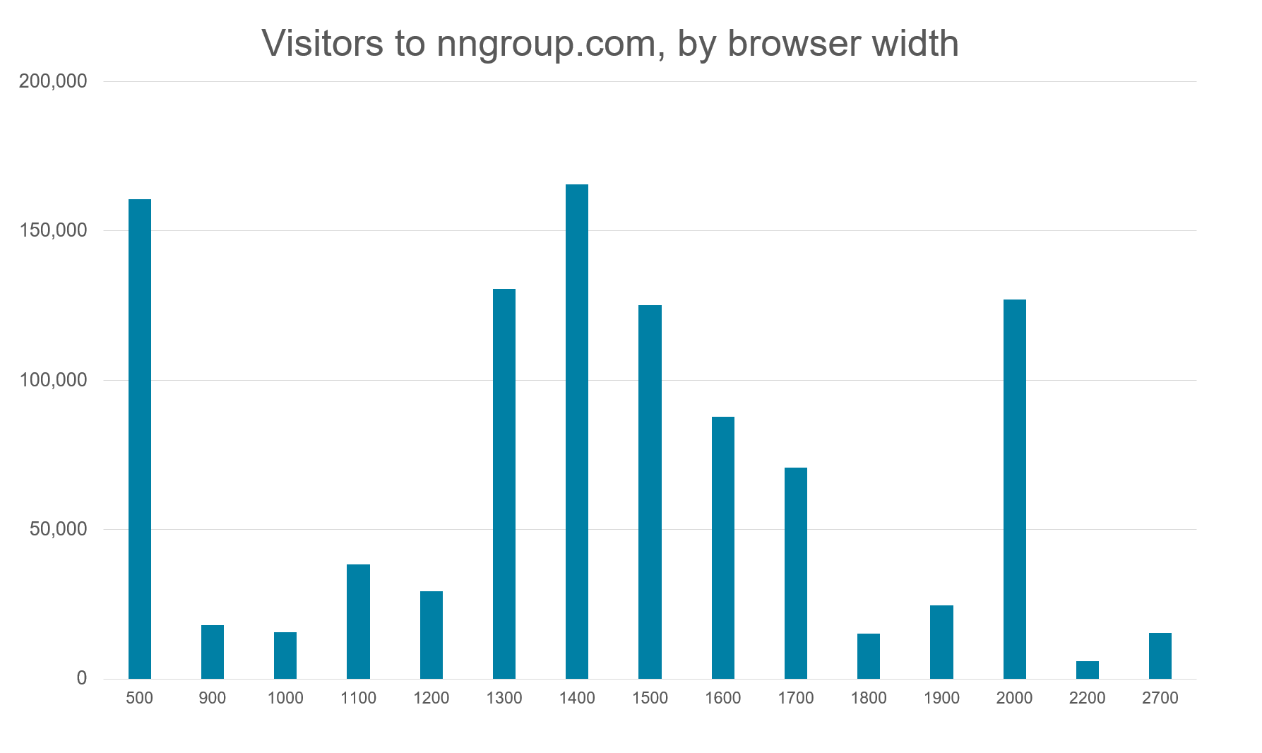
To support these users, the new homepage adjusts to large screens. (As of this writing, only the homepage adjusts; in the coming months we’ll be extending this feature to other pages, as well.)

Variable Fonts
Users want websites that look good, but they also detest websites that load slowly. Unfortunately, many design tactics for enhancing visual appeal result in slow page rendering. This dilemma is a common one: what do you prioritize and when do you make tradeoffs?
The tradeoff between aesthetics and performance is especially apparent when it comes to typefaces: rendering text in a custom font can significantly increase the visual appeal, but comes with delays due to the extra time needed for browsers to load the custom font files. The delay is even greater when your text requires different weights (such as bold or light weights), since each weight involves a separate font-file download. Font-file compression and caching help, but these techniques don’t completely solve the problem.
To expedite page load time, we previously used just one custom font for headings, and relied on standard browser-safe fonts for most text, since browsers can render both normal and bold weights without needing to download any font files at all. This approach wasn’t ideal because it was a compromise in both directions: having to load a custom font and still not achieving our ideal visual aesthetic (which would have taken more 3 custom-font weights).
This time around we discovered a new solution: variable fonts, which allow using a single font file but adjusting the weight of the characters. Variable fonts were introduced in September 2016 as a joint effort by Adobe, Apple, Google, and Microsoft; in just 2 years, browser support for variable fonts has increased from 2% to 70%.

We consulted our own web analytics and found that, for our audience, adoption is even higher than 70%: currently, 80% of sessions on nngroup.com are on browsers that support variable fonts, and we expect this number to increase further soon, when Firefox for Windows will implement its planned support for this feature. The 20% of traffic from browsers that do not support variable fonts will see a fallback, with browser-safe fonts plus one custom font, as our legacy site used to have. (We are grateful to Adobe, for releasing Source Sans Pro as an open-source variable font and to Richard Rutter, whose article about implementing variable fonts with a fallback was extremely helpful.)
Prioritizing by Audience Size
Each of the changes described here benefits about 80% of users. But what about the other 20% of users? When prioritizing design options and making tradeoffs, it’s important to consider both the size of the affected audience groups and the severity of the effect on each group. A change that benefits most users may not be worthwhile if it creates a very negative impact on a minority of users (assuming that minority is actually part of your target audience).
Let’s consider a case from the history of the web, at the time when 20% of users were still using slow dial-up modems. You would like to use a nice big hero image that would increase page load time by 1 minute for these dial-up users, even though the delay would be negligible for broadband users. Don’t do it. The penalty for the 20% of users would be too big. Similarly, it would not be wise to distribute a document in a format that 80% of users would be able to view, but 20% of users could not open at all.
In these two examples (and many more), the enhancement that would benefit 80% of the users ends up imposing severe pain on the remaining 20% of users.
Luckily, wide-screen layouts and variable fonts don’t fall into this category. Yes, the 80% of users will see a better-looking website, but the 20% of users will still see a good-looking site. Nothing terrible will happen to them — in fact, their experience will be exactly as before. The existence of the fallback solution makes all the difference to the feasibility of helping the 80% without hurting the 20%.
Conclusion
We’re well-known for our conservative approach to design. We came by it honestly: in 20 years of user research, we’ve observed too many design fads that didn’t help — and some that even hurt —the end-user’s experience.
But a cautious approach to trends doesn’t mean rejecting all innovation. We’re picky about which bandwagons we join, choosing only trends that provide true UX value. Less scrolling and more content for large-screen users is a clear winner. And although variable fonts are not yet widely adopted, we bet that this innovative technology is here to stay, given its overwhelming industry support and demonstrable benefit to both appearance and performance.
These examples demonstrate just a few of the ways in which analytics can drive meaningful adjustments to improve users’ experiences. Whether it be new technology or extensive breakpoints, look at your own website’s analytics before deciding where it is worth investing your design and development resources.