Deciding which category or link to click requires cognitive effort. If a page has many links, users must choose the one most likely to help them achieve their goal. This process can be exhausting, especially if the link names are vague and unclear.
Users Prefer Clear Over Clever
Good link names help people quickly and accurately predict what they’ll get before they click.
Descriptive category names that people understand are better than made-up words or internal jargon. Because website designers are usually domain experts, they’re familiar with internal jargon and sometimes forget that their audiences are not.

Five Tips for Good Category Labels
Cleaning up unhelpful labels creates a better user experience and can positively impact people’s perceptions of your organization. Use these tips to ensure that your category names are understandable.
1. Be Descriptive and Relatable
Your navigation labels should be easily understood, even if they feel boring. Choose function over form, and make sure that your names are descriptive and that your audience can relate to them.
When labels are nondescript, people are more likely to click the wrong link and miss information that they need. In usability studies, we often see users skip a category name with weak information scent, even though that link leads to the item they are looking for.


2. Avoid Made-Up Terms
Don’t be tempted by the allure of clever names. Stick to commonly used words. For example, About Us is better than Company Experience because it is a more common phrase.
Featuring user-centric language improves decision time, which is important to website visitors who navigate quickly. If you must use fancy names, always explain their meaning, because people tend to skip over meaningless words.

3. Check for Overlapping Categories
The most useful categorization schemes have distinct and descriptive category labels. They can’t be too broad, narrow, vague, ambiguous, or overlap in meaning.Each of your categories should have a unique identity so users don’t get confused between two similar options. Research methods like card sorting and tree testing can help you determine the best labels for your categories.

4. Categorize Based on Users’ Mental Models
Categories should be structured based on how your users think. Users should be able to navigate your website with only their own experiences informing their decision making.
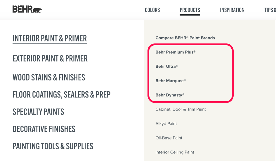
Organizations often categorize components using schemes that are familiar to them. For example, they mirror their organizational charts or arrange products by model number. Instead, research your user base to determine their mental models.
5. Don’t Rely on Instincts
Test names with your users to make sure they can accurately predict which information is contained in each category. Research methods, such as card sorting and tree testing, can help you get feedback on your labels and can show you how to structure your website so that people can navigate it effectively. User research is the only way to guarantee your category names will work for your users. Otherwise, you and your team’s mental models and thought processes could still be tainting your site.
Conclusion
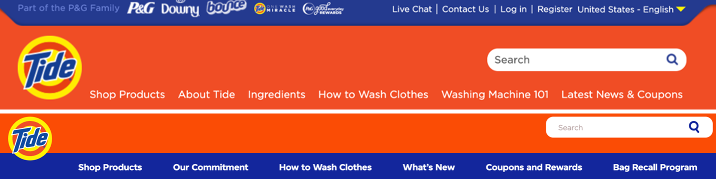
Not only do bad category names create confusion and frustration, but they often increase the interaction cost because they force people to guess (often wrongly) what the labels refer to. And that’s going to leave a bad taste in your users’ mouths.
While communicating a brand identity is important, it should not require sacrificing findability and discoverability. No matter how tempting cool names may seem, good UX suggests staying away from them.