Surveys asking users to give feedback during or after an interaction should not interrupt the users' task and should be sent to the appropriate channel. They need to be short, easy to complete, and give the user the opportunity to provide details about their experience.
Using typefaces with distinct characters can help users easily differentiate alphanumeric data. Choose typefaces that pass the I-L-1 test for data tables and information seen at-a-glance.
Usability assesses how easy user interfaces are to use. Usability is defined by 5 quality components: learnability, efficiency, memorability, errors, and satisfaction.
Answer two questions to decide how to handle technical terminology in your writing: (1) How many readers will know this term? (2) How important is the term in your context?
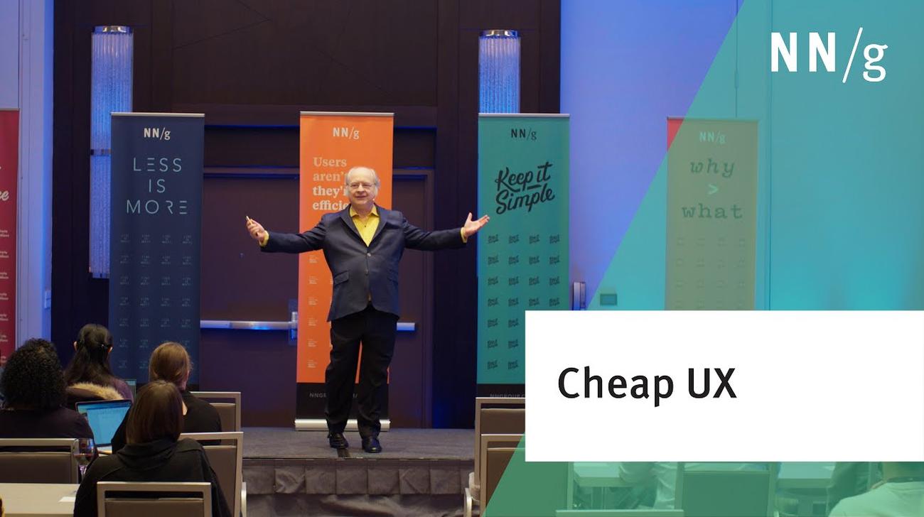
3 methods for cheap and fast UX work are still good advice to emphasize iterative design and accelerate UX maturity improvements (This was Jakob Nielsen's keynote at the in-person Washington DC UX Conference)
Job interviews are usually terrible at predicting future performance. Learn how structuring your hiring interviews can help UX teams strike gold by identifying high-performing and diverse hires with a less biased process.
Jakob Nielsen's 10 general principles for interaction design. They are called "heuristics" because they are broad rules of thumb for UX and not specific usability guidelines.
Empathy maps help UX teams visualize user attitudes and behaviors, building a shared understanding of end users while highlighting gaps in existing user data.
Modern day UX research methods answer a wide range of questions. To know when to use which method, each of 20 methods is mapped across 3 dimensions and over time within a typical product-development process.
User interviews have become a popular technique for getting user feedback, mainly because they are fast and easy. Use them to learn about users’ perceptions of your design, not about its usability.
User journeys and user flows both describe processes users go through in order to accomplish their goals, but they differ in scope, purpose, and format.
iOS 26’s visual language obscures content instead of letting it take the spotlight. New (but not always better) design patterns replace established conventions.
Elaborate usability tests are a waste of resources. The best results come from testing no more than 5 users and running as many small tests as you can afford.
In a card-sorting study, users organize topics into groups. Use this research method to create an information architecture that suits your users' expectations.