False positives and negatives are common errors in quantitative studies that can lead to harmful business decisions. To avoid these mistakes recruit large enough sample sizes, representative participants, and control for confounding variables.
Unsure where to start? Use this collection of links to our articles and videos to learn about principles of human psychology and how they relate to UX design.
NN/g’s 2023 Intranet Design Annual winners used AI for chatbots, tool recommendations, career guides, virtual assistants, and personalized communications to boost productivity.
Data on what works well or poorly on other sites saves you from implementing useless features and guides UX investments to features that your users need.
Is your UX portfolio woefully outdated? Use this simple technique every new year to capture your important achievements and make the task more manageable.
Data refers to unanalyzed user observations, findings capture patterns among data points, and insights are the actionable opportunities based on research and business goals.
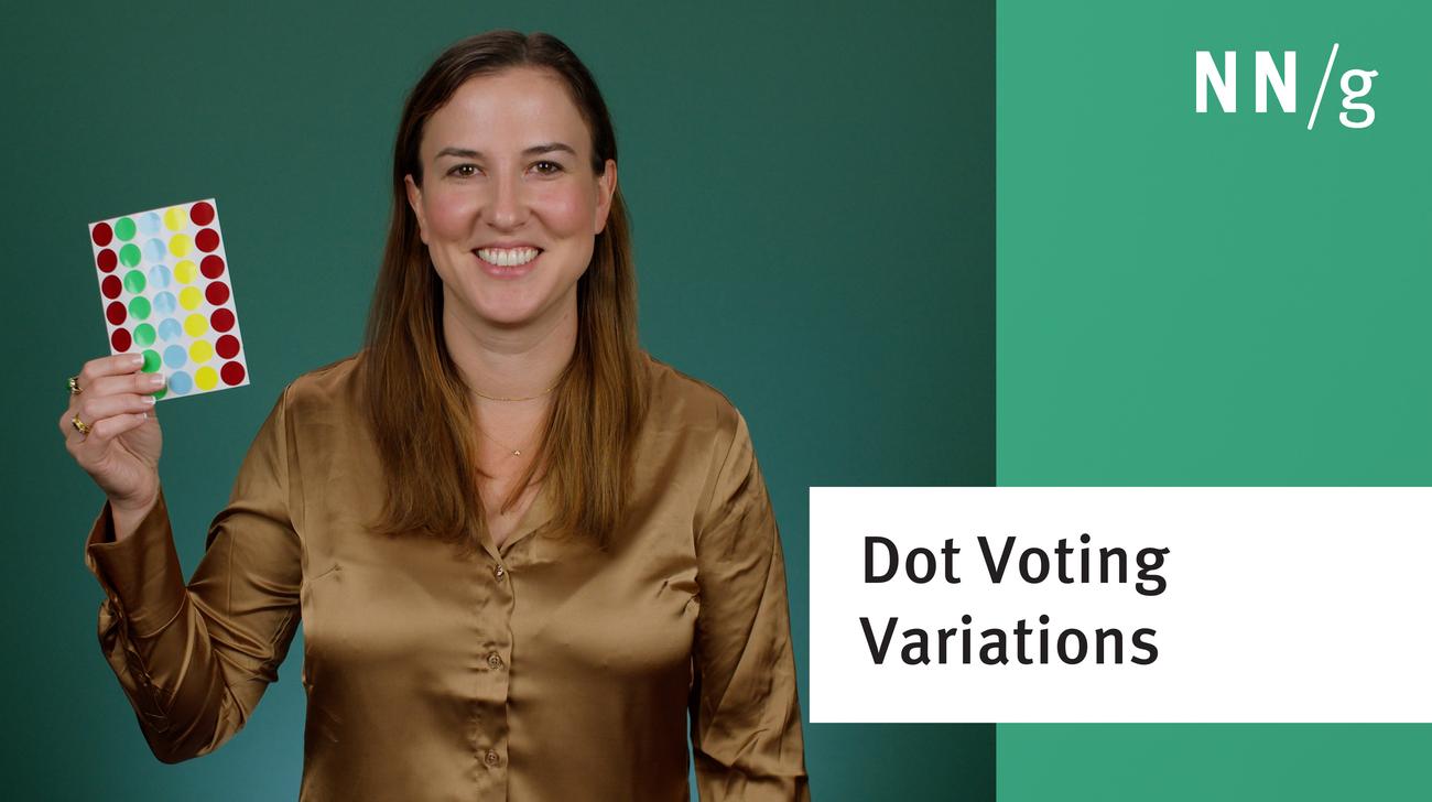
Think beyond the dot in your next UX workshop! Variations of dot voting such as heat mapping and dot coding add context and facilitate deeper discussion during UX prioritization activities.
Tables of contents show mobile users an overview of the information on the page and allow them to easily access the piece of content that is relevant to them. Two possible implementations involve in-page links and accordions.
Jakob Nielsen's 10 general principles for interaction design. They are called "heuristics" because they are broad rules of thumb for UX and not specific usability guidelines.
Empathy maps help UX teams visualize user attitudes and behaviors, building a shared understanding of end users while highlighting gaps in existing user data.
Modern day UX research methods answer a wide range of questions. To know when to use which method, each of 20 methods is mapped across 3 dimensions and over time within a typical product-development process.
User interviews have become a popular technique for getting user feedback, mainly because they are fast and easy. Use them to learn about users’ perceptions of your design, not about its usability.
User journeys and user flows both describe processes users go through in order to accomplish their goals, but they differ in scope, purpose, and format.
iOS 26’s visual language obscures content instead of letting it take the spotlight. New (but not always better) design patterns replace established conventions.
Elaborate usability tests are a waste of resources. The best results come from testing no more than 5 users and running as many small tests as you can afford.
In a card-sorting study, users organize topics into groups. Use this research method to create an information architecture that suits your users' expectations.