Users have a rudimentary understanding of cloud services and attempt to fit them into their existent, simpler mental models that they had formed for similar, more-traditional services.
Customers shopping online rely on product pages to decide what to buy. Help them by answering questions, enabling comparison, providing reviews, and facilitating the purchase process.
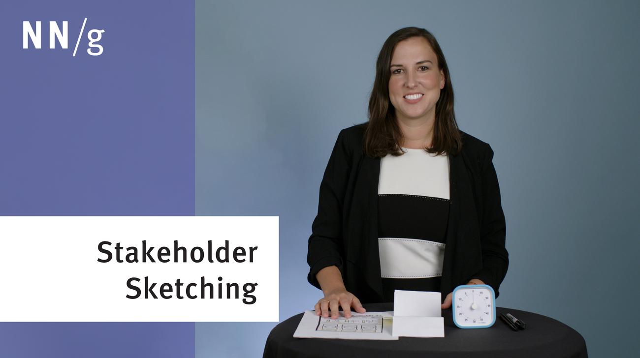
In ideation and many other UX activities, we want to include stakeholders and get them to participate in sketching UI prototypes and other visuals. Here are four tactics to getting everybody to sketch in your UX workshops.
The Halo Effect says that any one element in a user's experience with a company will rub off on their interpretation of other elements and their feelings about the company as a whole. Good design in one part of a website will make people like other parts better (and like the company better), but the opposite is also true.
Because today’s search-results pages have many possible complex layouts, users don’t always process search results sequentially. They distribute their attention more variably across the page than in the past.
Communication, credibility, collaboration, consistency, and a central place that organizes policies, forms, and all the tools offered in the digital workplace are some of the marks of successful intranets.
How to maximize the positive contribution of a variety of stakeholders in workshops throughout the UX design process while minimizing any disruptive or negative impact.
To maintain focus in a UX workshop, set aside ideas in a "parking lot" if they diverge from the stated agenda. Parked ideas should be discussed later when they won't slow the team's momentum in addressing the meeting's main topic. Here are 3 guidelines for making the most of a parking lot.
Because the field is being defined in real time, practitioners often have questions about what Design Operations means, and how to establish DesignOps practices.
To decide whether to visit a page, people take into account how much relevant information they are likely to find on that page relative to the effort involved in extracting that info.
Jakob Nielsen's 10 general principles for interaction design. They are called "heuristics" because they are broad rules of thumb for UX and not specific usability guidelines.
Empathy maps help UX teams visualize user attitudes and behaviors, building a shared understanding of end users while highlighting gaps in existing user data.
Modern day UX research methods answer a wide range of questions. To know when to use which method, each of 20 methods is mapped across 3 dimensions and over time within a typical product-development process.
User interviews have become a popular technique for getting user feedback, mainly because they are fast and easy. Use them to learn about users’ perceptions of your design, not about its usability.
User journeys and user flows both describe processes users go through in order to accomplish their goals, but they differ in scope, purpose, and format.
iOS 26’s visual language obscures content instead of letting it take the spotlight. New (but not always better) design patterns replace established conventions.
Elaborate usability tests are a waste of resources. The best results come from testing no more than 5 users and running as many small tests as you can afford.
In a card-sorting study, users organize topics into groups. Use this research method to create an information architecture that suits your users' expectations.