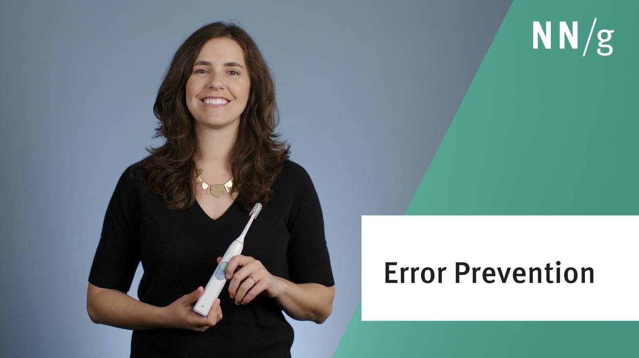
No. 5 of the top 10 UX design heuristics is to prevent interaction problems from occurring in the first place: either eliminate error-prone conditions or check for them and present users with a confirmation dialog.
A parking lot captures unrelated questions or out-of-scope conversations during UX meetings or workshops to keep the discussion focused and maintain momentum.
Users ages 65 and older face unique challenges when using websites and apps. Digital literacy among this demographic is rising, but designs need to accommodate older users.
Change blindness is the tendency for people to overlook things that change outside their focus of attention. In user interface design, this explains why screen changes that seem striking to the designer can be completely ignored by users.
Sliding hero images that rotate through a set of promotions, news, or the like on the top of web pages are often annoying to users and are definitely error prone, unless they are designed according to usability guidelines.
No. 4 of the top 10 UX design heuristics is to stick to UI conventions and follow existing standards, so that users know what to expect and how to operate the interface.
Distinguishing between these two actions is critical to avoiding losing users’ work. Save changes before closing a view, use text labels rather than an X icon, and provide a confirmation dialog before destructive actions.
Even though B2B and B2C ecommerce sites have different kinds of users, both types of sites can use similar strategies to simplify purchase flows and increase consumer trust.
Jakob Nielsen's 10 general principles for interaction design. They are called "heuristics" because they are broad rules of thumb for UX and not specific usability guidelines.
Empathy maps help UX teams visualize user attitudes and behaviors, building a shared understanding of end users while highlighting gaps in existing user data.
Modern day UX research methods answer a wide range of questions. To know when to use which method, each of 20 methods is mapped across 3 dimensions and over time within a typical product-development process.
User interviews have become a popular technique for getting user feedback, mainly because they are fast and easy. Use them to learn about users’ perceptions of your design, not about its usability.
User journeys and user flows both describe processes users go through in order to accomplish their goals, but they differ in scope, purpose, and format.
iOS 26’s visual language obscures content instead of letting it take the spotlight. New (but not always better) design patterns replace established conventions.
Elaborate usability tests are a waste of resources. The best results come from testing no more than 5 users and running as many small tests as you can afford.
In a card-sorting study, users organize topics into groups. Use this research method to create an information architecture that suits your users' expectations.