In a graphical user interface, having the user move a cursor within a narrow path (e.g., in a hierarchical menu or a slider) follows a strict law for how easy or difficult it is to do, depending on the specifics of the GUI.
Formative evaluations are used in an iterative process to make improvements before production. Summative evaluations are used to evaluate a shipped product in comparison to a benchmark.
Asynchronous remote ideation allows people to contribute ideas whenever it’s convenient to do so, but synchronous sessions lead to faster results and more team building.
No. 1 of the top 10 UX design heuristics is to provide visibility of system status through proper feedback, so that the user knows how commands are being interpreted and what the computer is up to at any time.
By understanding customers’ payment preferences and offering options that people are used to in their own country, sites can improve the checkout experience for international purchasers.
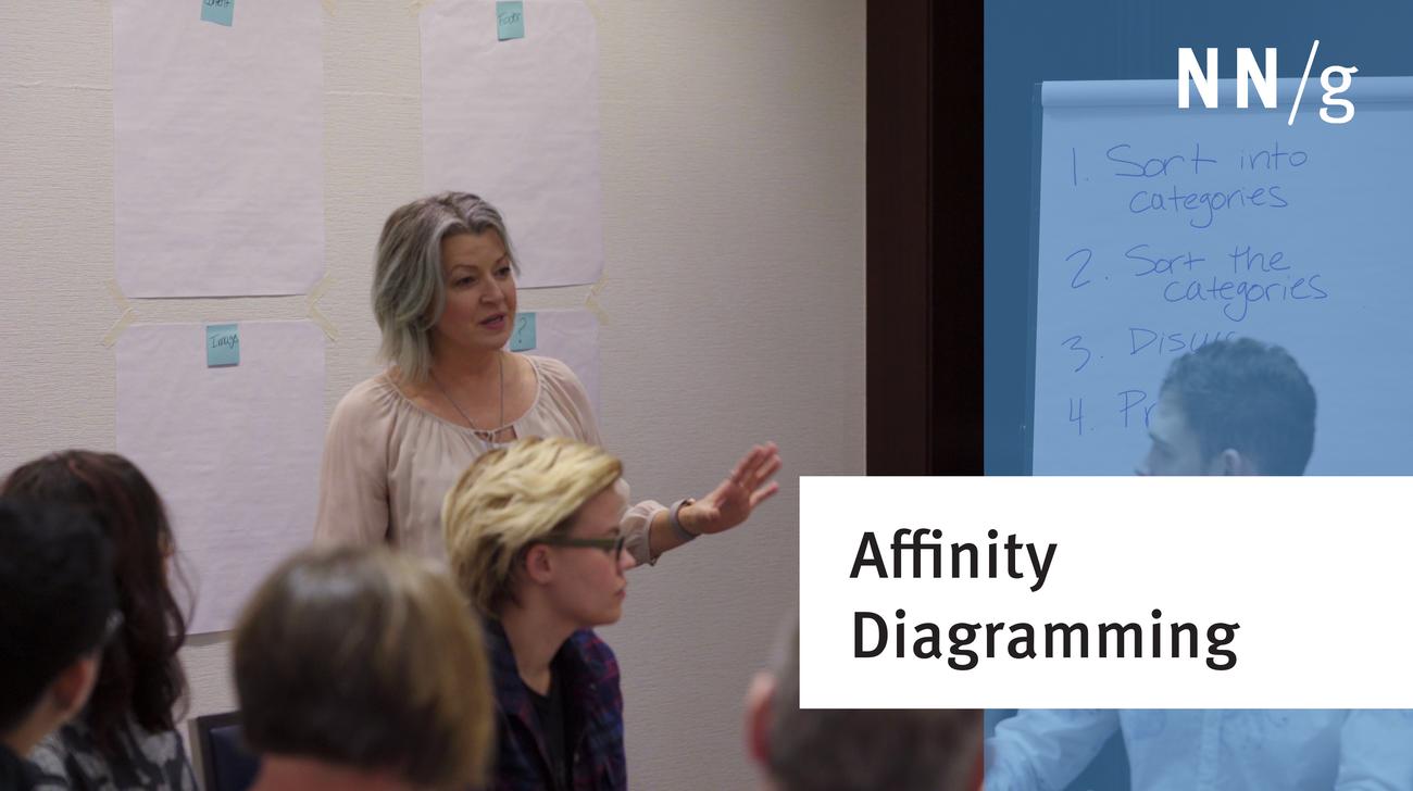
Use the affinity diagramming method with stakeholders and members to efficiently categorize then prioritize UX ideas, research findings, and any other rich topics. Work together to quickly develop a shared understanding among your team.
The portfolio of UX professionals (whether experienced, entry-level, or career-changers) should present both projects and deliverables. Tell a story for your user (the hiring manager).
Jakob Nielsen's 10 general principles for interaction design. They are called "heuristics" because they are broad rules of thumb for UX and not specific usability guidelines.
Empathy maps help UX teams visualize user attitudes and behaviors, building a shared understanding of end users while highlighting gaps in existing user data.
Modern day UX research methods answer a wide range of questions. To know when to use which method, each of 20 methods is mapped across 3 dimensions and over time within a typical product-development process.
User interviews have become a popular technique for getting user feedback, mainly because they are fast and easy. Use them to learn about users’ perceptions of your design, not about its usability.
User journeys and user flows both describe processes users go through in order to accomplish their goals, but they differ in scope, purpose, and format.
iOS 26’s visual language obscures content instead of letting it take the spotlight. New (but not always better) design patterns replace established conventions.
Elaborate usability tests are a waste of resources. The best results come from testing no more than 5 users and running as many small tests as you can afford.
In a card-sorting study, users organize topics into groups. Use this research method to create an information architecture that suits your users' expectations.