When designing bulk actions, provide a Select All option, use a contextual action bar, and give users clear feedback with the option to undo actions to ensure a smooth and efficient experience.
Users’ willingness to share data and their interactions with cookie permission box options vary quite drastically, falling into these five common user types: The Denier, The Skeptic, The Tech-Savvy, The Impatient, and The Enthusiast.
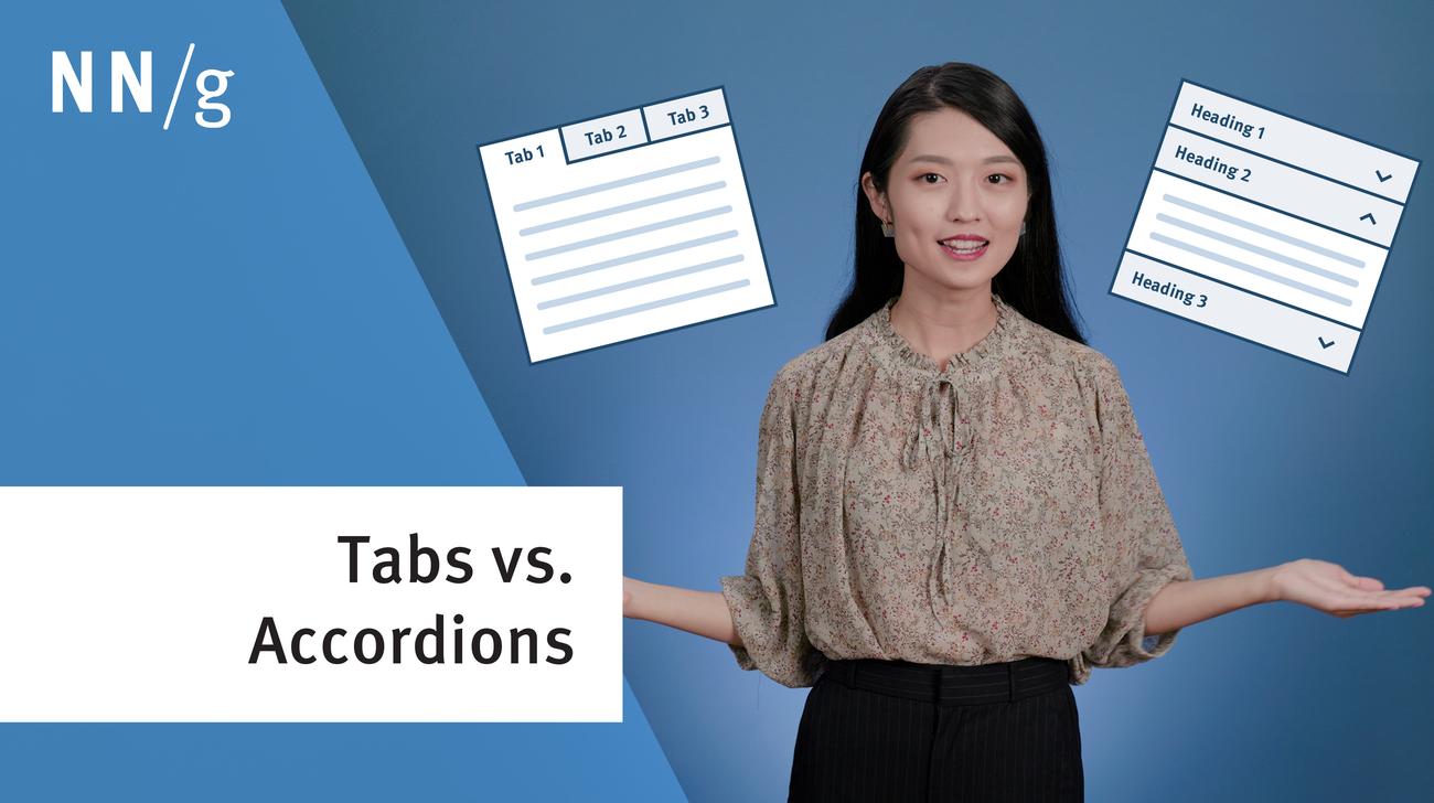
Tabs and accordions organize and layer content on the same page. Tabs suit a few long sections, while accordions fit many short ones. Choose based on your content structure and user needs for optimal layout.
In-page links help users navigate to specific content sections on the same page. For effective use, use descriptive headings that match the destination, and clearly distinguish in-page links from other links.
When humans interact with computers, mistakes and misunderstandings are inevitable. In these situations, good error messages are a vital tool to avoid frustrations and provide a satisfying user experience.
Transactional notifications are concise, timely messages related to customer-company interactions. For effective notifications, it's crucial to have a clear subject line, provide all necessary transaction details, and ensure easy options for users to unsubscribe.
Avoid using accordions when: 1. Users need access to most content; 2. There's little visible content on the page; 3. Content is complex with multiple levels; 4. Content can't be effectively chunked; 5. An uninterrupted reading flow is prioritized.
Accordions provide an overview of the whole page and mitigate the problem of long mobile pages, allowing users to directly access the content of interest.
International purchasers are more comfortable shopping in their own language. Follow these tips to make the language switcher on your site more discoverable and usable.
Infinite scrolling can create great user experiences, but it also has weaknesses. Consider 3 alternative design patterns that may work better for your product: A load-more button, integrated pagination within a long scroll, and traditional pages.
Our Beijing-based user research team conducted a field study in automated restaurants that serve diners with no staff. Current designs have some advantages, but the UI is too complicated for customized ordering.
Infinite scrolling through long lists of homogeneous items can lower interaction costs, but is less suited to support specific tasks such as finding a particular item.