If users don't notice a navigation menu, they won't use it, and website usage will plummet. Here are 5 design guidelines to increase the visibility of navigation menus.
There's a footer at the bottom of every web page, but the design of this utilitarian page element is often overlooked, making the website perform below its potential. In our usability studies, users often turn to page footers for important information and tasks, making them an integral part of the overall experience of a site.
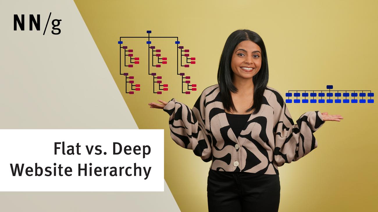
A key question in information architecture (IA) is to decide the number of items in navigation menus (including global menus and local menus). 4 main factors determine the answer, but it's not 7, despite a common myth.
Hick's Law (or the Hick–Hyman Law) says that the more choices you present to your users, the longer it takes them to reach a decision. However, combining Hick’s Law with other design techniques can make long menus easy to use.