Destination pages fulfill users' information needs through detailed content, while transition pages guide them toward these destinations through navigation and brief overviews. Content prioritization based on user goals and information needs is key in designing both pages.
Navigation, taxonomies, and the full IA structure are different ways of modeling a product's structure. We review the differences and similarities between these three different IA models.
In application design, prevent users from being overwhelmed by putting things in predictable places, using a clear visual hierarchy, and taking advantage of progressive disclosure.
Websites with many categories can benefit from showing navigation menu options in a vertical list: vertical menus allow for easy expansion, are easy to scan, plus users are familiar with this design pattern.
The computer mouse is the most efficient pointing device for speed and accuracy. More important, it's the symbol of user empowerment and control over the user interface.
Wayfinding cues like districts and landmarks help residents and tourists find their way around cities. The same ideas can help users of digital products (e.g., websites) understand where they are and where they can go.
People can only hold a small amount of information in their short-term memory, which fades fast. These facts impact most aspects of screen design and dictate many usability guidelines.
Information foraging explains how users behave on the web and why they click certain links and not others. Information scent can be used to analyze how people assess a link and the page context surrounding the link to judge what's on the other end of the link.
If users don't notice a navigation menu, they won't use it, and website usage will plummet. Here are 5 design guidelines to increase the visibility of navigation menus.
Users want to do the least amount of work possible to get to a desired web page. However, "work" is the sum of difficulty presented by each click and not the number of clicks in itself. Here are some tips for making a path easier to navigate.
Is it enough to have a search feature on a website? Or do users also benefit from a well-designed navigation interface? Depending on the nature of the site, the balance between the two can change.
Tree testing is a supplement to card sorting as a user research method for assessing the categories in an information architecture (especially a website IA and its proposed or existing navigation menu structure).
There's a footer at the bottom of every web page, but the design of this utilitarian page element is often overlooked, making the website perform below its potential. In our usability studies, users often turn to page footers for important information and tasks, making them an integral part of the overall experience of a site.
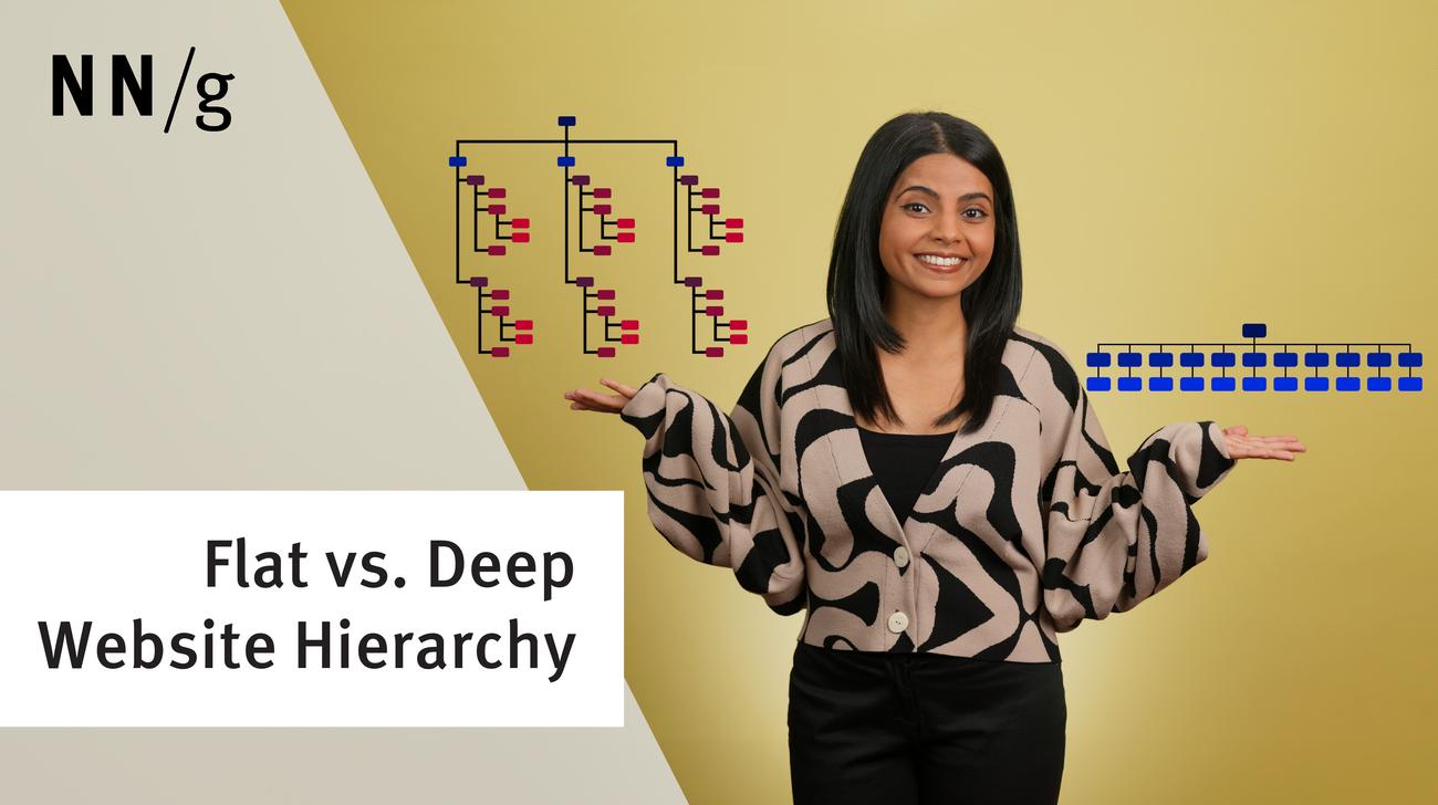
A key question in information architecture (IA) is to decide the number of items in navigation menus (including global menus and local menus). 4 main factors determine the answer, but it's not 7, despite a common myth.
Hick's Law (or the Hick–Hyman Law) says that the more choices you present to your users, the longer it takes them to reach a decision. However, combining Hick’s Law with other design techniques can make long menus easy to use.