The sparkles icon has become increasingly prevalent in user interfaces, particularly in association with AI-driven features, but it suffers from ambiguity and lacks a standardized meaning.
When following good practices, prompt controls can increase the discoverability of genAI chatbots’ features, offer inspiration, and minimize manual user input.
Tabs are everywhere, but do you use them properly? Distinguish between types of tabs, design them for visual clarity, and structure their content for usability.
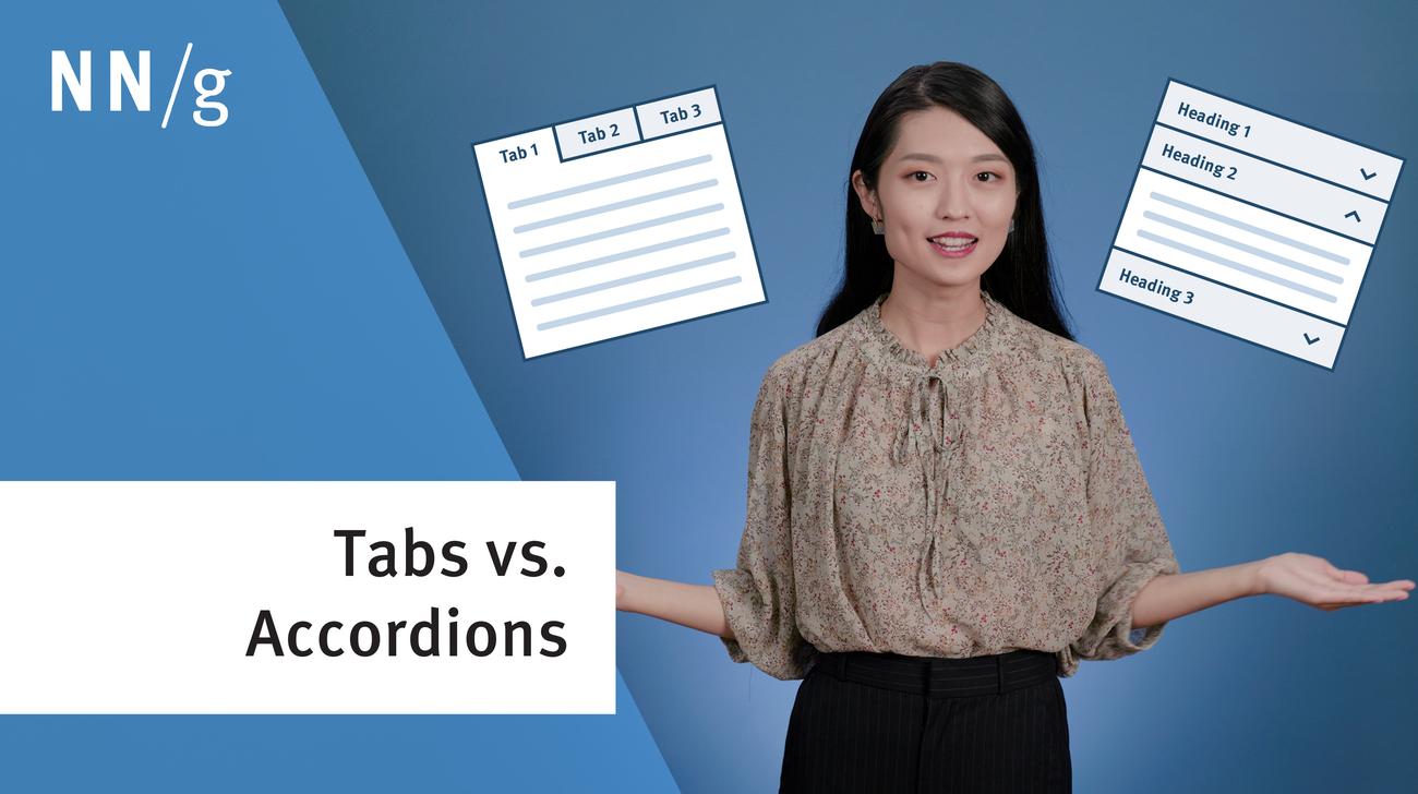
Tabs and accordions organize and layer content on the same page. Tabs suit a few long sections, while accordions fit many short ones. Choose based on your content structure and user needs for optimal layout.
Most calculator and quiz tools provide at least one or more of the following services: converting inputs, predicting the future, or providing recommendations.
In-page links help users navigate to specific content sections on the same page. For effective use, use descriptive headings that match the destination, and clearly distinguish in-page links from other links.
When humans interact with computers, mistakes and misunderstandings are inevitable. In these situations, good error messages are a vital tool to avoid frustrations and provide a satisfying user experience.
Calculators and quizzes provide personalized information. Users approach these tools with an exploratory mindset and appreciate them while making decisions.
Transactional notifications are concise, timely messages related to customer-company interactions. For effective notifications, it's crucial to have a clear subject line, provide all necessary transaction details, and ensure easy options for users to unsubscribe.
Avoid using accordions when: 1. Users need access to most content; 2. There's little visible content on the page; 3. Content is complex with multiple levels; 4. Content can't be effectively chunked; 5. An uninterrupted reading flow is prioritized.
Whether scroll fading is more distracting than usable depends on the following factors: its persistence, responsiveness, and how sparingly it is applied to elements on the page. When used right, this design pattern can improve brand perception, optimize page loading, and make content more digestible.