Overflow menu icons are widely recognized, but hiding key actions inside them can hurt usability. Use them for secondary actions, and always prioritize clarity and proximity.
Design effective checkboxes by using square boxes, clickable labels, and clear, positive wording. List items vertically with instructions, and ensure legal checkboxes are unchecked by default to respect user consent.
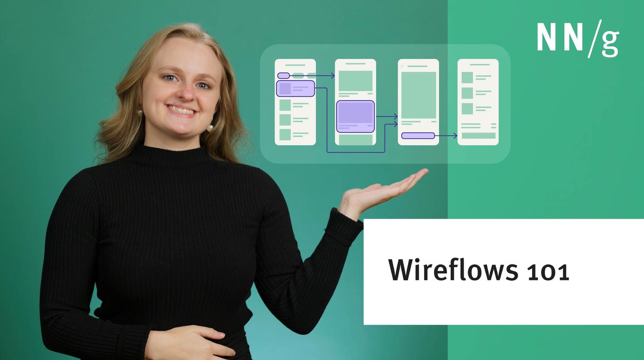
Wireflows combine wireframes with flowcharts to help document user interactions. They can aid in team collaboration, developer handoff, and help ensure clear communication for complex interactions.
When designing bulk actions, provide a Select All option, use a contextual action bar, and give users clear feedback with the option to undo actions to ensure a smooth and efficient experience.
Error messages can be a crucial point in the user experience. To be effective, they must be clearly visible, which can be accomplished by displaying them close to the error's source, using noticeable, redundant, and accessible indicators, designing them based on their impact, and avoiding displaying them prematurely.
Time on task decreases with the number of times the task has been performed in the past. As a result, a new version of an app translates into a temporary productivity loss for its users.
In application design, prevent users from being overwhelmed by putting things in predictable places, using a clear visual hierarchy, and taking advantage of progressive disclosure.
Well-designed empty states in applications can help increase user confidence, improve system learnability, and help users get started with key tasks quickly.
To reduce complexity in a user interface, employ progressive disclosure to defer secondary options to a subsidiary screen. This focuses users' attention on the primary options, which are the only ones shown by default.
Designers, researchers, and generalists alike can improve their visual design skills through creative exercises focused on identification, replication, or exploration.
Users believe that designs that look good also work well, and UX should take advantage of this. But don't make aesthetic usability lead you astray as a designer, because the UI must actually work well for long-term success.
People can only hold a small amount of information in their short-term memory, which fades fast. These facts impact most aspects of screen design and dictate many usability guidelines.
Fitts's Law describes how long time it takes to click a target, based on the distance to the target and its size. Use this information to make buttons and links faster to click.