The LATCH framework organizes information based on location, alphabet, time, category, and hierarchy. This method helps transform complex datasets into meaningful structures, facilitating effective navigation.
Card sorting studies help understand how users naturally categorize information. This information can help with creating a product's information architecture (IA) that matches users' mental models.
Navigation, taxonomies, and the full IA structure are different ways of modeling a product's structure. We review the differences and similarities between these three different IA models.
Websites with many categories can benefit from showing navigation menu options in a vertical list: vertical menus allow for easy expansion, are easy to scan, plus users are familiar with this design pattern.
Segmenting a website's navigation by audience categories will often degrade usability, either because users belong in multiple categories, or because they feel the need to look at content targeted at several segments.
Polyhierarchy is used to place a single item in more than one IA category. This can support users with different mental models but should be used judiciously.
Card sorting is great for designing or evaluating an information architecture (IA), but it can be hard to interpret. Dendrograms visualize the data which can help you make the necessary decisions which are rarely clear-cut but require tradeoffs.
Locating features or content on a website or in an app happens in two different ways: finding (users look for the item) and discovering (users come across the item). Both are important but require different user research techniques to evaluate.
Users want to do the least amount of work possible to get to a desired web page. However, "work" is the sum of difficulty presented by each click and not the number of clicks in itself. Here are some tips for making a path easier to navigate.
Tree testing is a supplement to card sorting as a user research method for assessing the categories in an information architecture (especially a website IA and its proposed or existing navigation menu structure).
4 guidelines for writing the link texts on websites to ensure users click the right options. Links should be Specific, Sincere, Substantial, and Succinct.
There's a footer at the bottom of every web page, but the design of this utilitarian page element is often overlooked, making the website perform below its potential. In our usability studies, users often turn to page footers for important information and tasks, making them an integral part of the overall experience of a site.
Simplicity depends on the capacity of the information channel and what's simple for one device, can be primitive or intricate for another, since screens are information channels with a limited capacity. When you're designing for multiple devices, don't go by common cliches like "simple is good."
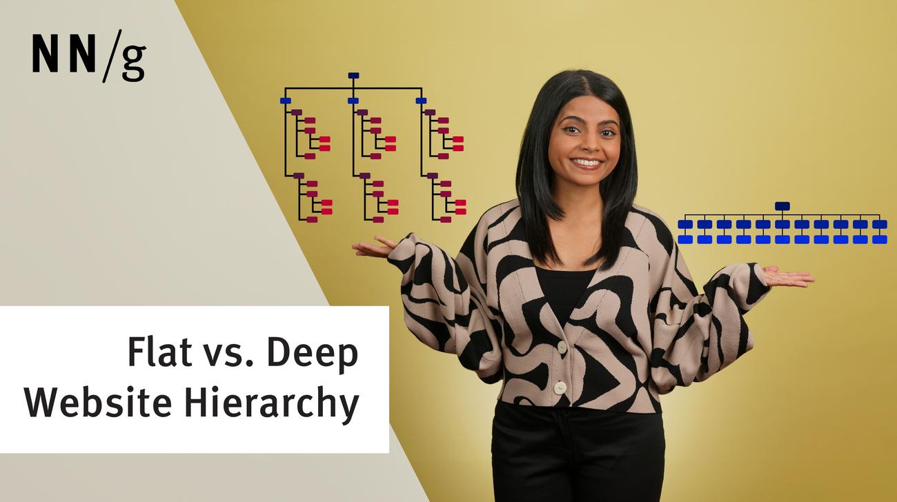
A key question in information architecture (IA) is to decide the number of items in navigation menus (including global menus and local menus). 4 main factors determine the answer, but it's not 7, despite a common myth.